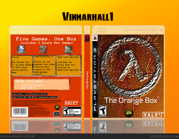
The back is way to plain and the front is that great but i can see the effort in the front at least. The front only shows the Half life logo then its a 3 game box.
#5, Well, you got it from my thread, and there were credits in the thread as well as in the filenames. But, I'll remind you again: The front was made by WickedGamer1, as well as the plastic on the back. Hellknight made the info on the back, but I re-typed it, and I also made the spine.
Okay:
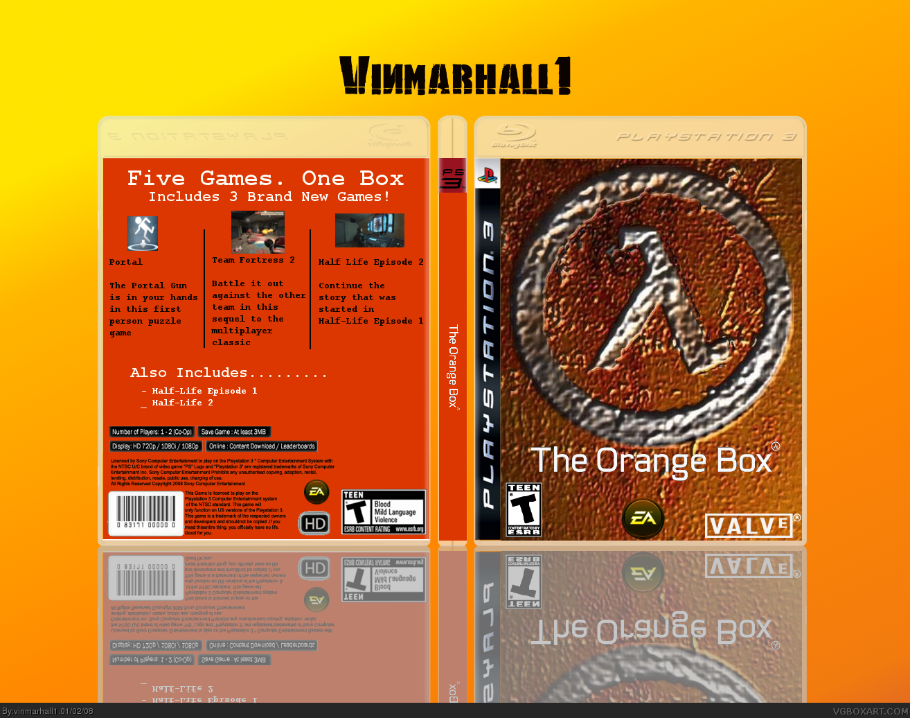
- Get a better font on the back.
- It should be rated "T - M".
- The images on the back should all be the same size.
- It should have characters or something.
- The front is very blurry.
looks good, backs a little too plain and I think the images needed resizing and maybe add a border, also try find a background image or make a simple one so its not just one big colour, really liked the front but very little effort was put into making it as its just a googled image which has been cut n pasted, overall 3/5
this is my last attempt on fixing the box, so i hope youre happy with it. i added borders to everything and made all the images the same size just like TwistedTinkerToy asked me to. this is already version 6 and i dont want to update it too many times, like my Iron Man box. so please tell me what you think
 The Orange Box Box Cover Comments
i was impressed, so i hope you are
[ Reply ]
The back is way to plain and the front is that great but i can see the effort in the front at least. The front only shows the Half life logo then its a 3 game box.
Edited at 1 decade ago
[ Reply ]
how do you add shadows to text in gimp?
[ Reply ]
I hate it when people don't give credit for temps.
[ Reply ]
didnt hellknight make this one? well ill give him credit. but if you made it, then ill give you credit instead
[ Reply ]
#5, Well, you got it from my thread, and there were credits in the thread as well as in the filenames. But, I'll remind you again: The front was made by WickedGamer1, as well as the plastic on the back. Hellknight made the info on the back, but I re-typed it, and I also made the spine.
Edited at 1 decade ago
[ Reply ]
well, then, credit to you, #6, ill remember to credit people for their templates from now on
[ Reply ]
Okay:
- Get a better font on the back.
- It should be rated "T - M".
- The images on the back should all be the same size.
- It should have characters or something.
- The front is very blurry.
Front = 3/5
Back = 2.5/5
Edited at 1 decade ago
[ Reply ]
1. the front isnt blurry
2. why the hell do i have to change the image sizes
3. i want it to be T
[ Reply ]
#9,
1. The front is blurry.
2. Because they look bad.
3. Keep that how you want, but that's not the actual rating.
4. I was just trying to help.
[ Reply ]
the images dont look bad
i know you were trying to help. i appreciate help, but some of it wasnt helpful
Edited at 1 decade ago
[ Reply ]
i sure hope you are satisfied with the back now because i updated it.
[ Reply ]
#2, erm... hate to be a goodie-goodie, but... link
i got nothing wrong with you using it, i'm just saying
[ Reply ]
i know #13, i jut dont know how to cut out charcters. HOW DO YOU CUT OUT CHARACTERS?
Edited at 1 decade ago
[ Reply ]
looks good, backs a little too plain and I think the images needed resizing and maybe add a border, also try find a background image or make a simple one so its not just one big colour, really liked the front but very little effort was put into making it as its just a googled image which has been cut n pasted, overall 3/5
[ Reply ]
this is my last attempt on fixing the box, so i hope youre happy with it. i added borders to everything and made all the images the same size just like TwistedTinkerToy asked me to. this is already version 6 and i dont want to update it too many times, like my Iron Man box. so please tell me what you think
[ Reply ]
good box
[ Reply ]