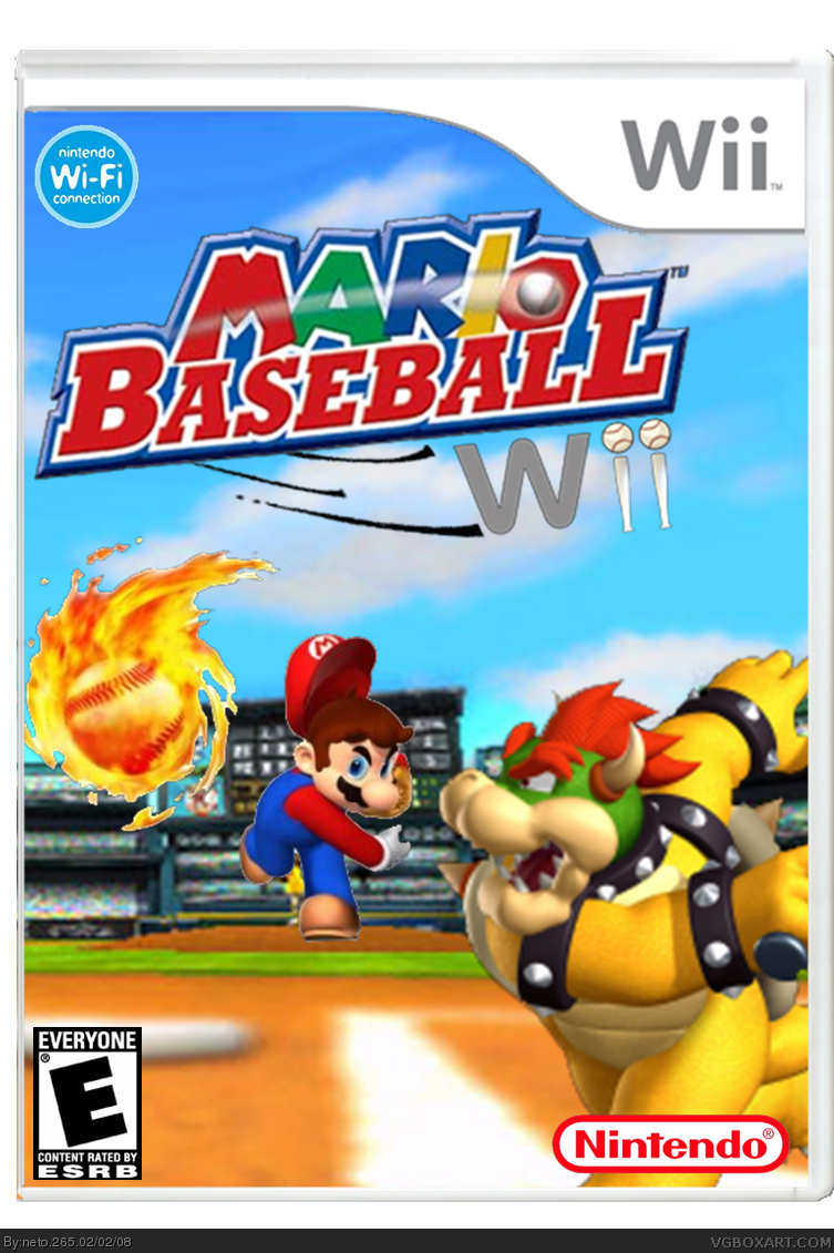
i saw this, and said, this should be good. i clicked on it, and was disappointed. its sort of lacking, and the characters seem oddly placed to me. 3.5/5
Neto, Mario should be blurred to match the background so he appears out of focus. Fixing the depth of field with this image will seriously help its overall look.
 Mario Baseball Wii Box Cover Comments
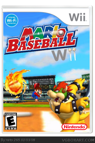
My 5th. box!! I hope you like it!! :)
[ Reply ]
I might be wrong, but Mario doesn't appear to be on the ground, it looks like he is just kinda floating, he also doesn't look to be cut out very well.
[ Reply ]
i say it look awsome i think is standing on the pitching area and hes cut out ok
[ Reply ]
if he's on the mound he needs to be smaller.
[ Reply ]
i saw this, and said, this should be good. i clicked on it, and was disappointed. its sort of lacking, and the characters seem oddly placed to me. 3.5/5
[ Reply ]
sorry about it...
Is it better now?
[ Reply ]
isnt the background the one from wii sports? 3.5/5
[ Reply ]
bowser is swinging backwards
he isnt at home plate
the background looks bad
[ Reply ]
Neto, Mario should be blurred to match the background so he appears out of focus. Fixing the depth of field with this image will seriously help its overall look.
[ Reply ]