[ Buy Mario Baseba... at Amazon ] By tucayo 6 on February 5th, 2008 No Printable Available [ Box updated on February 5th, 2008 ] [ original ] Mario Baseball Wii Box Cover Comments Comment on tucayo's Mario Baseball Wii Box Art / Cover. Cancel Reply KheartsKing 2 [ 1 decade ago ] ok, here i go... (these are suggestions) -fix wi-fi logo -get a new nintendo logo -fill in the little white spots in the logo -get rid of the black on the top right corner of the template 3/5 for now EDIT: beat you to first!! Edited at 1 decade ago [ Reply ] tucayo 6 [ 1 decade ago ] #1, whats with the logo? [ Reply ] KheartsKing 2 [ 1 decade ago ] it has all of those little spots you forgot to fill in with white [ Reply ] The Forsaken 6 [ 1 decade ago ] The ball looks like it's going into the bat... [ Reply ] kirby22 14 [ 1 decade ago ] okay. bad wifi logo bad nintendo logo bad logo boring blue background few black spots white dot on marios shoe boring pic of mario. nice try! 2/5 [ Reply ] Veronica 41 [ 1 decade ago ] #3 I think the spots on the logo where on purpose, to make it look old, and worn. However I might just be wrong about that. ^^" [ Reply ] KheartsKing 2 [ 1 decade ago ] #6, no he did the logo on paint because ive used that tool before to make it easier to cut out and it does that to the logo but he needs to put the effort to fill it in (not trying to be mean =] [ Reply ] tucayo 6 [ 1 decade ago ] version 2 [ Reply ] kirby22 14 [ 1 decade ago ] its, uh, better? 2.5/5 Edited at 1 decade ago [ Reply ] hsoldier 44 [ 1 decade ago ] worse 1/5 [ Reply ] E_G 39 [ 1 decade ago ] #10, Please make your criticism constructive. Edited at 1 decade ago [ Reply ] Lenny819 38 [ 1 decade ago ] wow the updates worse [ Reply ] KheartsKing 2 [ 1 decade ago ] #12, what did E_G just say to #10? [ Reply ] Veronica 41 [ 1 decade ago ] Better, cept for the the new logo. The first one was better, you just needed to clean it up. [ Reply ] Lenny819 38 [ 1 decade ago ] i could care less what E_G says Edited at 1 decade ago [ Reply ] KheartsKing 2 [ 1 decade ago ] Sorry didn't mean to start a fight. [ Reply ] Lenny819 38 [ 1 decade ago ] lmao u didnt, i just said i could care less what E_G says, but u might wanna read this before he deletes it again [ Reply ] Sergant Johnson 38 [ 1 decade ago ] #17, ANARCHY, ANARCHY!!!!! hahaha just kidding. Or am i? O_o [ Reply ] E_G 39 [ 1 decade ago ] Lenny819 do you want to be a cool rebel? You can but it'll get you banned. [ Reply ] neto.265 25 [ 1 decade ago ] Let me see... boring pic of mario. boring background. bad logo... nice try 2/5 Edited at 1 decade ago [ Reply ]

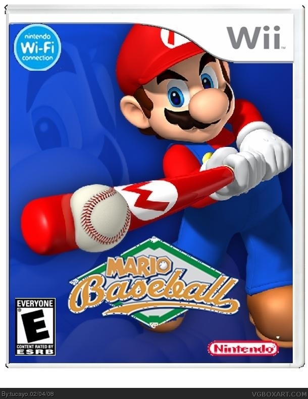
 Mario Baseball Wii Box Cover Comments
ok, here i go... (these are suggestions)
-fix wi-fi logo
-get a new nintendo logo
-fill in the little white spots in the logo
-get rid of the black on the top right corner of the template
3/5 for now
EDIT: beat you to first!!
Edited at 1 decade ago
[ Reply ]
#1, whats with the logo?
[ Reply ]
it has all of those little spots you forgot to fill in with white
[ Reply ]
The ball looks like it's going into the bat...
[ Reply ]
okay.
bad wifi logo
bad nintendo logo
bad logo
boring blue background
few black spots
white dot on marios shoe
boring pic of mario.
nice try! 2/5
[ Reply ]
#3
I think the spots on the logo where on purpose, to make it look old, and worn. However I might just be wrong about that. ^^"
[ Reply ]
#6, no he did the logo on paint because ive used that tool before to make it easier to cut out and it does that to the logo but he needs to put the effort to fill it in (not trying to be mean =]
[ Reply ]
version 2
[ Reply ]
its, uh, better? 2.5/5
Edited at 1 decade ago
[ Reply ]
worse 1/5
[ Reply ]
#10, Please make your criticism constructive.
Edited at 1 decade ago
[ Reply ]
wow the updates worse
[ Reply ]
#12, what did E_G just say to #10?
[ Reply ]
Better, cept for the the new logo. The first one was better, you just needed to clean it up.
[ Reply ]
i could care less what E_G says
Edited at 1 decade ago
[ Reply ]
Sorry didn't mean to start a fight.
[ Reply ]
lmao u didnt, i just said i could care less what E_G says, but u might wanna read this before he deletes it again
[ Reply ]
#17, ANARCHY, ANARCHY!!!!! hahaha just kidding. Or am i? O_o
[ Reply ]
Lenny819 do you want to be a cool rebel? You can but it'll get you banned.
[ Reply ]
Let me see...
boring pic of mario.
boring background.
bad logo...
nice try 2/5
Edited at 1 decade ago
[ Reply ]