thanks
i thought of this while playing super mario advance 3 on ds. but then i had a flashback about me eating paper so i thought why not put them together
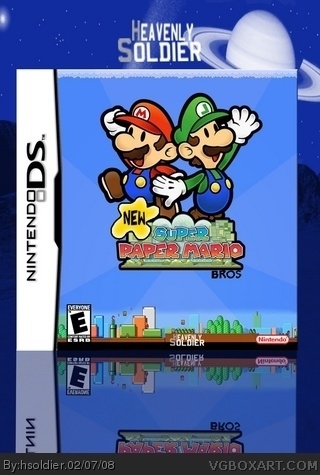
#5, could'nt have said it better myself. Seeing this isn't wonderful. The logo is small. The 'bros' part is bad. ESRB and dev logo are too small. No need to put your name ON the box, but other than that, it's not bad, just not wonderful.
No, I'm not yelling or being mean, I'm just trying to help it be 'wonderful.'
#4
When I said it wasn't too bad, I meant it was good. I guess when I think about it, it does mean that I found it bad. but it's just an idiomatic expression meaning it's fine. However I don't think it's in the category of wonderful.
There is a black box at the bottom with your name on the box. We don't put are name on the box because well it doesn't make sense. Do you see the artist name on official boxes? and i agree with #9
 New Super Paper Mario Box Cover Comments
definetley your best. that;s what the h stands for. 4/5
[ Reply ]
thanks
i thought of this while playing super mario advance 3 on ds. but then i had a flashback about me eating paper so i thought why not put them together
Edited at 1 decade ago
[ Reply ]
Not too bad, I like it.
[ Reply ]
too bad? its wonderful
Edited at 1 decade ago
[ Reply ]
#4, link
[ Reply ]
#5, excessive pride. epic device yo....go brit lit!
Anyway, I think it's a great job coming from heavenly soldier (I finally know what the "h" stands for XD) nice job.
[ Reply ]
#5, could'nt have said it better myself. Seeing this isn't wonderful. The logo is small. The 'bros' part is bad. ESRB and dev logo are too small. No need to put your name ON the box, but other than that, it's not bad, just not wonderful.
No, I'm not yelling or being mean, I'm just trying to help it be 'wonderful.'
Edited at 1 decade ago
[ Reply ]
#4
When I said it wasn't too bad, I meant it was good. I guess when I think about it, it does mean that I found it bad. but it's just an idiomatic expression meaning it's fine. However I don't think it's in the category of wonderful.
#5 I learned a new word. :D
[ Reply ]
a little to plain for my liking
[ Reply ]
There is a black box at the bottom with your name on the box. We don't put are name on the box because well it doesn't make sense. Do you see the artist name on official boxes? and i agree with #9
[ Reply ]
well obviously it isnt my name
call it a logo if you may and how can i make it less plain
Edited at 1 decade ago
[ Reply ]
creative,but not pulled off as good, but it looks pretty sleek.
[ Reply ]
Cooooool
[ Reply ]
Luigi's L is backwards
[ Reply ]