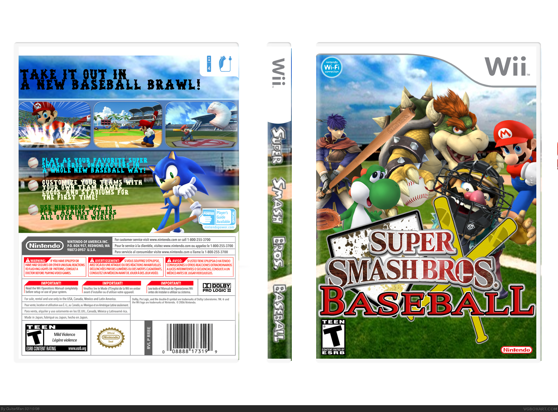
gotta love that logo...LoL, the front is awesome, the back like i said before i dont like the text for the bullitens and to much color, like my friend ayron told me "a back can make a box or break a box", that text kinda messes it up, remember, simple in some occasions can be effective, you get a fav from me for the effort and b/c its a good execution, but try to change that text.
also you have to move your background about one more hit to the left, the image pops out of the template a little bit and you can still see a little bit of mario's red bat on the far right side
thanks for the comments guys! and i know some of you think i put little effort into this box but i didn't worked hard on this. sure i didn't make the edits or the logo but does it matter. in the end it all matters how the box is put together.
 Super Smash Bros. Baseball Box Cover Comments
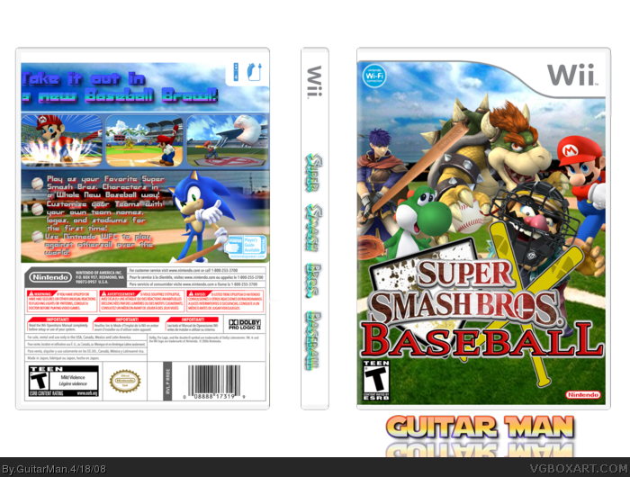
What exactly did you change from before? O__o
[ Reply ]
sorry i had to delete this box earlier but somestuff didn't match.
Credit:
Temp: Techne
Render edits: VGM
Logo: E-flowGFX
#1, rating and screenshot stuff
Edited at 1 decade ago
[ Reply ]
gotta love that logo...LoL, the front is awesome, the back like i said before i dont like the text for the bullitens and to much color, like my friend ayron told me "a back can make a box or break a box", that text kinda messes it up, remember, simple in some occasions can be effective, you get a fav from me for the effort and b/c its a good execution, but try to change that text.
[ Reply ]
#3 Hating on the Red sox text. :0, jk
good editing on the characters
[ Reply ]
Front: 4.5/5 Renders are great and the logo is fantastic
Effort: 2/5 You didnt do either
Back: 3/5 the text is pretty bad. However the screens look pretty cool.
[ Reply ]
#5, I agree.
[ Reply ]
also you have to move your background about one more hit to the left, the image pops out of the template a little bit and you can still see a little bit of mario's red bat on the far right side
[ Reply ]
lol the front is so cool. But change the font on the back.
[ Reply ]
#8, Yh, i agree with that.
[ Reply ]
I actualy like the font on the back
[ Reply ]
thanks for the comments guys! and i know some of you think i put little effort into this box but i didn't worked hard on this. sure i didn't make the edits or the logo but does it matter. in the end it all matters how the box is put together.
And yes i'll change the font. :D
EDIT: UPDATED
Edited at 1 decade ago
[ Reply ]
it came out good connor
[ Reply ]
i always know when its a Guitarman box. Always. FAVED. Just completley love it.
[ Reply ]
stroke the bullitans with a 1px black stroke, so it can stand out more
[ Reply ]
#14, ok i'll try that. XD
[ Reply ]
#15, iight, just trying to make your box look better
[ Reply ]
#16, i try as best i can. :D
[ Reply ]
#17, yea thats good
[ Reply ]
It has too much Mario in it, other than that it's great. I love the logo.
4/5
[ Reply ]