Here is my latest box and the last one for a while.
I made Army Of Two for PC. I hope EA Games will port this game on every platform they know (as usual).
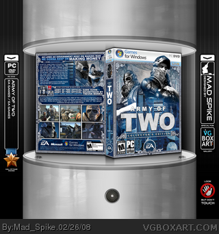
I love this box. Here you can check 2D version of the front cover :) link
Well, Enjoy! Comments and Favs are welcome!
Sweet. I couldn't visualize it being real though because the masks are quite representative of the game and they don't have a big focus. Still I like the difference, + Fav.
#10, Yes. But latest art of the game focused on the faces of the main characters.
#11, I decide to make a regular box - not a collector's edition. It's thick as always, but not a collector's edition.
Mad Spike, you did an awesome job. You really caught the feel of the game. The colors are so vivid, the arrangement is so stylish. Oh yeah. I've been wanting to say this...
The cityscape on the front doesn't fit the rest of the box. Also, I'm not sure if the guy's head should go over the template at the top. Overall, the design is well-made, but I agree with everyone else that the masks should have a more integral part on your front cover, since they essentially symbolize the game. Also, I know you're not a native english speaker, and this is just a nit-picky thing, but if you need a translation, please ask one of the english-speaking members to translate for you. Though I can understand what you mean, your wording is not entirely correct, and for a back header, it should be.
#30, No, I don't think so. Everyone can check the faces of the main heroes on every latest trailer of the game. I think their faces are not a big secret.
(!) UPDATE (!)
I made a lot of updates on this box.
I add "Collector's Edition" tag on the front. And a lot (a lot) of new decorating stuff. Also I put Army of Two OST in the box ;) And some other features.
Well, enjoy!
#4, By the way. I can't understand what do you mean. I can't find something that can be called "doesn't QUITE line up with the template".
Maybe I understand it wrong.
Can someone explain it to me? =)
#39, I just checked the 2D version and everything is perfect. Oh, and on the template, LIVE is bigger, so it covers some part of the border. And that's it :)
awesome box, only thing i saw is on the back of the box it says "As long as the government keep making war" and i think it should read "as long as the government keep's on making war".
i love the money patters thos were did you get that? or did you make it?
 Army Of Two Box Cover Comments
Here is my latest box and the last one for a while.
I made Army Of Two for PC. I hope EA Games will port this game on every platform they know (as usual).
I love this box. Here you can check 2D version of the front cover :)
link
Well, Enjoy! Comments and Favs are welcome!
[ Reply ]
Amazing!
It's great to see another box from you. :)
[ Reply ]
OMG Mad Spike you just beasted this box and totally raised the bar for anyone who wants to make a box for this game. Nice Job + FAV
[ Reply ]
Something I noticed... It looks like the art on the front doesn't QUITE line up with the template, perspective wise.
[ Reply ]
i sure hope this game is as amazing as this box.
[ Reply ]
Nice.
[ Reply ]
*looks at box and drools* this is amazing! awesome job.
Edited at 1 decade ago
[ Reply ]
Hey Reed, Mad Spike's back! Yay! Lovin' the box, MS.
[ Reply ]
I love the front. :D
[ Reply ]
Sweet. I couldn't visualize it being real though because the masks are quite representative of the game and they don't have a big focus. Still I like the difference, + Fav.
[ Reply ]
I would see theis as a Collector's Edition box due to the front.
[ Reply ]
#10, Yes. But latest art of the game focused on the faces of the main characters.
#11, I decide to make a regular box - not a collector's edition. It's thick as always, but not a collector's edition.
[ Reply ]
Woah
[ Reply ]
#4, who cares? Give it a rest already. =.=
Mad Spike, you did an awesome job. You really caught the feel of the game. The colors are so vivid, the arrangement is so stylish. Oh yeah. I've been wanting to say this...
FULL MAD SPIKE PNG PWNNESS! ^^p
[ Reply ]
You know what, Mad Spike? I HATE you. I really do. I just HATE YOU.
You wanna know why?
You make spectacular boxes that nearly no one can compete with! DARN YOU!
Faved, of course.
[ Reply ]
The cityscape on the front doesn't fit the rest of the box. Also, I'm not sure if the guy's head should go over the template at the top. Overall, the design is well-made, but I agree with everyone else that the masks should have a more integral part on your front cover, since they essentially symbolize the game. Also, I know you're not a native english speaker, and this is just a nit-picky thing, but if you need a translation, please ask one of the english-speaking members to translate for you. Though I can understand what you mean, your wording is not entirely correct, and for a back header, it should be.
[ Reply ]
#16, Sorry, were is a mistake on the back?
[ Reply ]
great box. I really disliked the retail cover, but your mix is excellent! Great work.
[ Reply ]
how do they say excellent in ukraine?
Because thats what it is.
[ Reply ]
#19, Thanks :)
"Vidminno" - that's how ukrainians would say :)
[ Reply ]
looks nice, but i dont really like how you pretty much copied what i did for the box borders :\
[ Reply ]
#14, So... You're saying I should just be all "XOMGX LE1K TOETAWOL OARJAZMAK PONAJE!!1111!111" when I notice a flaw instead of pointing it out?
I'll be more mindful of that in the future.
[ Reply ]
#21, Oh, I never saw your box before. I swear! But you was first - I admit it.
[ Reply ]
Thanks everyone for a good comments and favs :) This new voting system works fast :)
But please keep comment and faving %)
[ Reply ]
HOLY S***!
spectacular, awesome work.
[ Reply ]
+fav inspirational
[ Reply ]
#12, I didnt mean size, I meant the actual art makes it look like one.
[ Reply ]
I'm not too crazy about the monochromatic color palette but i think you did a really nice job with design.
[ Reply ]
#27, Yes, I understand.
[ Reply ]
It looks so cool, you got a fav. But I'm pretty sure that you spoiled the game a bit with showing faces.
[ Reply ]
#30, No, I don't think so. Everyone can check the faces of the main heroes on every latest trailer of the game. I think their faces are not a big secret.
[ Reply ]
#31, ok, I haven't seen the trailers, so I couldn't guess.
[ Reply ]
I want you dead. Seriously. Not being funny or anything. Why must you torture me so?
[ Reply ]
#33, Add this one to your favorites ;)
[ Reply ]
(!) UPDATE (!)
I made a lot of updates on this box.
I add "Collector's Edition" tag on the front. And a lot (a lot) of new decorating stuff. Also I put Army of Two OST in the box ;) And some other features.
Well, enjoy!
[ Reply ]
#4, By the way. I can't understand what do you mean. I can't find something that can be called "doesn't QUITE line up with the template".
Maybe I understand it wrong.
Can someone explain it to me? =)
Edited at 1 decade ago
[ Reply ]
geniously. Very qualitative work. I am proud of you:)
[ Reply ]
Thanks everyboby for your comments and favs ;)
[ Reply ]
#36, Maybe I'm being a lil' too picky, but on the front near the top the border is slanted slightly away from the template.
But hey. I faved anyway because you're incredible.
[ Reply ]
#39, I just checked the 2D version and everything is perfect. Oh, and on the template, LIVE is bigger, so it covers some part of the border. And that's it :)
[ Reply ]
your box is very nice but need som modifiiiiiiiiiiie
[ Reply ]
awesome box, only thing i saw is on the back of the box it says "As long as the government keep making war" and i think it should read "as long as the government keep's on making war".
i love the money patters thos were did you get that? or did you make it?
[ Reply ]
#42, Some patterns was from the original Army Of Two artworks, the others was from high res pic of real dollars :)
[ Reply ]
IVE NEVER SEEN SO MANY MOTHER FLIPPIN COMMENTS ON ONE BOX! DUDE! BRAVO!
[ Reply ]