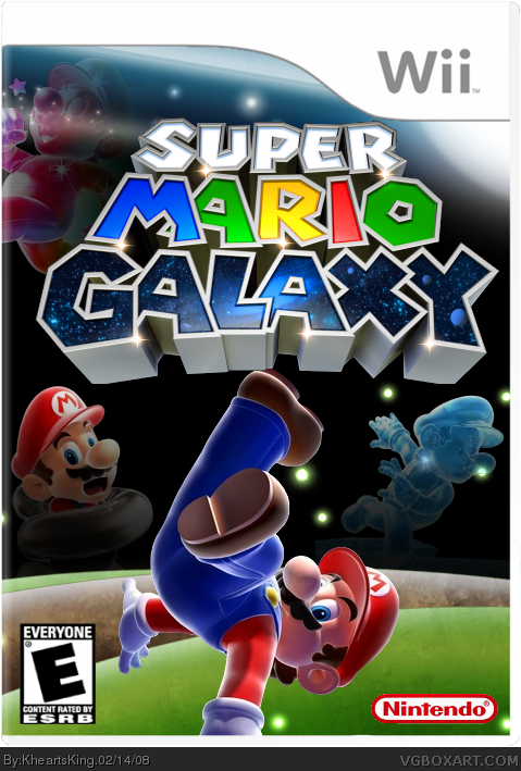
That's actually really good. My only suggestion would be to move Mario up a bit so that his hand isn't being cut off by the template and so that his foot is overlapping the logo a little bit, making something overlap a logo is a very important thing on Super Mario Galaxy boxes, unless you don't need to.
The Nintendo logo is also a little bit choppy, you should fix that too.
#3, over it, always make it overlapping unless it completely covers the logo up.
Well, there really isn't a way to "un-mege" them, but here's a tip for the next time you make a box, don't exit off of it for a while, wait a little bit so that you can still access the history and un-merge the Layers.
Ehh, it looks like the same old SMG boxart formula which we've all came to know (but not necessarily love.)
There is a slight hint of uniqueness in this box, but it's not very strong..
Thank you but if you look at my other boxes you can tell that I put 100% more effort into this box. Also i was trying to go official looking with this one while trying to touch it up with those faded pictured. Anyways, Thank You!
That's a pretty good box, particularly for paint.net (I've seen a lot of stinkers that used it.)
I especially like the Mario "constellations." If I had to complain about something though, I'd say that the background (Space, that is) needs more stars of varying sizes.

 Super Mario Galaxy Box Cover Comments
I am INSANELY pleased with my new SMG box!
Credits: KoopaDasher- Template
Planetrenders- Mario Pictures
Google- Background
HUGE shout out to Iron Man for making the tutorial on how to use paint.net!
Please Comment and Rate!
[ Reply ]
That's actually really good. My only suggestion would be to move Mario up a bit so that his hand isn't being cut off by the template and so that his foot is overlapping the logo a little bit, making something overlap a logo is a very important thing on Super Mario Galaxy boxes, unless you don't need to.
The Nintendo logo is also a little bit choppy, you should fix that too.
Overall, it's your best by far, great job!
[ Reply ]
thanks and should mario go over or under the logo?
EDIT: how do i un-merge the layers?
Edited at 1 decade ago
[ Reply ]
#3, over it, always make it overlapping unless it completely covers the logo up.
Well, there really isn't a way to "un-mege" them, but here's a tip for the next time you make a box, don't exit off of it for a while, wait a little bit so that you can still access the history and un-merge the Layers.
Edited at 1 decade ago
[ Reply ]
#4, So i basically need to remake the whole thing?
[ Reply ]
Hey, NICE~ you'r makin me scared for our duel.
[ Reply ]
#6,Haha, you should be lol just kidding.
EDIT: Updated! I changed what Iron Man suggested.
EDIT2: Thanks for the Fav Iron Man!
Edited at 1 decade ago
[ Reply ]
Ehh, it looks like the same old SMG boxart formula which we've all came to know (but not necessarily love.)
There is a slight hint of uniqueness in this box, but it's not very strong..
[ Reply ]
Thank you but if you look at my other boxes you can tell that I put 100% more effort into this box. Also i was trying to go official looking with this one while trying to touch it up with those faded pictured. Anyways, Thank You!
Edited at 1 decade ago
[ Reply ]
omg, not another smg box. they all look good, but they all look the same. nothing offensive to your box im speaking in general.
[ Reply ]
#10, Well can you talk about MY box please?
[ Reply ]
#1 sorry for not making the guide when i told you, im currently on exams now.... so sorry
aaaand this box is very good... better than my boxes
Edited at 1 decade ago
[ Reply ]
wow. definetley your best. huge improvement. 5/5. can you pm me with that problem i had?
just totally awsome. great job kheartsking.
[ Reply ]
#12 and 13, Thanks SOOOO much i really worked hard (just learned about layers and broke 8!) Anyways kirby i will get to that ASAP.
Also: fav's are welcome! just kidding i don't think this box is good enough to get many fav's.
Edited at 1 decade ago
[ Reply ]
I think its preaty good, the only thing i dont like is Marios leg on the "G". 3/5
Edit: what i meant was that i dont think the fade should be there but i just noticed it origianly wasnt but if you like the fade its your call
Edited at 1 decade ago
[ Reply ]
#15, That is the most i could fade it with you being able to see it but Thanks!
[ Reply ]
not bad at all... not bad at all...
[ Reply ]
#17, Thank you so much.
[ Reply ]
That's a pretty good box, particularly for paint.net (I've seen a lot of stinkers that used it.)
I especially like the Mario "constellations." If I had to complain about something though, I'd say that the background (Space, that is) needs more stars of varying sizes.
Good job, though. I like it.
[ Reply ]
#19, Thanks. I was trying to find a place for a bigger star but I thought it would be too crowded. Thanks for the comment!
[ Reply ]