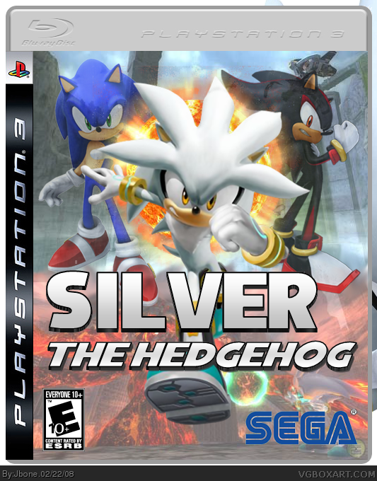
Faved. Faved because this is your first with an enormous amount of effort. It looks like Sonic and Shadow are floating, but that is no bigy. 5/5 Perfect first!
For a first, this is great! The design is definitely well thought out. I suggest making sonic and shadow stand out more as well as upping the box contrast a bit :) Great job and welcome to the site!
P.S. What design program do you use? Just curious. XD
Thanks AW. I think I need to preserve this box just the way it is because If I added a back it would look odd. Thanks for the faves, wow 21 faves! This could be HOF1 Keep it up! lol
#44, hows about you and me go a round in the duel arena? *looks back at post* i don't care if i did what i wasn't going to do, you, me, and a PC! *rasenganboi finally realises how nerdy he is now*
#48 Indeed right? XD. No but seriously all, THANK YOU for the faves. Even if this box doesn't reach HOF, It will always be the first domino in the toppling of sheer awesomeness in our cruel world that we love and know as VGBOXART.
#16, He does NOT work for SEGA, if he did they would have fired him for incompitance under the grounds of ruining their logo by not putting any white around it. While I'm dishing out the horror stories, there is no SonicTeam logo (yes, I know they don't put them on anymore but oh well).
I really like the arrangement of the characters and the Title font is very strong.
the only things I might recommend is that you maybe inch the title over to the right just a smidgen, and as other have mentioned, hit the SEGA logo with a white stroke (if your using Photoshop).
Update, and now it looks more like my Jak IV box. Better SEGA logo, used Techne's template and changed the sonic and shadow renders. The box looks more "EPIC" now.
#68 It's because so many people with no rank faved it and the ones that got banned don't count anymore (no offense to them, I appreciate your support). Counting everything so far, I have about 114 points and it took 140 points before Jak IV went into the HOF.
I'm sorry, but I don't think this deserves hall of fame. It's good, but definitely not amazing or anything. I'm just saying, because it looks like it's getting very close to it now.
Overall, good design. I'll give it a fav. Your Silver logo looks really similar to mine, lol...just showing great minds think alike, no?
Now for some BLASPHEMY with all the back patting going on for this...I don't like the black area around the box, looks tacky and lazy, though I'm certain that's not the case. I would go for an outer glow on it with blend mode on it set to multiply and color set to black. Looks a little less obvious AND makes a nice line between the white space and the box. Also not as harsh as a pixel stroke.
Im pretty astounded at how this box got over 100 comments! I mean usually that only happens when theres a big arguement or fight or when the box is somewhat controversial (remember Terrorist Toad box.)
I don't think this deserves the Hall of Fame. The "display" is ugly, the faded characters don't look good, Silver isn't standing on anything, the background is just two blended screenshots, one of which is dull and the other has a character in it. And the fact that you bumped it like a mad hooker doesn't help.
#107 you know, i respect your opinion, but get off my back for bumping ok? Since comment #60, I haven't bumped the box for attention or HOF. I also don't care about the display, others haven't complained so I'm not going to take just your own advice. I'm also well aware it's 2 screenshots, and most of the vets who faved this know it too.
Don't forget that this WAS my first box, when I was a really excited n00b about HOF.
#108, You know, really, theres always someone that has to ruin something that everyone likes. Whether you play really nice piano, theres always someone to say, stop playing. whether you make a damn nice VGboxart, someone like you comes up, out of jealousy, or any other reason trying to, with force, prove himself correct above others. you dont like it. dont comment it. dont look at it. dont think of it. as Jbone said, dont forget it's his first box. Really mature of you.
@115. Note alot are Rank 0 and most ranks will be about 7 because it saves the rank fav;d at. I've got abox at over 220 Points and 34/35 fav's and no HoF...

 Silver the Hedgehog Box Cover Comments
Well this is my first box! I really did try hard on this! Please use Constructive Critricism for me and NO swearing please!
#2 Thanks! Made it myself!
Edited at 1 decade ago
[ Reply ]
logo looks really nice.
[ Reply ]
Faved. Faved because this is your first with an enormous amount of effort. It looks like Sonic and Shadow are floating, but that is no bigy. 5/5 Perfect first!
[ Reply ]
Looks nearly professional.
[ Reply ]
not bad 5/5
[ Reply ]
pretty good I like the logo
[ Reply ]
wow this is really bad(just joking) for a first box this is beyond amazing 5/5 +fav
[ Reply ]
Thats Pretty Good
[ Reply ]
Whoa thanks guys! I saw a few people's first boxes and the majority weren't good, so I put alot effort into my first. Thanks alot!
[ Reply ]
Ok, I updated with a brighter background. Does anyone have the outlined Sega logo?
[ Reply ]
#10, You can find it here, along with most other developer logos. Just save it, and it will keep the transparency.
link
Edited at 1 decade ago
[ Reply ]
thnx, opinions for the box? I'm thinking of creating an alternate version, should I?
#13 Thanks for the fave. Unfortunately I don't know how but if you show me...?
Also I need help with a logo.
Edited at 1 decade ago
[ Reply ]
Nice logo. You should fade sonic and shadow's Waist down so it wont look like their flying
[ Reply ]
For a first, this is great! The design is definitely well thought out. I suggest making sonic and shadow stand out more as well as upping the box contrast a bit :) Great job and welcome to the site!
P.S. What design program do you use? Just curious. XD
[ Reply ]
I'm going to make an alternate version of this eventually. Thanks for the welcome ^_^
I use Photoshop. Still learning though!
[ Reply ]
#15, are you sure you don't work for SEGA, and use this as a cover-up, Because This Is Amazingly done. I see you going places, man.
[ Reply ]
#15, THIS BLEW MY MIND. 9/5
[ Reply ]
How do you fade stuff in paint? and the box is a 5/5
Edited at 1 decade ago
[ Reply ]
#18, ya can't.
#20, ya sorry, man, but download GIMP.
Edited at 1 decade ago
[ Reply ]
#19, oh
[ Reply ]
#20, You use Paint don't you?No wonder your boxes are so bad
[ Reply ]
100000000000000000000/10. NICE JOB.
[ Reply ]
*whistles* These faves keep coming!
[ Reply ]
Logo is a bit big along with the sega logo but still kewl.
[ Reply ]
#20, His Icon is the picture of Justin Long from Jeepers Creepers 2. Scary!
[ Reply ]
#23, For a good reason
[ Reply ]
Dang, this could make HOF :P
[ Reply ]
#27, i think so.
[ Reply ]
wasn't this one of those boxes that stewie123 from game trailers.com stole?no i dont think so but awesome!!!
Edited at 1 decade ago
[ Reply ]
Who's he?
[ Reply ]
HOF! HOF! come on HOF!
[ Reply ]
#30, some guy that was stealing everyones boxes here on vgb. and saying they were his and he created them and posting them at gametrailers
Edited at 1 decade ago
[ Reply ]
#29, No he stole my long worked on Silver The Hedgehog box. I just posted 2 days ago.
[ Reply ]
#33, ohhh my bad!!
[ Reply ]
#33 wow that must suck..
[ Reply ]
this is really good... you should add a back to it... +fav
[ Reply ]
Thanks AW. I think I need to preserve this box just the way it is because If I added a back it would look odd. Thanks for the faves, wow 21 faves! This could be HOF1 Keep it up! lol
[ Reply ]
THIS ISNT IN HOF?
[ Reply ]
#38 I don't know why! XD
Edited at 1 decade ago
[ Reply ]
Updated... looks cooler eh?
[ Reply ]
hey does anyone think I should make a back? 'cause I wasn't really sure if it would make it better..
Not bumping :P
[ Reply ]
This is very good.And I'm not just saying it's because it your first box it actually really good!
[ Reply ]
#42 thanks, even though you got banned...
Edited at 1 decade ago
[ Reply ]
*Counts points* thats 74. Pretty good.
Edited at 1 decade ago
[ Reply ]
#44, hows about you and me go a round in the duel arena? *looks back at post* i don't care if i did what i wasn't going to do, you, me, and a PC! *rasenganboi finally realises how nerdy he is now*
[ Reply ]
*shrugs* whatever. Make the thread.
[ Reply ]
#46, okie-dokie
[ Reply ]
You have to admit that is pretty cool.
[ Reply ]
#48 Indeed right? XD. No but seriously all, THANK YOU for the faves. Even if this box doesn't reach HOF, It will always be the first domino in the toppling of sheer awesomeness in our cruel world that we love and know as VGBOXART.
...
*wonders if I made sence*
[ Reply ]
#49, o.0
[ Reply ]
#50 ... did I spell "sence" like sense? XD.
Before I leave this box alone, was wondering if you all knew that this game is unoficially confirmed? I found it somewhere on Google.
[ Reply ]
OMG Like i favd lol hof now pleasE! :d
[ Reply ]
#52, Sorry but a rank of 2 really doesnt put it in the hof like 3 more poeple with a rank of like 7 or more would do it.
[ Reply ]
#53, Like I didn't know that. But I know that you were trying to help e so thanks anyways! :D
[ Reply ]
#53 well it doesn't matter now, it's 88 points.
[ Reply ]
#16, He does NOT work for SEGA, if he did they would have fired him for incompitance under the grounds of ruining their logo by not putting any white around it. While I'm dishing out the horror stories, there is no SonicTeam logo (yes, I know they don't put them on anymore but oh well).
[ Reply ]
#56 Er... funny story about that... :P
No I don't work for SEGA, just have a talent for making boxarts ;)
[ Reply ]
Looks very good!
I really like the arrangement of the characters and the Title font is very strong.
the only things I might recommend is that you maybe inch the title over to the right just a smidgen, and as other have mentioned, hit the SEGA logo with a white stroke (if your using Photoshop).
[ Reply ]
Damn still no HOF. Sad
[ Reply ]
#59 It probably won't get it, but I will update some of my older boxes soon.
#58 Ok, I'll try.
[ Reply ]
Update, and now it looks more like my Jak IV box. Better SEGA logo, used Techne's template and changed the sonic and shadow renders. The box looks more "EPIC" now.
Edited at 1 decade ago
[ Reply ]
if this reaches the Hall of fame, I will seriously Dye My Hair purple.
Edited at 1 decade ago
[ Reply ]
#62, You spelled dye wrong -_-
[ Reply ]
#63, fixed.
[ Reply ]
#64, Capitalization.. -_-
[ Reply ]
#62 I have no idea if that is a good comment or not.
Can you please comment on my box, those comments are really annoying.
[ Reply ]
pretty sweet!
it would be damn good if it got HoF,
deserves it definately
[ Reply ]
Forty seven favorites and no Hall of Fame. Maybe it needs more points.
[ Reply ]
#67 i hope so.
#68 It's because so many people with no rank faved it and the ones that got banned don't count anymore (no offense to them, I appreciate your support). Counting everything so far, I have about 114 points and it took 140 points before Jak IV went into the HOF.
[ Reply ]
this is pretty sad FAVE
[ Reply ]
really good!! i love it 7/5 +fav
[ Reply ]
+fav
[ Reply ]
fav and author fav
[ Reply ]
I'm sorry, but I don't think this deserves hall of fame. It's good, but definitely not amazing or anything. I'm just saying, because it looks like it's getting very close to it now.
[ Reply ]
#74, Then don't bump it back up where people can see it and fav it. Makes sense, no?
[ Reply ]
#75, i didn't bump it. #72 did, so I saw it and decided to comment.
[ Reply ]
#76 I was just telling him that I was faving it, I didn't mean to bump.
[ Reply ]
OMG!!! this is a first It is amazing!!!!!!!!!!! 10000000000/5
[ Reply ]
#74 *shrugs* it's your opinion. Alot of others do so it's not my call.
[ Reply ]
12 people w/o a rank faved this. and i counted 8 banned peeps. no HoF yet.
[ Reply ]
i bet a fav from MARKER will put this in HoF, if he could just looks at the fricken box!
[ Reply ]
creative
[ Reply ]
Overall, good design. I'll give it a fav. Your Silver logo looks really similar to mine, lol...just showing great minds think alike, no?
Now for some BLASPHEMY with all the back patting going on for this...I don't like the black area around the box, looks tacky and lazy, though I'm certain that's not the case. I would go for an outer glow on it with blend mode on it set to multiply and color set to black. Looks a little less obvious AND makes a nice line between the white space and the box. Also not as harsh as a pixel stroke.
[ Reply ]
#83 understandable. I'm changing my presentation again, but I don't think I'll update this box with it.
#80 that contributes aswell.
#81 LMAO
#82 Thanks.
[ Reply ]
Sorry to bump and all but this is #25 on the list of most favorited boxes xD
[ Reply ]
#85, and not in HoF? honestly, that's just messed up
[ Reply ]
#86, I agree, how is this not HoF?
[ Reply ]
this is perfect
[ Reply ]
i check this every month to see if it is in the HoF yet, now it's starting to piss me off
just get into the HoF!
[ Reply ]
Wow, this is weird! :O
Nice job tough...
[ Reply ]
Wait what? Not HoF? How?!
[ Reply ]
heh, HoF.
[ Reply ]
Finally!
[ Reply ]
!FINALLY!
XD
Too bad he's not online in almost two weeks. =P
Edited at 1 decade ago
[ Reply ]
I don't mind this being in the Hall,
but I feel it would deserve the Hall a lot more if you guys did not keep bumping.
[ Reply ]
Bout damn time. Congratz.
[ Reply ]
Congrats Ren!
I'm glad to see this finally made it in.
[ Reply ]
#97, after like, a year lolz xD
[ Reply ]
Well, there you go, you got your HoF on this!
[ Reply ]
ha! 100th comment!
[ Reply ]
Im pretty astounded at how this box got over 100 comments! I mean usually that only happens when theres a big arguement or fight or when the box is somewhat controversial (remember Terrorist Toad box.)
[ Reply ]
congratz on HoF
[ Reply ]
bout time i say
[ Reply ]
my prayers have been answered, sweet jesus yes! took enough months. lol :)
[ Reply ]
Well, this is a nice surprise :) Thanks guys!
[ Reply ]
Wow is good! Congratulations! 100000/5
[ Reply ]
I don't think this deserves the Hall of Fame. The "display" is ugly, the faded characters don't look good, Silver isn't standing on anything, the background is just two blended screenshots, one of which is dull and the other has a character in it. And the fact that you bumped it like a mad hooker doesn't help.
[ Reply ]
#107, theres your opinion, and everybody else's, and we all have the same opinion
[ Reply ]
#108, I'm well aware that it's my opinion, thank you very much...
[ Reply ]
#107 you know, i respect your opinion, but get off my back for bumping ok? Since comment #60, I haven't bumped the box for attention or HOF. I also don't care about the display, others haven't complained so I'm not going to take just your own advice. I'm also well aware it's 2 screenshots, and most of the vets who faved this know it too.
Don't forget that this WAS my first box, when I was a really excited n00b about HOF.
Edited at 1 decade ago
[ Reply ]
Congrats Jbone! ^^ Phew, finally, it's in...
[ Reply ]
nice job
[ Reply ]
awesome!^^
5/5
[ Reply ]
#108, You know, really, theres always someone that has to ruin something that everyone likes. Whether you play really nice piano, theres always someone to say, stop playing. whether you make a damn nice VGboxart, someone like you comes up, out of jealousy, or any other reason trying to, with force, prove himself correct above others. you dont like it. dont comment it. dont look at it. dont think of it. as Jbone said, dont forget it's his first box. Really mature of you.
amazing! 5/5 for definate!
Edited at 1 decade ago
[ Reply ]
84 favs and no Masterworks? WHAT!?
[ Reply ]
@115. Note alot are Rank 0 and most ranks will be about 7 because it saves the rank fav;d at. I've got abox at over 220 Points and 34/35 fav's and no HoF...
[ Reply ]
Bro if this made masterworks I'd be extremely surprised. Dang, it was pretty obvious I was a newb when I made this box, just look at all my bumps :P
Brings back fond memories though.
[ Reply ]