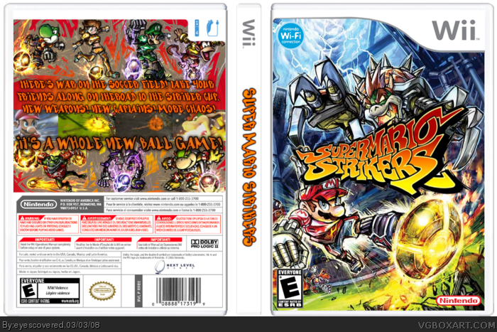
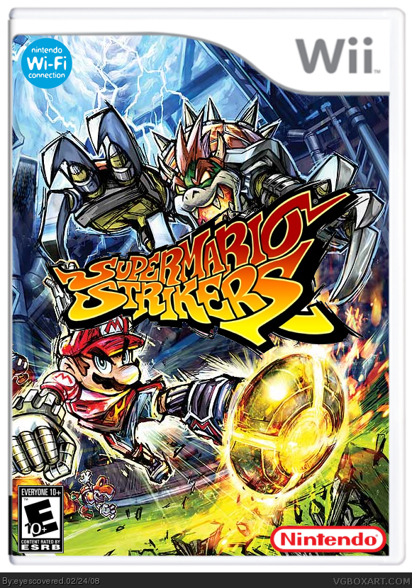
my second box submission. made with paint.net. i found the template (by jevangod) on the forums. got the dev, wifi and esrb from the vga photobucket. found the background image and logo on google.
You've won me over, I think it's outstanding for your second box. This has potential to be one of the best mario strikers boxes on the site! I should chllenge you to a box off >_>
#6, wow thanks! it really wasn't much work. just lined up the wallpaper just right and cut out that awesome logo i found. but thank you for the kind words! check out my Typing of the Dead box, too! (if you remember the Dreamcast one, you'll appreciate it!)
#6, well, I wouldn't go THAT far... mainly because there is no back. But it's alright. nothing super special about it. Glad your getting everything down :D
I know it looks kool but because its a wallpaper it defeats the purpose of the box. I mean were tested on making a decent box not slaping a template on an already made picture. (at least were spose to be)
#17, i totally understand that. i'm not looking to get in the hall of fame with this or anything. this is all i know how to do right now. i'm still learning and i know i'll get better. i've already started to play around with moving renders around. so just gimme some time! :)
you should change it to Mario Strikers Charged... pretty much every material you used on here is from MSC. The box is great, you just have the wrong title/logo.
#23, ya, i tried finding a graffiti font, that was the closest i could find that matched the logo. know of any i could try? i found that one on dafont.com
#24, true. i may do that. is there a way to change the title on the site, or do you have to resubmit it?
 Super Mario Strikers Box Cover Comments
Wow looks offical O_O
[ Reply ]
my second box submission. made with paint.net. i found the template (by jevangod) on the forums. got the dev, wifi and esrb from the vga photobucket. found the background image and logo on google.
[ Reply ]
#1, thanks. glad you like!
[ Reply ]
Really nice you made my temp look awesome
[ Reply ]
#4, ha! thank you for posting it!
[ Reply ]
You've won me over, I think it's outstanding for your second box. This has potential to be one of the best mario strikers boxes on the site! I should chllenge you to a box off >_>
[ Reply ]
#6, Yo Jbone your logo is ready I posted it in the thread. respond back to me there.
[ Reply ]
#6, wow thanks! it really wasn't much work. just lined up the wallpaper just right and cut out that awesome logo i found. but thank you for the kind words! check out my Typing of the Dead box, too! (if you remember the Dreamcast one, you'll appreciate it!)
[ Reply ]
#8, *Scratch off noise*...............wait...its just a wall paper? o.O
[ Reply ]
#9, shhh it's a secret! ;)
[ Reply ]
#6, well, I wouldn't go THAT far... mainly because there is no back. But it's alright. nothing super special about it. Glad your getting everything down :D
[ Reply ]
#11, ya, i just learned how to do fronts. once i get it down i'll try to do a back. thanks for the encouragement!
[ Reply ]
It's not bad, looks official,
4/5 because it's a wallpaper
:0
[ Reply ]
if it was on a gamecube temp, it would look like better than the official cover. Still, nice! Really good second! 4.5/5
[ Reply ]
i though it might be wallpeper becasue that mario fits too well with the ground being dug up by the ball.
i'll still fav it ;p
[ Reply ]
#14, you're probably right. a GameCube temp might have looked better.
thanks for the comments and the favs!
[ Reply ]
I know it looks kool but because its a wallpaper it defeats the purpose of the box. I mean were tested on making a decent box not slaping a template on an already made picture. (at least were spose to be)
[ Reply ]
#17, i totally understand that. i'm not looking to get in the hall of fame with this or anything. this is all i know how to do right now. i'm still learning and i know i'll get better. i've already started to play around with moving renders around. so just gimme some time! :)
[ Reply ]
would be awesome with a great back, keep it up ;)
[ Reply ]
#9, ...You're not exactly one to talk...
[ Reply ]
#20, Oh snap! Own3d.
[ Reply ]
updated! made a back and spine! tweaked some of the logos.
Edited at 1 decade ago
[ Reply ]
I like the back quite a bit, but the font isn't so great and there are a few typos.
Edited at 1 decade ago
[ Reply ]
you should change it to Mario Strikers Charged... pretty much every material you used on here is from MSC. The box is great, you just have the wrong title/logo.
[ Reply ]
oooh that eez guud... 5/5
[ Reply ]
#23, ya, i tried finding a graffiti font, that was the closest i could find that matched the logo. know of any i could try? i found that one on dafont.com
#24, true. i may do that. is there a way to change the title on the site, or do you have to resubmit it?
#25, thanks for the praise and fav!
[ Reply ]
that is so good 5/5 +fav
[ Reply ]