Good, but there is TONS of black space. I guess you needed it for the reflection, and one more thing, if you don't have the spine, put the wifi logo at the top left corner.
too big reflection and mario is covering popo's face.
the nintendo logo is too big and it should be white inside it.
it usualy is, at least, I think it looks better.
hey u gave something away the robots on it u must not do that naughty boy lol im joking its mega awesome and its the perfect for the cover that should be the real one thanks for posting it!!!
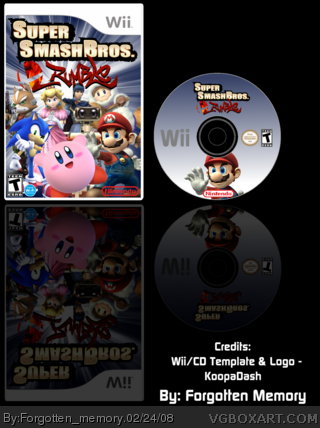
 Super Smash Bros. Rumble Box Cover Comments
My 2nd Box, much more better that the 1st.
Credit to KoopaDash for Templates & Logo.
[ Reply ]
Good, but there is TONS of black space. I guess you needed it for the reflection, and one more thing, if you don't have the spine, put the wifi logo at the top left corner.
Oh and also 5/5, GREAT for a 2nd box
Edited at 1 decade ago
[ Reply ]
yeah, the black space is sort of a problem, but it's really good!
[ Reply ]
I think it's nice, though the reflection is too big as well as the canvas :D
[ Reply ]
reflection is way to big... crop the bottom some and i will like it.
[ Reply ]
too big reflection and mario is covering popo's face.
the nintendo logo is too big and it should be white inside it.
it usualy is, at least, I think it looks better.
[ Reply ]
hey u gave something away the robots on it u must not do that naughty boy lol im joking its mega awesome and its the perfect for the cover that should be the real one thanks for posting it!!!
[ Reply ]
#1, lol our avs look almost the same
[ Reply ]
Replace Sonic and R.O.B and put in Raiden from mortal Kombat and Ryu in Street Fight then I'll fav. Also the WI-Fi is supposed to be on the top left.
4/5
[ Reply ]
man this is amazing! 4/5
Edited at 1 decade ago
[ Reply ]
amazing! 5/5 +fav
[ Reply ]