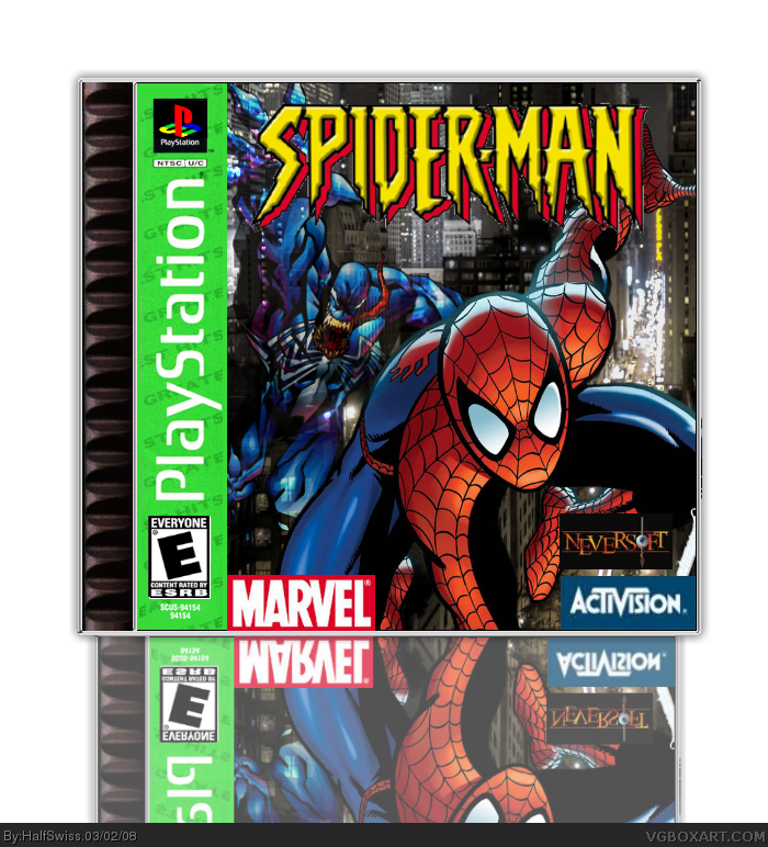
I couldn't wait for the critiques. I just HAD to post it. This goes out to one of my favorite games of all time, Spider-man on the PSX.
The non-cut logos are supposed to be like that, because they were like that on the actual box that's sitting right next to me. Same with the 2D reders on the actual photo, because it seems to be like that on the actual box, also. I cut the logo, so that's not so good. If you could cut it out better, please PM me. If I update it, I'll try to fix the ESRB logo. It seems like it jsut didn't turn out right. Credit to PlanetRenders for the Spiderman and Venom renders. Credit to the VGBA Database for the template, Neversoft logo, and ESRB logo.
The Activision logo isn't cut, and neither is the NeverSoft. (Although I'm not sure if it's supposed to be cut) The logo is also very choppy. I'm also guessing it's a wallpaper, though I could be wrong. If it's a wallpaper, 2/5, if not, 3/5.
#12, if you read the first psot, you would know that the dev logos are not supposed to be cut out. I had the actual game box sitting right next to me, and the logos were just like that and not cut out. I couldn't find any cut Spider-man logos either, so I ahd to do it myself. And it is not a wallpaper. The city background is a large image, but I had to work with the renders and everything.
#11, thanks a ton then! =D I found it on the VGBA Database. Did you make a back to it?

 Spider-Man Box Cover Comments
I couldn't wait for the critiques. I just HAD to post it. This goes out to one of my favorite games of all time, Spider-man on the PSX.
The non-cut logos are supposed to be like that, because they were like that on the actual box that's sitting right next to me. Same with the 2D reders on the actual photo, because it seems to be like that on the actual box, also. I cut the logo, so that's not so good. If you could cut it out better, please PM me. If I update it, I'll try to fix the ESRB logo. It seems like it jsut didn't turn out right. Credit to PlanetRenders for the Spiderman and Venom renders. Credit to the VGBA Database for the template, Neversoft logo, and ESRB logo.
[ Reply ]
I dunno if you noticed, but the reflection is off... Like, really off.
Like, a lot.
[ Reply ]
#2, I think it looks good. But ifnore the reflection then. Tell me about the actual box.
[ Reply ]
the box is alright kinda cool except the reflection 3/5
Edited at 1 decade ago
[ Reply ]
Ok, I removed the reflection. NOW comment on it.
[ Reply ]
Better.
[ Reply ]
#6, any comments?
[ Reply ]
cool 4/5 better
[ Reply ]
#7, Its better now and it looks good and everything looks put together good and overall its pretty good
BUT the activision logo looks a little blurry
4/5
[ Reply ]
I wanted it to look a little simple and cartoon-y.
EDIT: #9, yeah, but I wanted to use the Activision logo used on the actual box. Any logos that would look better for this?
Edited at 1 decade ago
[ Reply ]
looks alright, also thats my template :D
[ Reply ]
The Activision logo isn't cut, and neither is the NeverSoft. (Although I'm not sure if it's supposed to be cut) The logo is also very choppy. I'm also guessing it's a wallpaper, though I could be wrong. If it's a wallpaper, 2/5, if not, 3/5.
[ Reply ]
#12, if you read the first psot, you would know that the dev logos are not supposed to be cut out. I had the actual game box sitting right next to me, and the logos were just like that and not cut out. I couldn't find any cut Spider-man logos either, so I ahd to do it myself. And it is not a wallpaper. The city background is a large image, but I had to work with the renders and everything.
#11, thanks a ton then! =D I found it on the VGBA Database. Did you make a back to it?
Edited at 1 decade ago
[ Reply ]
#13, Well, couldn't you get some decent quality ones? Those ones are pretty bad looking.
[ Reply ]
i remember playin that game so many years ago is kicked ass :)
[ Reply ]
#11, no, never made a back unfortunatley
[ Reply ]
Why is venom transparent?
[ Reply ]