#1 So you acknowledged the problem about Tails mouth but rather than trying to fix it and make it look better, you thought you would just upload it anyway and pray for forgiveness?!
I know your new here but please upload boxes that your happy with! I can tell from your first post your not happy with the way this box turned out! And even if its just a quickie, make an effort =/
#18 I agree! The first one was far from perfect but at least it was interesting and sorta unique! The updated version is just a plain black background with badly cut images placed on top!
And if your gonna do a third update, PLEASE add some logos =]
 Sonic Battle Box Cover Comments
Enjoy my little quickie it just a little small quick one with sonic tails motuh looks wierd with the little white gap its wierd but enjoy!!!
[ Reply ]
the logo isn't cut out propertly and it has no logos exept the name of the game, and what is that background?
[ Reply ]
no offence but use renders, dont try and cut them yourdelf ;)
[ Reply ]
I cut them myself but i can do better than this!
2/5 for the effort
[ Reply ]
Whoops srry for double post
Edited at 1 decade ago
[ Reply ]
#2, I think they're pies...
[ Reply ]
ummmmmm.....
[ Reply ]
There Sonic smash flowers that i made on paint!
[ Reply ]
#1 So you acknowledged the problem about Tails mouth but rather than trying to fix it and make it look better, you thought you would just upload it anyway and pray for forgiveness?!
I know your new here but please upload boxes that your happy with! I can tell from your first post your not happy with the way this box turned out! And even if its just a quickie, make an effort =/
On the plus side though, the template is nice ^_^
[ Reply ]
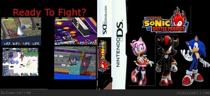
What happend to Tails' Mouth?
[ Reply ]
well when i done it the background white and when i done the colour it turned out like it!!!!
[ Reply ]
#11, you should have done the ground black!
[ Reply ]
CERIUM IS BACK!!!!
[ Reply ]
good point!!!!!! doing it now!!!!!!! thanks!
[ Reply ]
Update!!!!!!!!!! hope u like the back and front....enjoy!
[ Reply ]
ALOT of missing stuff on the back
[ Reply ]
does anybody like the update i do cause it goes with the bodys and the logo!!!!
[ Reply ]
uh, first one was better. no esrbs, very plain, poorly cut out, and i DO NOT know what happened to the spine. 1.5/5 keep trying!
Edited at 1 decade ago
[ Reply ]
#18 I agree! The first one was far from perfect but at least it was interesting and sorta unique! The updated version is just a plain black background with badly cut images placed on top!
And if your gonna do a third update, PLEASE add some logos =]
[ Reply ]
#19, cerium your back!!!
[ Reply ]
#17, Are you one somesort of drug? Stop with all of the unneeded "!!!!!!!!!"'s at the end of all your posts, it's annoying.
[ Reply ]
thre should be texts on the back.
[ Reply ]
Well i might do a load of text!
[ Reply ]
you need more text on the back
the scenes on the back are varied in size
the front has those lines in it
2/5
4/10
[ Reply ]