![]() »
»
[ Box updated on March 19th, 2008 ] [ original ]
 The Legend of Zelda: The Windwaker Box Cover Comments
Comment on numerobetically's The Legend of Zelda: The Windwaker Box Art / Cover.
![]() »
»
[ Box updated on March 19th, 2008 ] [ original ]
Comment on numerobetically's The Legend of Zelda: The Windwaker Box Art / Cover.
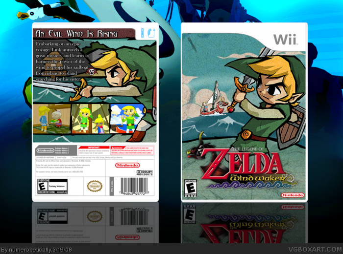
my latest box... i really am proud of this. the link on the front used to be red, the one on the back used to be purple, and i made the waves in the background on the front myself, as well as the screenshot frames. i had a lot of fun :)
[ Reply ]
I love this box, its so simple and elegant +fav
[ Reply ]
VERY VERY NICE :D
Maybe your best work so far?? Its not perfect, there are a few minor improvements needed here and there but its no big deal! I actually like it very much :D 4.5/5 +fav
[ Reply ]
You could've said where it could be improved Cerium. I love that front too and just when I thought nothing much else could be done with this game. The back might be better if you can do more to go with ocean theme. Overall really nice.
Edited at 1 decade ago
[ Reply ]
oh wow, you know, that's a really great idea e_g! i didnt even think about that... well as i'm going to edit anyway, now, cerium - how bout those minor improvements?
[ Reply ]
#4 In past posts where i have said about minor things being improved, I have had people blasting me for "nit-picking" and just generally having a go at me! So i decided to save myself the bother if thats alright with you?
[ Reply ]
coolerific.
[ Reply ]
#6, Well it depends on what you're complaining about, if you pick on a box for things like Sonic timeline continuity issues then it's arguably very picky but you shouldn't get the wrong impression. I don't have anything against you.
There isn't much point in mentioning issues here when you don't say what they are. Sorry for going off topic.
[ Reply ]
thanks guys.
#6 i wont blast you for nitpicking because i'm already changing stuff, so i might as well get the "nitpicking" stuff fixed.
[ Reply ]
beutiful, fave
[ Reply ]
Nice work I love the border around the screenshots =]
[ Reply ]
i made the back ocean themed, and i did all the artwork there myself. even the little octorok
[ Reply ]
I like it, 5/5 +fave I don't really see anything that could be improved...
[ Reply ]
Nice update.
I think you should use a more original but great bold font for the description maybe with a black stroke instead of a drop shadow.
[ Reply ]
i did this outline thing... i hope that's what you're talking about. but i think it looks better this way.
[ Reply ]
That's better, I'll fav it.
[ Reply ]
Awesome, perfectly fits the style of the game
[ Reply ]
thanks so much everyone! i'm really proud of the back
[ Reply ]
There's something about the back that isn't quite right... I can't put my finger on it, but it's there. The front is just awesome, and it alone is worth a favorite. I just love it. I really like how you put someone else in the boat. Smart thinking.
[ Reply ]
#19 its probably the black outlines, it looks really different from the front. thanks for the fave!
[ Reply ]
Crazy we sumbitted WW boxes almost the same time
My only thing is the text, you need like features and stuff like that
Edited at 1 decade ago
[ Reply ]
*bing* I've got it!!! The back needs to work with itself, especially the text. It can't just be floating around in the middle. Maybe if you put some kind of a border around an area where you put text, it would look better AND fit your theme :D! but also, you should include more information, and make the text smaller. But I love the self-drawn stuff, that alone is worth a fave :D
Edited at 1 decade ago
[ Reply ]
not bad at all.
[ Reply ]
cool one of your best 5/5
[ Reply ]
thanks guys. kirbylore check your pms!
[ Reply ]
Fsquared. Great job.
[ Reply ]
Awesome! +fave +author fave (cuz I stupidly forgot to do that way earlier!)
Edited at 1 decade ago
[ Reply ]
Fantastic! I love your zelda boxes! :) Keep it up.
[ Reply ]
#27 haha thanks that means a lot
& again thanks to everyone else. i feel like a weirdo thanking everybody but i want to XD
#31 thank you
Edited at 1 decade ago
[ Reply ]
Sweet.
[ Reply ]
I faved you as an author.
[ Reply ]
uhh... i kind of just looked at the front and back together (i mean REALLY looked, like looking for flaws)and the front is lacking the look of the back, meaning the black outlines. should i change that or am i just being critical?
[ Reply ]
#32, Try it out, and see how it looks. If you like it post, if not what your looking for don't. It's up to the maker. I happen to enjoy the changing feel.
[ Reply ]
Very well done, amazing execution here, numero. ;)
[ Reply ]
#33 you're right, of course, but i like to hear other people's opinions
thanks LK :)
[ Reply ]
i updated before school this morning but didnt have time to say anything about it, and i just wanted to address a few things.
first, that i added a black outline to the front to differentiate against the land and water - the water i left the way it was so it feels like it's an actual ocean - and second, i added a border-like-thing behind the text for kirbylore (i know it's not exactly what you meant either) but didnt make the text smaller or more detailed because it looked to crowded.
[ Reply ]
wow nicely done has a nice feel to it +fav
[ Reply ]
thanks! :D
[ Reply ]
nice one
go hof go ^^
[ Reply ]
#39 thanks! this one is my favorite box. well, this one and my mario one with the wii :P
[ Reply ]
This needs HoF. I'd like to see you get a box in the Hall. :)
[ Reply ]
me too :) and thanks that means a lot
[ Reply ]
Congrats on your first HOF
[ Reply ]
Congrats on the 1st HoF you fully deserved it :)
Edited at 1 decade ago
[ Reply ]
YES! HoF! Congrats!
[ Reply ]
#43, i second that
#44,i second that as well
#45, and i second that
oh and congratz on the HoF
[ Reply ]
Congrats on your first hof!
[ Reply ]
yay! i'm so excited! i actually squealed lol.
thanks #s 43-47
[ Reply ]
congrats numero! we're the same rating now :D I'm excited for you and glad I could help a bit. :D Feel free to ask me anything anytime, I'm more than happy to help when I can :).
[ Reply ]
I love the texture of the cover, could you make the screenshots on the back less bright.. they burn your eyes so to speak..
[ Reply ]