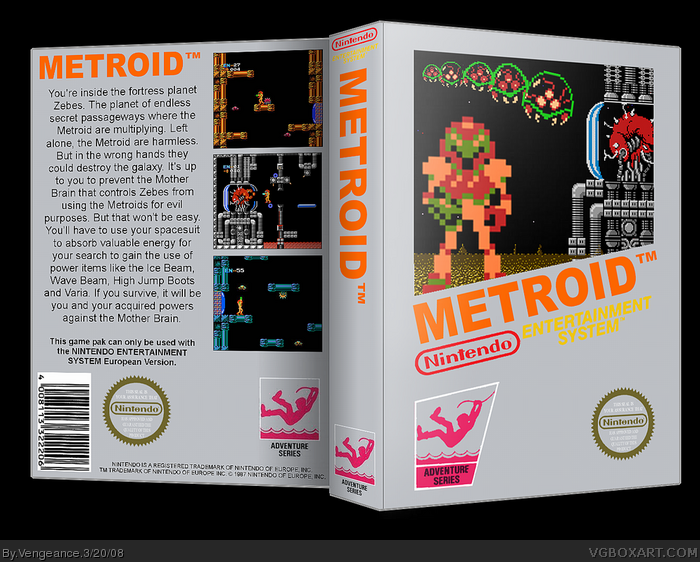
with all the retro boxes lately, I thought I should try my hand at one. So I present to you Metroid 1. I was going for a similar look to the official box, and due to the only materials i could get hold of being a few sprites, i had to improvise. Credit to Koopa for template. Time spent: 40 minutes approx.
If you say "wow this is plain" then I will murder you and your family.
this is one of my fav metroid boxes on the site. It's very plain and simple; dont murder me, i like this one plain. With good render choices, good screenshots, this should easily be a HoF; hopefully.
Perhaps try putting screenborders, and possibly a font that stands out more; it's a little boring. But these are relativley small problems, nothing big. Big time fav, i really enjoyed this box.
 Metroid Box Cover Comments
with all the retro boxes lately, I thought I should try my hand at one. So I present to you Metroid 1. I was going for a similar look to the official box, and due to the only materials i could get hold of being a few sprites, i had to improvise. Credit to Koopa for template. Time spent: 40 minutes approx.
If you say "wow this is plain" then I will murder you and your family.
[ Reply ]
wow this is plain
"mom?,MOM!!!!!"
its nice, retro style
fav
[ Reply ]
You got a back temp! o.O
Love it.
[ Reply ]
it's not really a back temp... i just got a big box, same colour as the front, and copy/pasted some of the icons onto it. easy as 1-2-3.
[ Reply ]
#4, yeah, but I'm very lazy.
[ Reply ]
I love this, good job!
[ Reply ]
Great job. :)
[ Reply ]
Awesome...
[ Reply ]
Very retro and nice.
[ Reply ]
Looks real!
BTW: I know my first two boxes sucked, and now I'll focus on satire boxes. The first one will be Command & Conquer 3: Tiberium Fart.
[ Reply ]
why do I have a feeling this will get HoF?
[ Reply ]
#11, because it's awesome. :D
[ Reply ]
Its cool
Edited at 1 decade ago
[ Reply ]
this is one of my fav metroid boxes on the site. It's very plain and simple; dont murder me, i like this one plain. With good render choices, good screenshots, this should easily be a HoF; hopefully.
Perhaps try putting screenborders, and possibly a font that stands out more; it's a little boring. But these are relativley small problems, nothing big. Big time fav, i really enjoyed this box.
[ Reply ]
Now THIS is why I come to Vgboxart! Faved.
[ Reply ]
This is nice, well made for this game =]
[ Reply ]
Love the retro design, Greg. :)
I remember playing it when I was 4, back then it seemed like it never ends. XD
[ Reply ]
ehh, it's too plain.
...wait a minute, MUM, DAD NOOOOOOOO!!!!!!
LOL jk
Awesome box :D
[ Reply ]
Loving the retro feel, good job :)
[ Reply ]
#2, Lol
Nice box homie. Faved!
[ Reply ]
So is this exactly what an NES back looks like?
[ Reply ]
nice your definatly my fav box artist :) 5/5 +fav
[ Reply ]
Oh, the 90s. When all the style was in the clothing.
[ Reply ]
FINALLY! Congratulations.
[ Reply ]
...seriously? This got in the Hall? o_O
[ Reply ]
awesome
[ Reply ]
awesome
[ Reply ]
sorry my computer screwed up and added my comment twice
[ Reply ]
package seems a bit too wide
[ Reply ]
#19, NES boxes looked like that, or at least the Metroid one does.
[ Reply ]
very original!
Good job!
4.9/5 +fav.
[ Reply ]