The sonic on your back is cut out badly, its choppy. #8 i have to say boxes need some type of flow, and i don't think this box did it well. Its well done, just a few kinks.
Really good box. Don't mind too much that there's no floor under Sonic. I think it would be better if you used the star field from front, behind the parchment paper on the back. Also, the word 'Page' is over the tear in the parchment on top. I'm not a fan of text that run around images either.. prefer justify left, right or center.
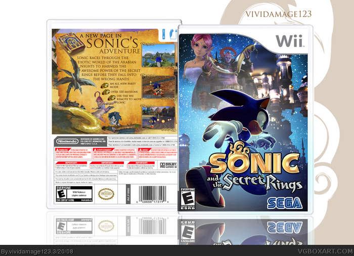
 Sonic and the Secret Rings Box Cover Comments
Cool, but the front dosen't match the back...
[ Reply ]
#1, i agree
[ Reply ]
i really like it, just make it look as if sonic's actually running on SOMETHING, and i'll fav.
[ Reply ]
#3, I wish I could put all the layers are merged...
Credit for temp : Jevangod(sp?)
[ Reply ]
good job vividamage! 5/5 +fav +author fav
[ Reply ]
#4, why didnt you save without the layers merged also?
Its very nice, 5/5
[ Reply ]
hmm its a great box but as #1and 2 said front dosent really flow with the back
but still nice +fav
Edited at 1 decade ago
[ Reply ]
#1, the front doesn't ALWAYS have to match the back.
[ Reply ]
The sonic on your back is cut out badly, its choppy. #8 i have to say boxes need some type of flow, and i don't think this box did it well. Its well done, just a few kinks.
[ Reply ]
#9, well, I mean, it's good to have variety in your boxes, that's all I'm saying.
[ Reply ]
#10, No I understand, just needs a certain flow, not a complete match =]
[ Reply ]
#1 I agree and i think he needs to be running on something.
Looks great don't get me wrong.
[ Reply ]
looks very good, i really like what you did with the front.
[ Reply ]
Really good box. Don't mind too much that there's no floor under Sonic. I think it would be better if you used the star field from front, behind the parchment paper on the back. Also, the word 'Page' is over the tear in the parchment on top. I'm not a fan of text that run around images either.. prefer justify left, right or center.
[ Reply ]
Wow. Awesome job, vivi.
+ fav box/author ;)
[ Reply ]
WOW. Very nice.
Although you shouldn't use Trajan Pro for every box :p
+fav
[ Reply ]
I'm very impressed with the back cover. Excellent.
[ Reply ]
im realy impressed, and this blows the offical far away.
[ Reply ]
Whoa sick!
Thanks for everyone's favs :)
Edited at 1 decade ago
[ Reply ]
cool me likey 4/5. my only complaint is that sonics running on nothing
[ Reply ]
lol, yeah I heard alot of that, I was thinking of it, but like what could I put there? Hey let's just say it's a mystical box lol! :)
[ Reply ]
Awesome.
;)
[ Reply ]
#22, Thanks, I appreciate that
[ Reply ]
Why does it have the nun-chuck? You don't use it in the game, so why have it there?
[ Reply ]