Title is too low. It's even touching the ESRB logo. I think Title should be centered. Also I can see some yellow stripe on the right of the ESRB logo. Blue squares thing not cuted well (I mean lower left corner - I think it shouldn't be there).
X360 back template text resized wrong.
Thats the main flaws. Everything else is a quastion of taste.
 The Bourne Conspiracy Box Cover Comments
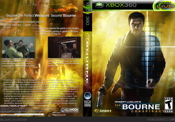
Title is too low. It's even touching the ESRB logo. I think Title should be centered. Also I can see some yellow stripe on the right of the ESRB logo. Blue squares thing not cuted well (I mean lower left corner - I think it shouldn't be there).
X360 back template text resized wrong.
Thats the main flaws. Everything else is a quastion of taste.
[ Reply ]
Pretty cool, I agree with Mad Spike. BTW I don't think a box would use the word "ass" ;)
[ Reply ]
its ok but i dont really like it or temp
[ Reply ]
you design is verrry gggggggood ok
think you jord
[ Reply ]