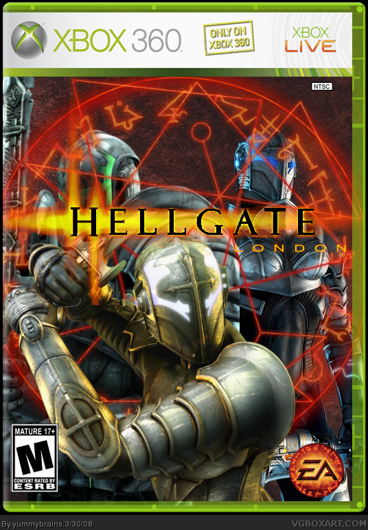
Looks very good, though there are some shortcomings:
- ESRB logo is too small
- EA logo too small
- Where is Namco Bandai logo?
- "Only on Xbox 360"?
Overall 8/10
Pretty cool i realy love that EA logo. I would like to see a back on this because u could make it really action packed and "hellish" if that makes any sense :)
I like the images that you used and i MIGHT concider moving the back 2 charicters in front of the red symbol try it and see how it works i dunno. good job Yummy. 4/5
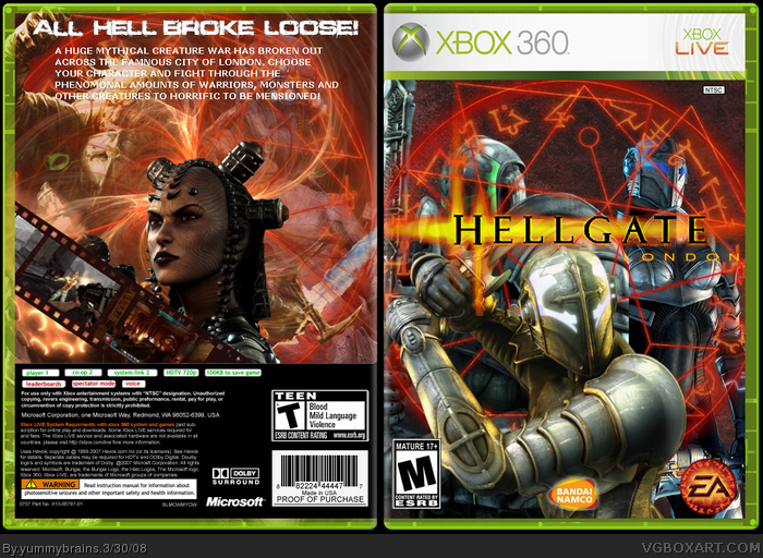
Update with a back. Credit ot PR for the apophysis fractual render and LK for the BG (you can hardly see IMO :P) and the film strip. God I worked hard on the back.
Very nice, but too busy IMO. The back text doesn't show up over some sections of the background, the screen borders don't really fit the game, and its too open. Then again, I'm known for stuffing my boxes to oblivion :p. So change the font color and/or make it show up some how, change the borders and you got a fav from me ;)
#15, Do you think I could do all that blending in paint? :p
Jks, I'm using Gimp.
I'll try do that but i just got back from football training and i'm very tired.
The back is kinda meh. It's very plain and the screenshot placement is kinda lame. The text also looks bad. Also, that one guy one the front is being covered by the logo.
 Hellgate: London Box Cover Comments
Probably one of my best boxes. Credit to LK for the BG and techne for the temp.
[ Reply ]
its nice, worth my fav
[ Reply ]
#2, A billion thanks.
[ Reply ]
Looks very good, though there are some shortcomings:
- ESRB logo is too small
- EA logo too small
- Where is Namco Bandai logo?
- "Only on Xbox 360"?
Overall 8/10
[ Reply ]
#4, The esrb and dev logo is not to small. I'll sort the other problems out now. Will you fav after I do that?
[ Reply ]
Updated with bandai namco logo and no "Only for xbox 360" thing.
[ Reply ]
really cool work yummi
[ Reply ]
This is, without a doubt, your best. However, the logo is kinda choppy and the images are bleeding out onto the template. 4/5
[ Reply ]
Looks pretty good.
[ Reply ]
Thanks everyone!
Updateed, not so much bleeding.
Edited at 1 decade ago
[ Reply ]
Pretty cool i realy love that EA logo. I would like to see a back on this because u could make it really action packed and "hellish" if that makes any sense :)
I like the images that you used and i MIGHT concider moving the back 2 charicters in front of the red symbol try it and see how it works i dunno. good job Yummy. 4/5
[ Reply ]
#11, Thanks man, i tried it but it doesn't look to good.
[ Reply ]
Update with a back. Credit ot PR for the apophysis fractual render and LK for the BG (you can hardly see IMO :P) and the film strip. God I worked hard on the back.
[ Reply ]
Noone genna comment on the back?
[ Reply ]
Very nice, but too busy IMO. The back text doesn't show up over some sections of the background, the screen borders don't really fit the game, and its too open. Then again, I'm known for stuffing my boxes to oblivion :p. So change the font color and/or make it show up some how, change the borders and you got a fav from me ;)
BTW are you still using paint?
Edited at 1 decade ago
[ Reply ]
#15, Do you think I could do all that blending in paint? :p
Jks, I'm using Gimp.
I'll try do that but i just got back from football training and i'm very tired.
[ Reply ]
The back is kinda meh. It's very plain and the screenshot placement is kinda lame. The text also looks bad. Also, that one guy one the front is being covered by the logo.
[ Reply ]
#16, Football like the man sport or soccer :P
[ Reply ]
#17, Meh, I couldn't think of a good placement for the logo.
#18, Soccer IS a man sport, especially if you live in Europe. Anyway, soccer/football.
[ Reply ]
#19, Lol, I'm kidding. Wearing no pads. Gotta give you props :p
But rugby is toughest of all <__<
[ Reply ]
#20, Yeah, Rugby is tougher, but it's really confusing. They're so many rules.
[ Reply ]