Yeah, another Sonic Unleashed box... but as I was gonna do a Printable, thought I'll have a stab at this. Especially as I like doing covers where there's little material so have to create stuff. Anyway.. hope you like... and as per usual best (?) in full view and printable available at the usual place. This will likely be updated once official logo and other stuff appear in the future.
I like it.....but there's just something that I really don't like about that line with the rings on the front. :-\
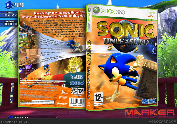
I'd remove it from the front and spine...but of course keep the ring as the "O" in sonic ;)
#5, I grabbed the artwork from website.. and it's not even rendered.. it's blended into the my loop and masked out. I have NEVER used renders in any of my boxes - every image I use is a full picture I grabbed from the web as seen in my "Not Another Teen Game" tutorial.
#6, Sorry.. but that line is suppose to be the loop.. suppose to come from the back and loop round.. would be silly to remove it... hence why it has the rings on it.
its nice, but i think this looks rushed and possibly your worst box. no offense. i mean the logo is bad enough on its own, the whole screenshot/speedbar (?) thing is very unappealing especially with the warped text.the background is also very stretched and blurry. but the box does stand out and is alright.
#15, You see the faded background on the top-back of box It's a loop (corkscrew, or whatever you want to call it).. where Sonic runs along.. up.. upside-down.. round... down.. and then carry-on forward. Imagine you are dead center in the circle, and look up. That's the view you get for my box... with Sonic running upside-down collection the rings on the corkscrew/loop. Get it?
I hate sonic (I don't think I'll get away with this though) but this looks great, the back is so adorable and so is the front. Don't know why some of you guys didn't like the rings on the line in the front. :/ +fav of course!
 Sonic Unleashed Box Cover Comments
Absolutely yes.
[ Reply ]
i love the whole Warehedgehog thing in this game. i love this box too. 5/5 +fav
[ Reply ]
Yeah, another Sonic Unleashed box... but as I was gonna do a Printable, thought I'll have a stab at this. Especially as I like doing covers where there's little material so have to create stuff. Anyway.. hope you like... and as per usual best (?) in full view and printable available at the usual place. This will likely be updated once official logo and other stuff appear in the future.
[ Reply ]
Classy, it's an odd design choice to have a focus on Sonic kicking a box.
[ Reply ]
you should credit JBone for wolf sonic render, but this is absolutley rad!
Edited at 1 decade ago
[ Reply ]
I like it.....but there's just something that I really don't like about that line with the rings on the front. :-\
I'd remove it from the front and spine...but of course keep the ring as the "O" in sonic ;)
#5, Ummm its not a render......
Edited at 1 decade ago
[ Reply ]
#6, if he took it off, then it would be too plain.
Edited at 1 decade ago
[ Reply ]
#5, I grabbed the artwork from website.. and it's not even rendered.. it's blended into the my loop and masked out. I have NEVER used renders in any of my boxes - every image I use is a full picture I grabbed from the web as seen in my "Not Another Teen Game" tutorial.
#6, Sorry.. but that line is suppose to be the loop.. suppose to come from the back and loop round.. would be silly to remove it... hence why it has the rings on it.
[ Reply ]
AWESOME TO TEH MAX!
[ Reply ]
damn you marker.....e_e
[ Reply ]
Very nice, however, I think you should have made the Sonic on the back's head overlapping the line/loop thing, same goes for the Super Sonic.
Edited at 1 decade ago
[ Reply ]
idk kinda odd
[ Reply ]
its nice, but i think this looks rushed and possibly your worst box. no offense. i mean the logo is bad enough on its own, the whole screenshot/speedbar (?) thing is very unappealing especially with the warped text.the background is also very stretched and blurry. but the box does stand out and is alright.
[ Reply ]
I like it.
[ Reply ]
#8, I don't get it?
and #7, plain isn't bad
Edited at 1 decade ago
[ Reply ]
1 word: AWSOME
[ Reply ]
#15, You see the faded background on the top-back of box It's a loop (corkscrew, or whatever you want to call it).. where Sonic runs along.. up.. upside-down.. round... down.. and then carry-on forward. Imagine you are dead center in the circle, and look up. That's the view you get for my box... with Sonic running upside-down collection the rings on the corkscrew/loop. Get it?
[ Reply ]
Best Sonic Unleashed box by far! I see you made the "sonic" logo have a sort of chaos emerald-looking texture, like my Galaxy box.
[ Reply ]
+ Fav
[ Reply ]
I dont like it... its better than my Sonic Unleashed box!!!
Oh yeah, 5/5 +fav :)
[ Reply ]
great
[ Reply ]
I Died And went to Heaven, got kicked out and landed here.
[ Reply ]
This is good but honestly, compared to your other boxes Marker, this didn't need to make HOF.
[ Reply ]
#23, The thing that made it so good was how he created it off of very limited material.
[ Reply ]
#17, I honestly don't xD
[ Reply ]
to be frank (not benny) the graphics on sonic unleashed scare me, but could you pm me all the pics.that you have used!
[ Reply ]
#23, "this didn't need to make HOF"??? I just post the box... I don't have any control of it making into the HOF.
#26, You can grab pics of the game from all over the place now. Think I got most of mine from gamekult --
link
Edited at 1 decade ago
[ Reply ]
I hate sonic (I don't think I'll get away with this though) but this looks great, the back is so adorable and so is the front. Don't know why some of you guys didn't like the rings on the line in the front. :/ +fav of course!
[ Reply ]
#27, thanks, i get most of my pics from the sonic research art archive!
link
[ Reply ]
#22, Wtf?
[ Reply ]
#27, actually i meant the renders.
[ Reply ]
this is awesome. +fav
[ Reply ]
#8, What about that Sonic on the back?
[ Reply ]