![]() »
»
[ Box updated on April 27th, 2008 ] [ original ]
 Valkyrie Of The Battlefield: Gallian Chronicles Box Cover Comments
Comment on shadysaiyan's Valkyrie Of The Battlefield: Gallian Chronicles Box Art / Cover.
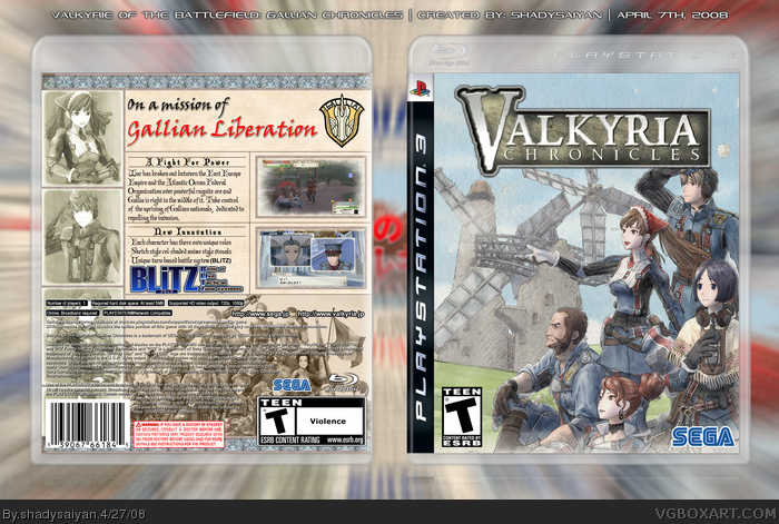
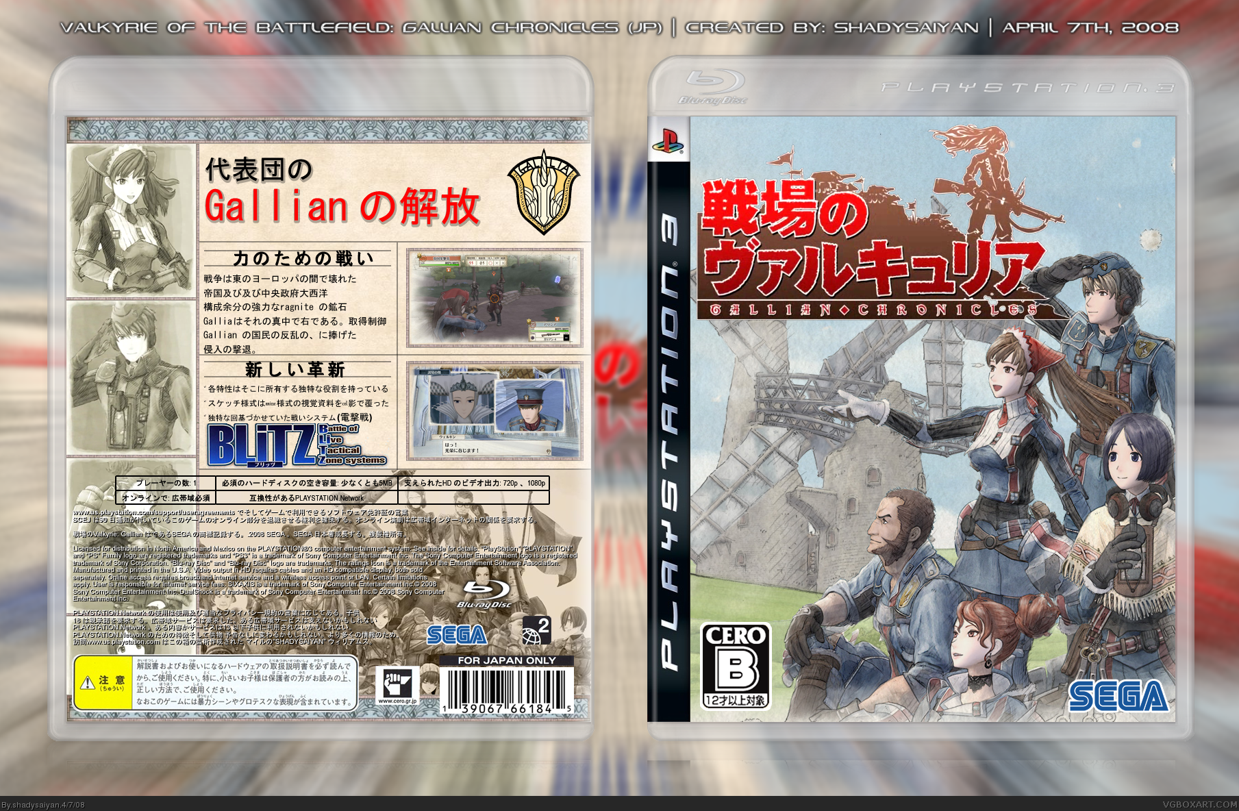
Well i think this game looks Awesome and is definitely something i would determine as "Next-Gen". i actually worked backwards on this, starting with the back and moving on to the front later. took me a while to finish, but i think it was worth it. also i've uploaded 2 versions, V1 is the Japanese (translated) version, since i think thats the way it is meant to be. V2 is obviously the english one (except the logo, no US/EU version has bee revealed yet) also this game comes out this month in Japan and makes its way to the US/EU in teh Fall this year. Cheers!
[ Reply ]
That's awesome! I love the style and back layout!
[ Reply ]
Your best box no question.
[ Reply ]
#3, His LBP box is his best.
Awesome job Shady, you nailed the Japanese style.
Edited at 1 decade ago
[ Reply ]
Very nice.
[ Reply ]
:D thanx
#4, i wonder if i'll top it someday :)
[ Reply ]
Nice shady.
I only wished you had lower down the opacity of the characters where the legal text is and didn't have that additional character portait (which can barely be seen behind all that legal info).
Otherwise I love the colors and the especially the front cover.
[ Reply ]
i thought this was a satire because i thought it said "valerie" =P
great box, +fav from me
[ Reply ]
#7, I agree.
[ Reply ]
Great Box.. looks fab. Excellent font on the back to match the slick images. I have to agree with DMS about the images behind the legal... and made blend in that "Blitz" image a bit better -- stands out too much.
[ Reply ]
#7, #10, i see what your saying. i should do that, but i think it may be unbalanced, because the top half of the back is full and the lower back is in half or less transparency...kinda like a glass half empty(full?) but still i get what you two are saying. i may update it later on. i also had the BLiTZ logo blended in via luminosity, but it just looked kinda nasty in brown. but that is the logo was made so i also figured, why mess with the officialness.
[ Reply ]
I like this box alot. It's very nice and clean. Great feel here. +fav =]
[ Reply ]
practically perfect
[ Reply ]
#13, agreed
[ Reply ]
#13, #14, Thanks means a lot :D
[ Reply ]
Update, nothing special, just added the US/EU logo and yes the V is actually supposed to look like that.
[ Reply ]
@#16, I was just checking my favs list and noticed the update. At first I was like "I don't remember faving this box?" but then clicking upon it I came here and I was like "oh..its shady's box".
Talk about massive difference - the new logo makes it looks like an entirely different box. Anyway, it still looks good - but I thought the Japanese logo looked more badass.
[ Reply ]
#17, yeah i also think the japanese one looked better :D
[ Reply ]
I love the style of this game and it really came through in the box. The back resembles a war propaganda poster which I love. Yeah, the Japanese logo is pretty badass.
+(worthless 0-rank)fav
P.S. You should check out this week's 1up Show segment on Valkyria.
[ Reply ]
Awesome. Saw it before, but only got to comment/fav now, sorry. :(
[ Reply ]
#20, Haha :D Thanks!
[ Reply ]
it does include vyse and aika from skies of arcadia, so it is one of those instant buys
[ Reply ]