Not bad, could use work, I agree with Ayron. I don't like the huge text either. The front doesn't tell you enough about the game. I suggest you add more than a character firing a slingshot.
#10 >.< thats the obvious thing to do that i totally missed thanks lol
#11 they look mostly the same because a) it's my style and b) most of the games i make boxes for are similar. but i'll keep that in mind for my next box, promise :)
#25 :) like i said, the next one will be different. i'm currently working on a zack and wiki box, which i feel is the perfect box for me to experiment with a new back. i do like this back though, mostly because it looks all exotic and stuff. the stuff i found for it was way too cool not to use =P
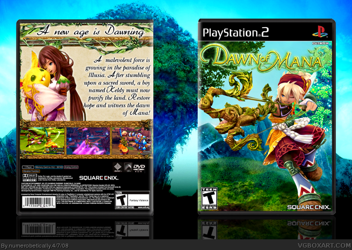
</updated> I moved some stuff around in my design from last night, changed the screenborder colors a bit, and in general made it better, I think. I wanted to explain some stuff about it but my friend called me with a personal problem so it had to wait. So... I wanted to do a different design, and you may think it isn't different, but it is. There's the tagline, of course, then I wanted people to see the description and then the screenshots. This makes a sort of "L" shape. Then I wanted you to take in the various characters, first left, top, then right (or the other way around), which makes a "U" shape. Of course, some people may look at the "U" before the "L" but the general idea is that you look at one or the other. So let me know what you think about this new back :)
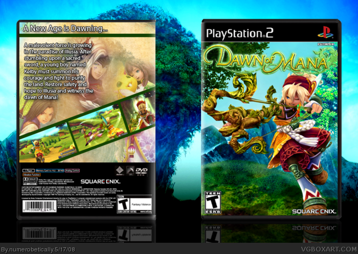
 Dawn of Mana Box Cover Comments
the back would be nicer with some texture or something, instead of a clean,brown surface.
Réally nice though.
[ Reply ]
I was just going to comment on this, and then it disappeared.
Anyhow, looks really great.
[ Reply ]
it's a paper texture :) like light parchment.
#2 yeah it didnt upload correctly the first two times
Edited at 1 decade ago
[ Reply ]
very creative, the thing on the back looks like pikachu LOL! 4.7/5 +fav
[ Reply ]
i know! lol it's like a giant decapitated pikachu head O.O
[ Reply ]
I think it's too small, but it's good.
[ Reply ]
this is great dude!! or dudet owell this is just awsome!! 5/5
Edited at 1 decade ago
[ Reply ]
Not bad, could use work, I agree with Ayron. I don't like the huge text either. The front doesn't tell you enough about the game. I suggest you add more than a character firing a slingshot.
[ Reply ]
#8 it looked too cluttered because of how much space the guy takes up. :(
Edited at 1 decade ago
[ Reply ]
#9, You could make him smaller then.
[ Reply ]
I think that you need to try something different with your backs, they all look the same. :|
[ Reply ]
#10 >.< thats the obvious thing to do that i totally missed thanks lol
#11 they look mostly the same because a) it's my style and b) most of the games i make boxes for are similar. but i'll keep that in mind for my next box, promise :)
[ Reply ]
#12, You wanna keep doing boxes that are colorful, correct? Make a Zack and Wki box. ;)
[ Reply ]
**Kidnaps Nikki**
[ Reply ]
#14, I don't even wanna know what you plan on doing next.
[ Reply ]
#13 yeah zack and wiki? who makes that?
[ Reply ]
#16, Capcom.
Nikki.
Teehee
[ Reply ]
#17 look forward to that. you'll be helping me =P
[ Reply ]
#18, cool, Nikki.
Teehee
[ Reply ]
Too similar to your other bioxes
but thats not necesssecrarly (spelling XP) a bad thing but if you do the same every box it might get repetitive,
try a new layout.... i dare ya XP
[ Reply ]
I really like this, +fav!
[ Reply ]
#20 it's necessarily lol. and dont worry, i will.
[ Reply ]
Nice +fav!
[ Reply ]
#23 thanks!
sorry it's so similar, i didnt know that was a problem.
[ Reply ]
I love the front. Very creative.
But you might want to mix it up with your back layouts.. they're all looking a little too similar for my liking. ;)
[ Reply ]
#25 :) like i said, the next one will be different. i'm currently working on a zack and wiki box, which i feel is the perfect box for me to experiment with a new back. i do like this back though, mostly because it looks all exotic and stuff. the stuff i found for it was way too cool not to use =P
[ Reply ]
If you need help with your Zack and Wiki box, tell me ^^
This looks great!
[ Reply ]
the front is awesome.
the back is kinda plain and the writing is too big imo.
the view full is too small.
but I really like it, great job +fav
[ Reply ]
#27 i do lol. i'll pm you
[ Reply ]
Well gosh dernit I decided I hated the back. So I made a new one.
[ Reply ]
</updated> I moved some stuff around in my design from last night, changed the screenborder colors a bit, and in general made it better, I think. I wanted to explain some stuff about it but my friend called me with a personal problem so it had to wait. So... I wanted to do a different design, and you may think it isn't different, but it is. There's the tagline, of course, then I wanted people to see the description and then the screenshots. This makes a sort of "L" shape. Then I wanted you to take in the various characters, first left, top, then right (or the other way around), which makes a "U" shape. Of course, some people may look at the "U" before the "L" but the general idea is that you look at one or the other. So let me know what you think about this new back :)
[ Reply ]
I didn't even notice lol.
[ Reply ]