#6, No problem. Keep it up ;)
Some tips: Shadow is a little too dark, a way to bring him out would be to have somesort of red background/texture behind at about 50-30% opacity. Also I forget if the Sonic Team logo is supposed to be on there, I think ShadowTH was the last game they used it on.
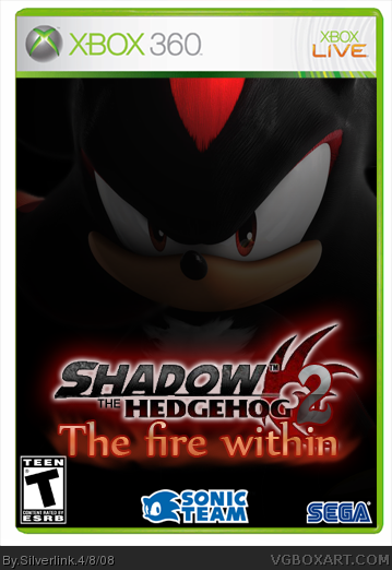
Changes to v4:
- Added a side panel (whatever you call that thing :p)
Changes to V5:
- Continued the background to the side panel
- Conitnued the hair(?) of Shadow to the Side panel
- Fixed up the borders of the side panel
and don't forget keep om fav'ing it an commenting on it :p
SHIT THAT IS GOOD!!!!! PM me the shadow, i would really like to use him on a box, damn your good, WOW!!!!!!!!!! !!!!!!!!!!! !!!!!!! !!!!!! !!!!!!!!!!!!!!!!!

 Shadow The Hedgehog 2 Box Cover Comments
Well this is my first box i ever made!
So don't be to harsh xD. Credits go to who ever made the box template.
N-Joy
[ Reply ]
The logo is pretty good, did you make it?
[ Reply ]
I Cutted out the orginal (which was a pain in the ass.) and there i editted it from on! The Fire within text is complety hand made ofcourse.
[ Reply ]
#3, Pretty cool. I will fav :)
[ Reply ]
Edited at 1 decade ago
[ Reply ]
Whoa thnx man!
If anyone has some tips how to improve the box i will gladly hear their tips!
Edited at 1 decade ago
[ Reply ]
#6, No problem. Keep it up ;)
Some tips: Shadow is a little too dark, a way to bring him out would be to have somesort of red background/texture behind at about 50-30% opacity. Also I forget if the Sonic Team logo is supposed to be on there, I think ShadowTH was the last game they used it on.
Edited at 1 decade ago
[ Reply ]
Changes to V2:
- Brighten shadow up
- Added a Background behind Shadow (small but it's there :p)
- Added Fire in eyes
[ Reply ]
nice updates.
fav
[ Reply ]
Change to V3:
- Added a Orange fire effect to his eyes.
Keep the comments, tips and critism (spelled right?) going! (and fav's ofcourse! ;))
[ Reply ]
awsome 4 a 1st 5/5
[ Reply ]
awsome first box dude! what did u use?
[ Reply ]
Looks amazing for a first.
[ Reply ]
Thnx for the comments guys.
I used Adobe Photoshop CS3
[ Reply ]
Changes to v4:
- Added a side panel (whatever you call that thing :p)
Changes to V5:
- Continued the background to the side panel
- Conitnued the hair(?) of Shadow to the Side panel
- Fixed up the borders of the side panel
and don't forget keep om fav'ing it an commenting on it :p
Edited at 1 decade ago
[ Reply ]
cool I'll fav. Sorry, but i dont like the logo that much. Still, nice.
[ Reply ]
This is awesome. Especially for a first. Oh, and the "side panel" is a spine. :)
[ Reply ]
Cool, maybe lower the opacity on the flames alittle, and maybe, MAYBE color the background red. That might look horrible tho.
[ Reply ]
Spine ofcourse! it was on the tip of my tongue but couldn't put my finger on it! thnx!
And thnx for the support guys!
[ Reply ]
nice logo and the effect with the eyes fav
[ Reply ]
SHIT THAT IS GOOD!!!!! PM me the shadow, i would really like to use him on a box, damn your good, WOW!!!!!!!!!! !!!!!!!!!!! !!!!!!! !!!!!! !!!!!!!!!!!!!!!!!
[ Reply ]
Brilliant.
[ Reply ]
Thnx guys for the comments
Gives me a reason to make more boxes :p
[ Reply ]
Hate how Shadow has fire in his eyes! 9.1/5
[ Reply ]
nice man 10/10
[ Reply ]