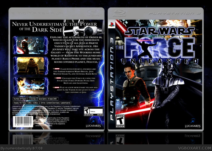
[ Box updated on August 7th, 2008 ] [ original ]
 Star Wars: The Force Unleashed Box Cover Comments
Comment on numerobetically's Star Wars: The Force Unleashed Box Art / Cover.
[ Box updated on August 7th, 2008 ] [ original ]
Comment on numerobetically's Star Wars: The Force Unleashed Box Art / Cover.
ummm credit to...wickedgamer for the temp and..master_general for cutting out the logo
[ Reply ]
Really nice, I'm glad it's different from the others.
[ Reply ]
NICCCCCE!
..Though I'd go for a more futuristic font on the back.
Update = +fav
[ Reply ]
futuristic = what font? =p
#2 the other starwars boxes or my other boxes?
Edited at 1 decade ago
[ Reply ]
#4- Something from here could possibly work: link
[ Reply ]
#4, The other SW boxes.
[ Reply ]
I like the back, the borders around the screenshots are cool!
[ Reply ]
Love The cover, and the Back title. 5/5 + 2 faves.
[ Reply ]
Not bad. The back seems a little plain to me. Though the front is nice. =] Well done.
[ Reply ]
Win.
[ Reply ]
#5 i tried 12 different fonts i thought could work and they all look like...boohockey. sorry :(
#9 just trying something different. e_g suggested on my last box that i use bullet points, so i tried selecting a box that i could effectively do that on. this game's pretty big, and in order to capture everything i could i had to use up the whole back lol.
thanks everybody!
[ Reply ]
Looks good... different from mine anyway! ;) Nice idea of the 'dark side' approach.. front looks good although I think Vader should be bigger that the other guy since he's in front (or other guy should be smaller). Really like the electric borders esp. having it just on the sides. Back is nice... although I do think it needs some extra images.
[ Reply ]
#12 okay, based on your comment i have an update. vader is a tad bigger, the other guy is a bit smaller, and i added a storm trooper to the back. he sort of looks like he's trying to grab onto the screenshot :)
EDIT: i just noticed something's wrong..updating again lol
Edited at 1 decade ago
[ Reply ]
Make the logo stick out more. I mean like change the black to white on the logo.
[ Reply ]
#14 really? that seems like it would be ugly. i'll try it and see how it looks though.
[ Reply ]
This is an update to a box that I thought had some potential.
I changed the font on the back because looking back I think it looked stupid. I felt like fixing this box after I went on Star Tours at Disneyland the other day.
[ Reply ]
You know, I actually like this box enough to fav it now. I think the sabers look better.
[ Reply ]