[ Box updated on April 13th, 2008 ] [ original ]
 Super Smash Bros Brawl: Deluxe Edition Box Cover Comments
Comment on vidboy10's Super Smash Bros Brawl: Deluxe Edition Box Art / Cover.
[ Box updated on April 13th, 2008 ] [ original ]
Comment on vidboy10's Super Smash Bros Brawl: Deluxe Edition Box Art / Cover.
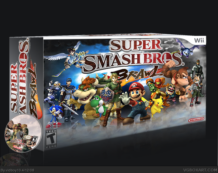
after looking at koopadsher's version i decided why not make my own? =D
[ Reply ]
I was about to fav it, but it's too blurry. Try to make is a better quality. What image type is it? And Sonic looks like Marth's pet dog because of his size...
[ Reply ]
The side is what i dont like.
[ Reply ]
#3, whats wrong with the side?
[ Reply ]
#2, Probably .png.
#4, It's kinda screwy, make the logo smaller on the side and make the image quality better, if possible.
[ Reply ]
#5, damn i just noctice that i overlaped my file biaxadent =(
and yes its a png
Edit: HOLY CRAP!!!!!! 2 FAVS allready? O_O
Edited at 1 decade ago
[ Reply ]
no more comments? T_T
[ Reply ]
sorry to bump a but thanks for the Favs guys ^_^
[ Reply ]
Vidboy do I even need to say it? Stop bumping.
[ Reply ]
It's gonna get you banned. Reed even said so somewhere.
[ Reply ]
#9, k I'll stop Y_Y
Edited at 1 decade ago
[ Reply ]
Wow, awesome job man. Definitely your best yet. :)
[ Reply ]
2 things:
1. Stop bumping.
2. The box is mecha-blurry.
[ Reply ]
yeah vidboy!
[ Reply ]
OMG Lady killer faving my box?!?!?!?!?!?
Thank you guys!!!!! ^_^
[ Reply ]
UPDATE:
Credit to TTT for the disc and Guitar man for the temp
[ Reply ]
I bet jevangod removed his fav because I was acting like a jerk on his box T_T
[ Reply ]
#17, Ya damn straight. And like E_G said before stop bumpin your damn boxes.
[ Reply ]
#17, Obviously. Now, stop bumping.
#18, Heh, we posted at the same time. I think we should be able to delete our comments within 30 minutes of posting.
Edited at 1 decade ago
[ Reply ]
Wow, I saw your comment on Jevan's box and figured I would check it out. I expected a pretty decent box, since his was well done, but to be frank, this looks like shit. Things are crooked and misaligned, parts of it are lower resolution than the rest, the sides of the box have been poorly put together.
next time use a reference, high quality images, and hold the shift key when stretching/skewing.
[ Reply ]
I expected a lot more from you, vidboy10. This entire box is basically effortless. Wanna know why? link
[ Reply ]