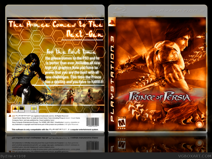
#4, the front has some pretty cool effects, but as sinful said, it doesn't fit the style, plus some of the effects leak out of the box. the back isn't that great, hex patterns should be used for sci-fi games, and the background isn't too appealing either.
 Prince of Persia Box Cover Comments
This is THE hardest box I have ever worked one. Hope you guys enjoy.
[ Reply ]
WICKED!!! but the text on the top of the back is kinda hard to read, 4.5/5 and fave and author fave.
Edited at 1 decade ago
[ Reply ]
this is a very nice box but it dosent really have the feel of the game
-and it feels a littile over done
Edited at 1 decade ago
[ Reply ]
Thank You and what do you mean by overdone, well any more comments?
Edited at 1 decade ago
[ Reply ]
#4, the front has some pretty cool effects, but as sinful said, it doesn't fit the style, plus some of the effects leak out of the box. the back isn't that great, hex patterns should be used for sci-fi games, and the background isn't too appealing either.
[ Reply ]
Great box, love the effects, font, color. Over all is just great!
[ Reply ]
The prince HAS already went next-gen (Wii). Nice box, but the effects really don't match the style.
[ Reply ]
Never said it was the first time
[ Reply ]
#8, on the back tagline.
[ Reply ]
"For the first time the prince comes to the PS3"
[ Reply ]