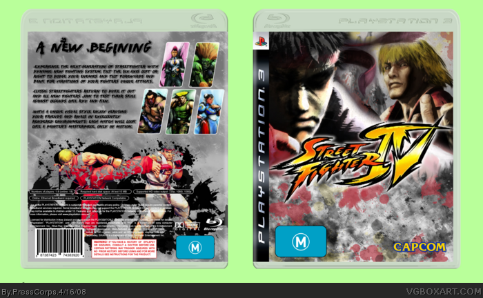
Medicore box IMO, but I haven't been happy with any of my boxes lately, that's why I haven't submited since January... sorry if the capcom logo is too small, couldn't judge the size compared to the rest of the box properly.
I'm working on something big, so big infact I have to take some time off of doing the box and advancing my skills in graphic work, otherwise my idea will be tacky, and dull. P.S. It's going to be a RSV2 box.
P.S.S. I got my PS3 last friday, I only have prologue, but that goodness I have friends with like 15 games each. ^^
EDIT: Forgot to add, Australian rating, they really are that big on the box, bigger on others...
I like, I like. But you didn't exactly get the M rating right. Its suppost to have that other little box attatched to it saying why its rated M. on both the front and back, right?
Good lord it must suck to have australian boxes. Not only do you have to pay more for games (or so I've heard) but you get fugly large rating symbols that cover half the box.
looks pretty good. i think there should be something in the lower space of the front, also more characters have been revealed, so i think you could've added more characters. nice though
Hmmm... It's ok. The background behind the box really does not fit in at all with the box itself. On the box, the background is sort of ugly and doesnt look that good. But i do like the front. So, it's ok. 3.4/5
 Street Fighter IV Box Cover Comments
nice one, the m logo is odd tho
[ Reply ]
mee luvs it!
[ Reply ]
Medicore box IMO, but I haven't been happy with any of my boxes lately, that's why I haven't submited since January... sorry if the capcom logo is too small, couldn't judge the size compared to the rest of the box properly.
I'm working on something big, so big infact I have to take some time off of doing the box and advancing my skills in graphic work, otherwise my idea will be tacky, and dull. P.S. It's going to be a RSV2 box.
P.S.S. I got my PS3 last friday, I only have prologue, but that goodness I have friends with like 15 games each. ^^
EDIT: Forgot to add, Australian rating, they really are that big on the box, bigger on others...
Edited at 1 decade ago
[ Reply ]
okie-dokies
[ Reply ]
I like, I like. But you didn't exactly get the M rating right. Its suppost to have that other little box attatched to it saying why its rated M. on both the front and back, right?
[ Reply ]
Good lord it must suck to have australian boxes. Not only do you have to pay more for games (or so I've heard) but you get fugly large rating symbols that cover half the box.
Edited at 1 decade ago
[ Reply ]
The Capcom logo looks a bit too high and that 'M' logo looks.... strange O___o
[ Reply ]
looks pretty good. i think there should be something in the lower space of the front, also more characters have been revealed, so i think you could've added more characters. nice though
[ Reply ]
Hmmm... It's ok. The background behind the box really does not fit in at all with the box itself. On the box, the background is sort of ugly and doesnt look that good. But i do like the front. So, it's ok. 3.4/5
[ Reply ]