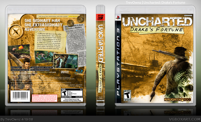
Ok so i really like the art for this game and i thought i might be able to do something someone else hasn't so i gave it a try and before i could even think if i wanted to make the boxart or not it was mostly done lol. I spent a while on it. The wallpaper and stuff i used didn't have color so i added color to the guy on front and back and did some other stuff. I think it looks sweet and i hope you do to.
Nice one mate... I think if I did a proper Uncharted (part did one with my compilation box) it'll look something like that with the newspaper clippings etc.. too ;) great design. Find those metal corner things on the screen shots a bit weird however ;) Also not sure of the characters on the back, don't think they are really needed since they appear behind the legal -- but fab! ;)
#5, Yeah well the screen shot corners was from the official i do believe and the character on the back are placed there because they fill in some emptiness and give some color. I didn't feel like editing them out so i added to them. Everyone is going to have different opinions so i understand that you see things you dislike and like.
#6, The newspaper is easy. Take a square and with the erase tool just cut it all bad looking and there you go it looks like a torn page haha. I think i did the same thing on my Fallout box.
#3, Can you tell me what you mean by that. Usually when someone post a comment that doesn't have anything to do with the box like #4 its because they fav'ed it so there just throwing a comment out because there don't feel like describing why they like the box or see nothing wrong with it so they don't crit. it. So tell me if you like or dislike or see anything wrong with it. Thanks.
#15, I wasn't trying to be mean or anything It's just i didn't know how you felt about it and i wanted to know. I hope the character placement doesn't take away from any favs or anything or i will change it. I thought they gave good color and filled in space well and TTT I wanted him and his image to has a lot of color.
The Good:
- You captured the feel of the game amazingly
- Outstanding back
- Well placed screenshots
The Bad:
- No Sony logo
- Naughty Dog logo shouldn't have effects
- I know that font! "One ordinary man"! That font is called IF. I used that for my Kill 2 box (which wasn't extremely good or something)
Overall, 88 out of 100. Just like the actual game...
I can't change the size or placement of the characters without messing up the background. As i said before i added there colors and stuff but they were on the wallpaper before i just edited the picture i didn't move just added to it. If i made him bigger the wallpaper would not look as good. I don't see why your being so harsh #19... look at your Uncharted box and by the way my font wasn't called "IF", the Naughty Dog logo looks like that in one of the trailers and i used it. Does it matter if it has an effect to it? because i think that it gives it more of a theme feeling which your box doesn't have at all... yes i did forget the Sony logo but i can update it.
hi everyone I'm new just off the google train as I was unlucky enough to only find a platinum Uncharted. TrevOwnz this is a lovely cover! A couple of things that I think dont quite gel though..
1. The font for the synopsis (on the post-it) looks out of place.
2. The revision to the text breaks its momentum a bit too.
3. The main protagonists being behind the small print looks, well.. off.
4. (not sure if this is an NTSC template) the game requirements and legal stuff look weird, as if they're too spread out.
on a personal preference note, do you ever consider doing BBFC/PAL versions?
@TrevOwnz I was commenting on a couple of things on the back cover that looked out of place (to me)
1. the '480 year old clue' text font looks a bit out of place I meant
2. Sorry about that one actually left it in by mistake.
3. at the back of the case Drake and Elena are behind the legal/trademark text and barcode.
4. Discount this one too, my mistake (all the covers I have here are European and the trademark/ specs are on a white background).
Snyway great work mate, a real eye opener! (its the first box I saw on the site)
#34, Thanks for the constructive criticism. I actually did a little changing a while ago and posted it on comment 28 (this link link Do you like that more? I will see what I can do about the text looking out of place.
Yes I saw that one, and I ahve to say its hard to really choose between them, at least objectively, I prefer this one (in your link) the back cover seems quite a lot tidier to me. but in any case you really have a winner here mate, I also loved the effect on the Naughty Dog logo, I think it really fits with the Uncharted aesthetic
If (i had any skill at all) the only thing I'd change (based on my personal preference) would be to make use of the new PS3 branding, (obviously I'm not and all lol) but for the sake of uniformity with the other titles I got in my collection, sorry i tend to ramble a bit :)
 Uncharted: Drake's Fortune Box Cover Comments
Ok so i really like the art for this game and i thought i might be able to do something someone else hasn't so i gave it a try and before i could even think if i wanted to make the boxart or not it was mostly done lol. I spent a while on it. The wallpaper and stuff i used didn't have color so i added color to the guy on front and back and did some other stuff. I think it looks sweet and i hope you do to.
Thank for looking =]
[ Reply ]
Great Trev fav
[ Reply ]
Hoo hoo boy...
[ Reply ]
I love you...
[ Reply ]
Nice one mate... I think if I did a proper Uncharted (part did one with my compilation box) it'll look something like that with the newspaper clippings etc.. too ;) great design. Find those metal corner things on the screen shots a bit weird however ;) Also not sure of the characters on the back, don't think they are really needed since they appear behind the legal -- but fab! ;)
[ Reply ]
Oh yeah, Trev, if it's not much trouble, could you please PM me how you did the paper like that? Like the edge of the newspaper? :)
[ Reply ]
#5, Yeah well the screen shot corners was from the official i do believe and the character on the back are placed there because they fill in some emptiness and give some color. I didn't feel like editing them out so i added to them. Everyone is going to have different opinions so i understand that you see things you dislike and like.
#6, The newspaper is easy. Take a square and with the erase tool just cut it all bad looking and there you go it looks like a torn page haha. I think i did the same thing on my Fallout box.
#3, Can you tell me what you mean by that. Usually when someone post a comment that doesn't have anything to do with the box like #4 its because they fav'ed it so there just throwing a comment out because there don't feel like describing why they like the box or see nothing wrong with it so they don't crit. it. So tell me if you like or dislike or see anything wrong with it. Thanks.
Thanks you to everyone for the comments and favs.
Edited at 1 decade ago
[ Reply ]
Really, really good
Edited at 1 decade ago
[ Reply ]
very nice trev. The back really does it for me :D
[ Reply ]
Awesomey man!
[ Reply ]
i agree with marker about the characters on the back, but this looks really good, nice job trev!
[ Reply ]
#3 I wasn't asking for a fav just to clear up what you said but thank you lol. Thank everyone for the comments and favs =]
#11, I might fix the character thing later.
[ Reply ]
Pretty cool. Something that I think would look better is if the leefs in front of Drake had a bit of a yellow-ish hue.
[ Reply ]
I love it, but I also agree with Socky and MARKER about the characters.
Edited at 1 decade ago
[ Reply ]
I faved it a while ago...the hoo hoo boy was just a way for me to describe the awesomeness of the box. Sorry for not elaborating.
[ Reply ]
#15, I wasn't trying to be mean or anything It's just i didn't know how you felt about it and i wanted to know. I hope the character placement doesn't take away from any favs or anything or i will change it. I thought they gave good color and filled in space well and TTT I wanted him and his image to has a lot of color.
[ Reply ]
#14, ??? Sockey didn't posted O_o
[ Reply ]
I think the character on the front should be bigger. Everything else is great!
+ Fav
[ Reply ]
The Good:
- You captured the feel of the game amazingly
- Outstanding back
- Well placed screenshots
The Bad:
- No Sony logo
- Naughty Dog logo shouldn't have effects
- I know that font! "One ordinary man"! That font is called IF. I used that for my Kill 2 box (which wasn't extremely good or something)
Overall, 88 out of 100. Just like the actual game...
[ Reply ]
#19, You took points off because you know the name of the font he used?
[ Reply ]
#19, You took points off because you know the name of the font he used?
[ Reply ]
I can't change the size or placement of the characters without messing up the background. As i said before i added there colors and stuff but they were on the wallpaper before i just edited the picture i didn't move just added to it. If i made him bigger the wallpaper would not look as good. I don't see why your being so harsh #19... look at your Uncharted box and by the way my font wasn't called "IF", the Naughty Dog logo looks like that in one of the trailers and i used it. Does it matter if it has an effect to it? because i think that it gives it more of a theme feeling which your box doesn't have at all... yes i did forget the Sony logo but i can update it.
Edited at 1 decade ago
[ Reply ]
Grats Trev! We live close. o.O
[ Reply ]
Wow a HoF with just 17 favs?! Could this be a new record? ^_^
[ Reply ]
#24, No, because one box recently got in with 14. o.O
[ Reply ]
Sorry I wasn't able to comment on this earlier, Trev.
Great work as always, not too fond of how drake and elena are behind the legal info stuff, but just a minor gripe.
As for the front cover, its nice but a bit on the empty side. Maybe you should've used a slightly bigger version of nate.
Overall, great job my friend.
Edited at 1 decade ago
[ Reply ]
Oh sweet, thanks everyone that commented and faved this box. Makes me happy =]
[ Reply ]
Ok for those of you that didn't like the version i posted i made him bigger and removed the guy on the back. I dislike it so I'm not updating link
[ Reply ]
Extravagant.
[ Reply ]
Trev do you have the "flat" image, for lack of a better word? Where you can print it out to use in a PS3 case?
I really really like this (and faved your piece, and am faving you as well).
Thanks!
[ Reply ]
hi everyone I'm new just off the google train as I was unlucky enough to only find a platinum Uncharted. TrevOwnz this is a lovely cover! A couple of things that I think dont quite gel though..
1. The font for the synopsis (on the post-it) looks out of place.
2. The revision to the text breaks its momentum a bit too.
3. The main protagonists being behind the small print looks, well.. off.
4. (not sure if this is an NTSC template) the game requirements and legal stuff look weird, as if they're too spread out.
on a personal preference note, do you ever consider doing BBFC/PAL versions?
[ Reply ]
#30, I will find it and post it but it's not 300 dpi so I hope it looks good.
#31, I don't get about half of what your saying and no I won't do PAL cause I'm American and I have NTSC boxes.
[ Reply ]
Thanks Trev. I love your cover!
Would prefer the one without Drake behind the print, but either one works.
Edited at 1 decade ago
[ Reply ]
@TrevOwnz I was commenting on a couple of things on the back cover that looked out of place (to me)
1. the '480 year old clue' text font looks a bit out of place I meant
2. Sorry about that one actually left it in by mistake.
3. at the back of the case Drake and Elena are behind the legal/trademark text and barcode.
4. Discount this one too, my mistake (all the covers I have here are European and the trademark/ specs are on a white background).
Snyway great work mate, a real eye opener! (its the first box I saw on the site)
[ Reply ]
#34, Thanks for the constructive criticism. I actually did a little changing a while ago and posted it on comment 28 (this link link Do you like that more? I will see what I can do about the text looking out of place.
[ Reply ]
Yes I saw that one, and I ahve to say its hard to really choose between them, at least objectively, I prefer this one (in your link) the back cover seems quite a lot tidier to me. but in any case you really have a winner here mate, I also loved the effect on the Naughty Dog logo, I think it really fits with the Uncharted aesthetic
If (i had any skill at all) the only thing I'd change (based on my personal preference) would be to make use of the new PS3 branding, (obviously I'm not and all lol) but for the sake of uniformity with the other titles I got in my collection, sorry i tend to ramble a bit :)
Edited at 1 decade ago
[ Reply ]