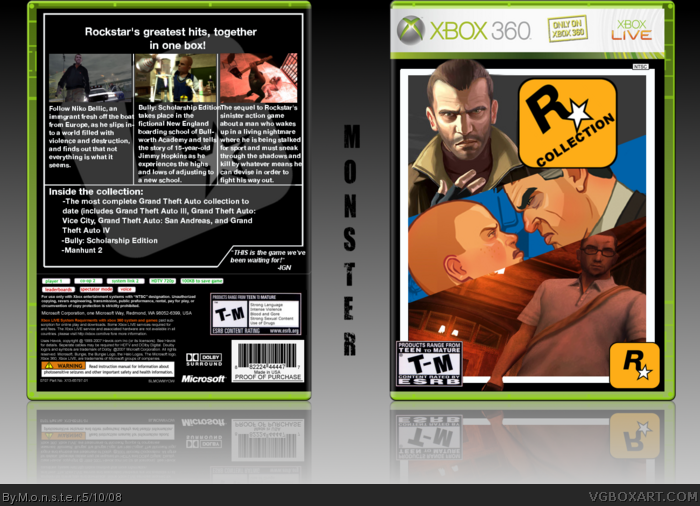
Hey guys, I'm fairly new here, even though I've seen your site quite a bit. I actually know a member here, DrDoomsday, from school, and he's shown me this site a couple times. I finally decided to make an account when I was at his house a couple days ago. Anyways, here's my first submission, Rockstar Collection. It's kind of like a spin-off of the Orange Box, and I think if they made this, it would be quite successful. I'm afraid that I'm no good at Photoshop however, and I know most of you won't like this, but I'm hoping at least a couple will like it.
Alright, thanks for reading. As a final note, please give me the pros and cons of this box, and give it an overall rating out of 10. Thanks!
Pros:
- Good idea
- Nice design
- Nice back layout
Cons:
- Some of the text in the Bully description is going into the Manhunt description.
- Boring text
- Back could use some more effects here and there to spice it up a bit.
Overall, it's a good first box. I'm looking forward to more boxes from you. 4/5 (About 8/10)
#4, Would you mind helping me out with making a better one? Sorry, I'm pretty new to Photoshop, this was my first time using it.
#6, thanks for using the rating system that I asked everyone to use :) Would you have an example of some of the effects that would make this look more appealing?
#7 I did post my comment before I saw your first comment otherwise I would of used your rating system :P Sorry
And I dont use photoshop so I wouldnt be much help! Try asking a more experienced member of the site :)
Maybe have the word "ROCKSTAR" actually somewhere in the logo?
Well, I like the concept and what you're going for.
Some minor errors in technique abound though, like the oversized rockstar logo and the tagline could be much bigger. Nothing too major, especially for a first box. It just doesn't have that "wow" factor that I always look for in boxes and seems a tad boring. I'm sure you'll improve lots as you design more. :)
Good first box and lookin' forward to more from you. ;)
 Rockstar Collection Box Cover Comments
Pretty cool, but you bled some stuff out of the temp on the front.
And I'd have preferred if you used actual art from Manhunt instead of a screenshot so it fits in with the rest of it.
That said, very nice first box.
[ Reply ]
*Gulp* Okay, first box, here goes...
Hey guys, I'm fairly new here, even though I've seen your site quite a bit. I actually know a member here, DrDoomsday, from school, and he's shown me this site a couple times. I finally decided to make an account when I was at his house a couple days ago. Anyways, here's my first submission, Rockstar Collection. It's kind of like a spin-off of the Orange Box, and I think if they made this, it would be quite successful. I'm afraid that I'm no good at Photoshop however, and I know most of you won't like this, but I'm hoping at least a couple will like it.
Alright, thanks for reading. As a final note, please give me the pros and cons of this box, and give it an overall rating out of 10. Thanks!
[ Reply ]
Hold me....
[ Reply ]
I dont like the ESRB logo. Why not just rate it M?
Also the actual logo itself seems very lazy and effortless.
Cool idea though 6/10
Edited at 1 decade ago
[ Reply ]
#4, Because Bully isn't M.
That's what they did on the Orange Box.
[ Reply ]
Ok....
Pros:
- Good idea
- Nice design
- Nice back layout
Cons:
- Some of the text in the Bully description is going into the Manhunt description.
- Boring text
- Back could use some more effects here and there to spice it up a bit.
Overall, it's a good first box. I'm looking forward to more boxes from you. 4/5 (About 8/10)
[ Reply ]
#4, Would you mind helping me out with making a better one? Sorry, I'm pretty new to Photoshop, this was my first time using it.
#6, thanks for using the rating system that I asked everyone to use :) Would you have an example of some of the effects that would make this look more appealing?
[ Reply ]
#7 I did post my comment before I saw your first comment otherwise I would of used your rating system :P Sorry
And I dont use photoshop so I wouldnt be much help! Try asking a more experienced member of the site :)
Maybe have the word "ROCKSTAR" actually somewhere in the logo?
[ Reply ]
Well, I like the concept and what you're going for.
Some minor errors in technique abound though, like the oversized rockstar logo and the tagline could be much bigger. Nothing too major, especially for a first box. It just doesn't have that "wow" factor that I always look for in boxes and seems a tad boring. I'm sure you'll improve lots as you design more. :)
Good first box and lookin' forward to more from you. ;)
[ Reply ]
Lol, I was about to do something very similar to this. Nice job, but something doesn't seem right...
[ Reply ]
#7, maybe a gradient on the lines and text on the back?
[ Reply ]
Great for a first.
[ Reply ]
This amazing i see a awesome box art person coming up and a bunch of fav's from me.
[ Reply ]