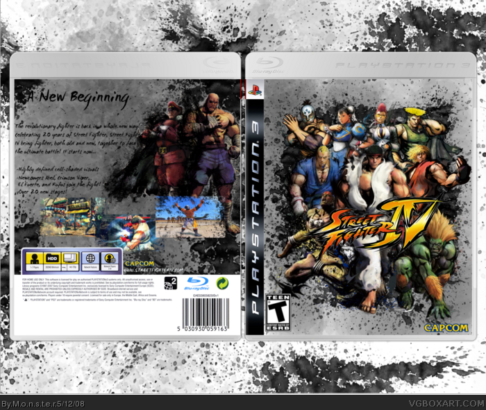
Second box. I wanted to go for the splatter effect that the images had, so I ended up with this! On the front, it's meant to look like they were going out of a hole. Anyways, thanks for viewing! Comments, criticism, and favs wanted, please.
#4, I'd say something that matches the black spolts... something even to match how the characters are outlined, I usually try to make it match the art work of the renders I use.
Awesome job, Matt, keep it up! This is really good for a second box, and I mean it. The only thing you're missing is the back Teen info, and I agree about the outline border for the screens. Work on that, and it'll look better.
 Street Fighter IV Box Cover Comments
Second box. I wanted to go for the splatter effect that the images had, so I ended up with this! On the front, it's meant to look like they were going out of a hole. Anyways, thanks for viewing! Comments, criticism, and favs wanted, please.
[ Reply ]
I'm impressed, the art is awesomely used. The description text gets a bit lost.
[ Reply ]
#2, I have to agree, also the screens are to plain, try and give them a border of some sort. well done all in all though
[ Reply ]
Thanks for the feedback. #3, what would you suggest, sorta like a scribbled border, or something straight and clean?
[ Reply ]
#4, I'd say something that matches the black spolts... something even to match how the characters are outlined, I usually try to make it match the art work of the renders I use.
[ Reply ]
Awesome job, Matt, keep it up! This is really good for a second box, and I mean it. The only thing you're missing is the back Teen info, and I agree about the outline border for the screens. Work on that, and it'll look better.
[ Reply ]
Really, nothing to improve, if you ask me.
I actually think this is HoF worthy!
5/5 and faved!
things to improve:
(1)fix up the teen logo on the front so the bottom and side are equally apart
(2)use a little better grammar on the back
P.S.
Where'd you find the teen, capcom, and temp? They're awesome!
Edited at 1 decade ago
[ Reply ]