![]() »
»
[ Box updated on May 13th, 2008 ] [ original ]
 S.T.A.L.K.E.R. Shadow of Chernobyl Box Cover Comments
Comment on Rokudaime's S.T.A.L.K.E.R. Shadow of Chernobyl Box Art / Cover.
![]() »
»
[ Box updated on May 13th, 2008 ] [ original ]
Comment on Rokudaime's S.T.A.L.K.E.R. Shadow of Chernobyl Box Art / Cover.
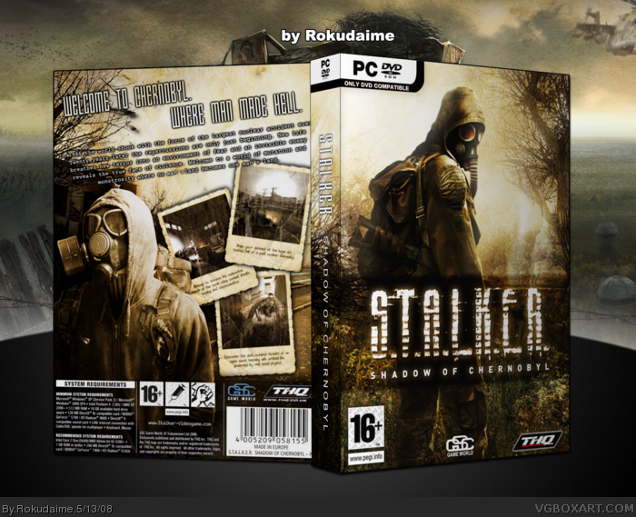
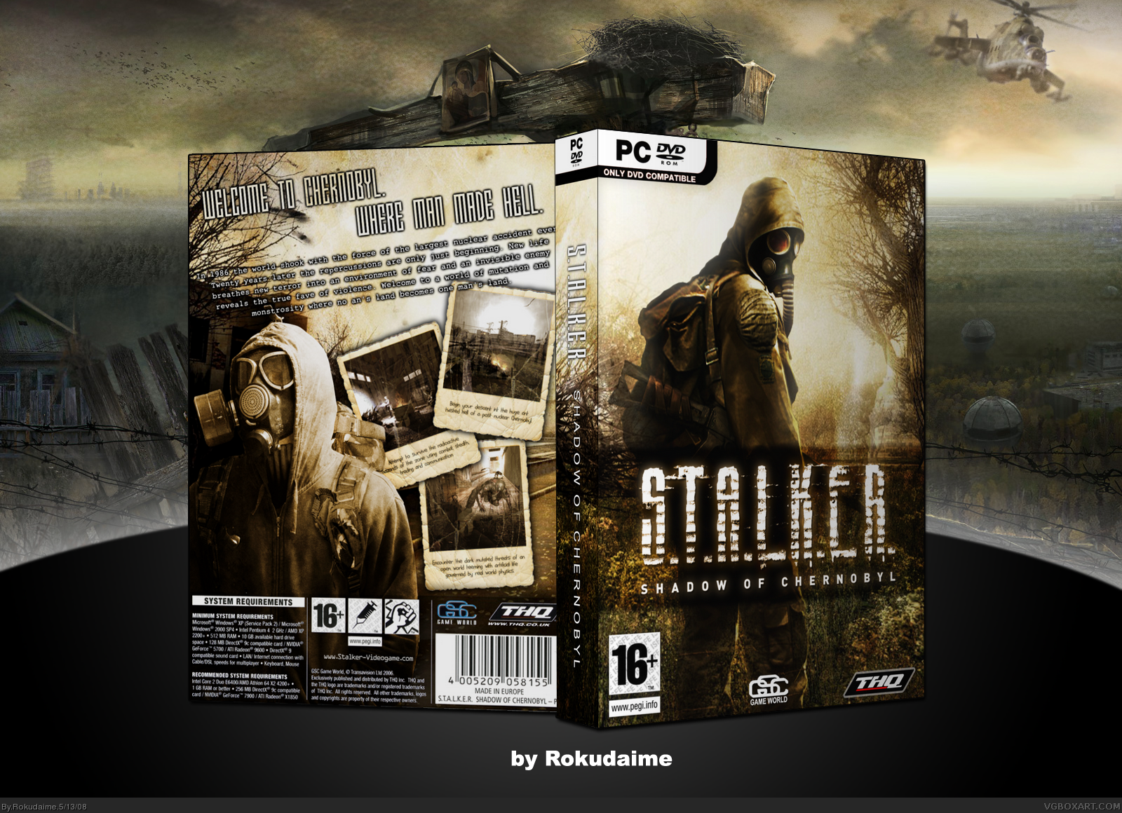
I really hate the official stalker cover, so I made my own.
[ Reply ]
I do too. This is better than the official. Excellent work.
[ Reply ]
There's too much space outside the box but the design is high quality.
[ Reply ]
I like this one too. Simple and stylish.
+ Fav
[ Reply ]
thanks guys
update:
corrected 2 typos and made the background smaller.
[ Reply ]
Awesome
[ Reply ]
Great.
[ Reply ]
Looks great.
[ Reply ]
Nicely done. I really like the muted color palette as it goes with the theme of the game very well.
Edited at 1 decade ago
[ Reply ]
Well i likes it!
[ Reply ]
Finally, it's here!
[ Reply ]
Very cool!
[ Reply ]
thank you all
#12, the back took some time cause I wasn't really motivated.
[ Reply ]
50,000 people used to live here...
*waits for someone to finish*
[ Reply ]
the style of the front has been done before, however you did a great job of making the box really flow.
[ Reply ]
dude so smexy
[ Reply ]
#14, and now its a ghost town....
great box deserved HoF congrats.
[ Reply ]