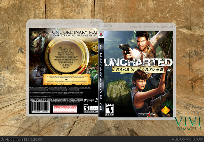
It's me new box and I hope everyone likes it I focused it alot on the compass in the back and the main two characters, I wanted it to be verry different from the rest although the cover is similiar
This box was a kinda a competition box against Sinful Complexitys to see which was more succesful :)
Shame it's not the blonde girl on front but great job on the entire box.. love the use of the compass in the middle on the back and everything around it. Nice. Love the wood presentation too... wish I didn't tell you how to do mine now! j/k LOL ;)
#11, how is it anymore original than any other Uncharted box?
I don't like the front. It's unoriginal in my opinion and the light on Drake's head looks bad. The back design looks pretty cool but I don't like the stroke on the text and the way the text is positioned just bothers me.
#15, It's I guess more original because they are suspended over water rather on a tree or somthing, the stroke was a hard part because I couldnt find an appropriate color for it so stuck with that, the text is a matter of opinion
#16, Yeah it was clearly concept art but still capture's Elena, you can tell it's her but rather a different looking one
#15, The art may be the same, but she implemented it damn near flawlessly and it looks more original than all the other ones that used it, which all had little to no editing.
But the back is the big draw for me, it's amazing.
 Uncharted: Drake's Fortune Box Cover Comments
nice
Edited at 1 decade ago
[ Reply ]
Dum Dum Dum...!
Vivi Presents
Uncharted Drake's Fortune Unnoficial box Art!
Temp Credit goes to - Techne
It's me new box and I hope everyone likes it I focused it alot on the compass in the back and the main two characters, I wanted it to be verry different from the rest although the cover is similiar
This box was a kinda a competition box against Sinful Complexitys to see which was more succesful :)
[ Reply ]
Man that box looks great.
[ Reply ]
Shame it's not the blonde girl on front but great job on the entire box.. love the use of the compass in the middle on the back and everything around it. Nice. Love the wood presentation too... wish I didn't tell you how to do mine now! j/k LOL ;)
[ Reply ]
Front is a bit generic, but the back...wow.
[ Reply ]
Very nice!
[ Reply ]
Spicy!
[ Reply ]
#5, Agreed. I've seen the front too many a times in the past. The back, however, is wonderful.
I also dig the presentation style. Nice job. :)
[ Reply ]
Thanks
[ Reply ]
Wowwww.
[ Reply ]
That's probably the most original use of that front wallpaper I've seen, and wow, that back is tremendous.
[ Reply ]
I love the back
[ Reply ]
#12, Thanks
[ Reply ]
#13, no prob could you pm the paper you used on the back?
[ Reply ]
#11, how is it anymore original than any other Uncharted box?
I don't like the front. It's unoriginal in my opinion and the light on Drake's head looks bad. The back design looks pretty cool but I don't like the stroke on the text and the way the text is positioned just bothers me.
[ Reply ]
#4, that is her. for some reason in the artwork she has dark hair and she looks much ugly. i think it's concept art.
[ Reply ]
#15, It's I guess more original because they are suspended over water rather on a tree or somthing, the stroke was a hard part because I couldnt find an appropriate color for it so stuck with that, the text is a matter of opinion
#16, Yeah it was clearly concept art but still capture's Elena, you can tell it's her but rather a different looking one
[ Reply ]
#15, The art may be the same, but she implemented it damn near flawlessly and it looks more original than all the other ones that used it, which all had little to no editing.
But the back is the big draw for me, it's amazing.
[ Reply ]
#18, Hahaha Im a guy and thanks alot hunter, Im glad you keep defending my box
[ Reply ]
i agree with #5, the front been done before, but the back is interesingly designed.
keep it up.
Edited at 1 decade ago
[ Reply ]
that logo is HUGEEEEEEEEE
[ Reply ]