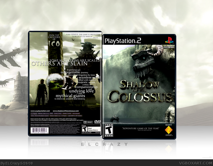
amazing back. but what's with all that black space at the bottom of the front? I know it's to fill up the box without making the image bigger, but it looks weird.
The look for the front that I was going for was a "David vs. Goliath" look. I think it turned out well.
I decided to go against the warm, brown color scheme that recent SOTC boxes had. I experimented with a few color schemes, and I decided the best way to go is green, a slightly gritty theme, leaning more towards the look of the official website.
I also decided to not use my usual signature for the presentation as it would not look right with the feel that I was going for.
Massive cred to Ladykiller for letting me use his logo. Thanks a bunch, dude!
Also, credit goes out to DS11 for the temp back info. (system requirements, copyright bullshit etc.)
I absolutely love the shot you chose for the front.
I don't really like the back arrangement. It doesn't feel as though you took advantage of all of the space by placing the screenshots and text in the same area, not really stylish placement in my opinion. I think the background is too big as well.
Like Vengeance said the back is awesome, the front looks a little plain but it still suits the SOTC style. Overall this box is very cool. +fav + author fav
Love the front -- gives the impression of size really well - but have to agree with Vengeance on the black space on the front bottom -- a quote from a magazine review should go there or something -- it should never be just black.
Back is cool, although not keen on the words on the column on the top since it doesn't blend into it.. and none of the other words interact with the images.
However... minor issues.. so gets my fave.. esp. if changed! lol
Agreed with all the crits that's been said so far. Also there's a part in the canvas that needs to be blended- it's a hard edge in the bottom part of the canvas. I also wouldn't recommend keeping the leafless trees and the grain stalks for the canvas, as you actually don't see those in the game. XD
That said, this is another spectacular box from you, my friend.
Superb.
I love how the front gives such a drastic size comparison. And the back is very unique, but at the same time, it works well. I also love the gree/greyish theme.
One of your best. ;)
Hey Man, i am Brazilian fan and i like this cover , so great ... But i no have say download, please help me brother, give me this cover ... I Need cover for my collection , help me
 Shadow of the Colossus Box Cover Comments
amazing back. but what's with all that black space at the bottom of the front? I know it's to fill up the box without making the image bigger, but it looks weird.
[ Reply ]
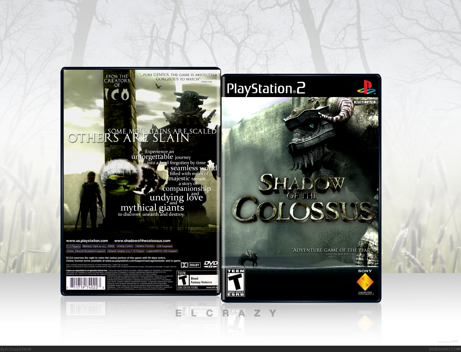
I am very happy with how this came out.
The look for the front that I was going for was a "David vs. Goliath" look. I think it turned out well.
I decided to go against the warm, brown color scheme that recent SOTC boxes had. I experimented with a few color schemes, and I decided the best way to go is green, a slightly gritty theme, leaning more towards the look of the official website.
I also decided to not use my usual signature for the presentation as it would not look right with the feel that I was going for.
Massive cred to Ladykiller for letting me use his logo. Thanks a bunch, dude!
Also, credit goes out to DS11 for the temp back info. (system requirements, copyright bullshit etc.)
Enjoy! (:
[ Reply ]
I absolutely love the shot you chose for the front.
I don't really like the back arrangement. It doesn't feel as though you took advantage of all of the space by placing the screenshots and text in the same area, not really stylish placement in my opinion. I think the background is too big as well.
[ Reply ]
Like Vengeance said the back is awesome, the front looks a little plain but it still suits the SOTC style. Overall this box is very cool. +fav + author fav
[ Reply ]
Whoa. That's just great.
[ Reply ]
Love the front -- gives the impression of size really well - but have to agree with Vengeance on the black space on the front bottom -- a quote from a magazine review should go there or something -- it should never be just black.
Back is cool, although not keen on the words on the column on the top since it doesn't blend into it.. and none of the other words interact with the images.
However... minor issues.. so gets my fave.. esp. if changed! lol
[ Reply ]
Thanks guys. I'll work on your suggestions, Onn =D
[ Reply ]
Really lovin' the David vs. Goliath concept here.
Agreed with all the crits that's been said so far. Also there's a part in the canvas that needs to be blended- it's a hard edge in the bottom part of the canvas. I also wouldn't recommend keeping the leafless trees and the grain stalks for the canvas, as you actually don't see those in the game. XD
That said, this is another spectacular box from you, my friend.
[ Reply ]
Wonderful job. I love the crisp contrast of the front. Could you possibly PM me the rendered title? :)
Edited at 1 decade ago
[ Reply ]
*moves to Singapore*
[ Reply ]
Good job. Faved.
[ Reply ]
I love the style and design choices. Well made.
[ Reply ]
Hehehe...
[ Reply ]
Thanks guys! I'll work on a V2 ASAP.
#8, the hard edge is supposed to look like a table. =P
Edited at 1 decade ago
[ Reply ]
Updated!
[ Reply ]
awsome job with the back !! +fav
[ Reply ]
Wow, sick nasty.
[ Reply ]
This has a darker look to it than the other Shadow of the colossus boxes I've seen, I like it.
[ Reply ]
Yay HoF!
Thanks guys! =D
[ Reply ]
Superb.
I love how the front gives such a drastic size comparison. And the back is very unique, but at the same time, it works well. I also love the gree/greyish theme.
One of your best. ;)
[ Reply ]
#20, thanks dude (:
[ Reply ]
I agree with #20
[ Reply ]
....damn....
[ Reply ]
Hell, I'm jus--*fap*
[ Reply ]
Hey Man, i am Brazilian fan and i like this cover , so great ... But i no have say download, please help me brother, give me this cover ... I Need cover for my collection , help me
[ Reply ]