It's good, but doesnt stand out from other GTA4 boxes. I cant, dont know about anyone else, can see the difference from the fronts. I dont study every picture on the GTA4 boxes, so i cant teel which pictures are what, if they've been used or not, or whatever. But that doesnt matter. It's still a box that you put a lot of effort in, and it's not bad. 4.3/5 +fav
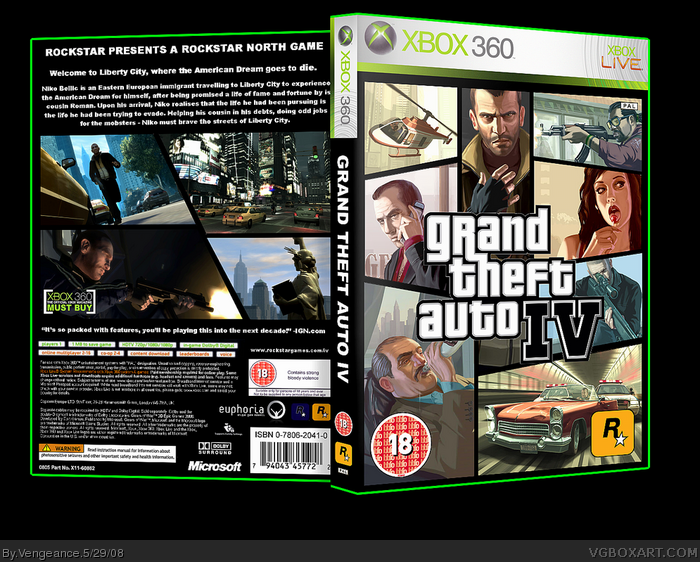
This box-- it's too unoriginal and plain for my likings.
May i have the freedom to explain why?...ok..
First of all, the front is basically the original front. Which is not bad- but it's just nothing new. Now, believe me-- im a sucker for simplicity, but the back is not what i hoped for. It's just a bland,black background with oddly sized screenshots and some text. I was hoping for something more catching, and original-- perhaps something more 'deep' to express the relation between the different GTA's?
Overall, this box isn't as bad as i might've made it look like i think it is. [ hope that made sense ]-- but it's still not top-notch, as to be expected from you being a 8-ranker Vengeance.
Where did Vengeance go? Anyway, didn't expect this from Vengeance but it looks simple which is not always that bad. Just a little bit plain and maybe a better font for the back. I like it though. +fav
I like it. It may not be unique but it's really crisp and well made and I love the very slick and sly back. The one complaint is the 3D kinda distorts the text and that takes away from the crisp, slyness (word?) of the back.
Still, the design is awesome (though unoriginal) 4.5/5 (because of the unoriginality) but fav because it's so slick.
 Grand Theft Auto IV Box Cover Comments
Awsome. Not my fav from you but it's great.
[ Reply ]
Nice, but the text on the back is very plain and on the spine. Use a sleeker font or add some effects. Overall, 4/5
[ Reply ]
I like it, but it's pretty generic..
[ Reply ]
Very Nice.. Printable would be nice ;)
[ Reply ]
It's good, but doesnt stand out from other GTA4 boxes. I cant, dont know about anyone else, can see the difference from the fronts. I dont study every picture on the GTA4 boxes, so i cant teel which pictures are what, if they've been used or not, or whatever. But that doesnt matter. It's still a box that you put a lot of effort in, and it's not bad. 4.3/5 +fav
[ Reply ]
I thought this was the real first, then i saw it was you Greg who made it and i cant understand why you should use the real one.
+Fav
[ Reply ]
Ok.. sorry mate, but i've gotta say this.
This box-- it's too unoriginal and plain for my likings.
May i have the freedom to explain why?...ok..
First of all, the front is basically the original front. Which is not bad- but it's just nothing new. Now, believe me-- im a sucker for simplicity, but the back is not what i hoped for. It's just a bland,black background with oddly sized screenshots and some text. I was hoping for something more catching, and original-- perhaps something more 'deep' to express the relation between the different GTA's?
Overall, this box isn't as bad as i might've made it look like i think it is. [ hope that made sense ]-- but it's still not top-notch, as to be expected from you being a 8-ranker Vengeance.
[ Reply ]
<double-post>
Edited at 1 decade ago
[ Reply ]
Where did Vengeance go? Anyway, didn't expect this from Vengeance but it looks simple which is not always that bad. Just a little bit plain and maybe a better font for the back. I like it though. +fav
[ Reply ]
I like it. It may not be unique but it's really crisp and well made and I love the very slick and sly back. The one complaint is the 3D kinda distorts the text and that takes away from the crisp, slyness (word?) of the back.
Still, the design is awesome (though unoriginal) 4.5/5 (because of the unoriginality) but fav because it's so slick.
[ Reply ]
It's too much of the original, GTA style..but I like it..I'll fave because today..I am no longer sick, :D.
[ Reply ]
Yeah, this is really generic...Both front and Back.
[ Reply ]
Wow really nice. Where can i download it?
[ Reply ]
it reminds me too much of the original...
[ Reply ]
the back looks better than the original
[ Reply ]
I might try one of these
[ Reply ]