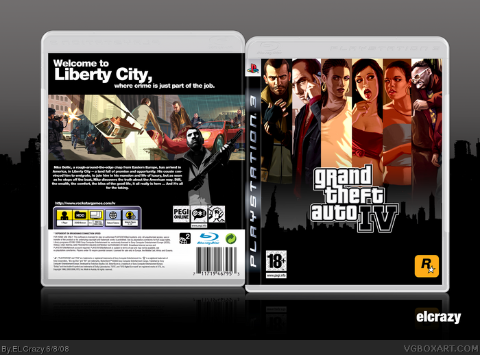
Firstly, as I crack my brain to think of an ultra-controversial box for the finals, I decided to do this.
No doubt that there would be many complaints about this box, especially about the back, but it'll be awesome if you manage to understand what I was going for the back.
For the back, I wanted a simple, yet stylish look, like the official cover and Vengeance's. I thought that the font gave that special touch.
#3, It's Arial Black but with minor adjustments. If you use Photoshop, you should be able to do it. -75 for the tracking of the characters, and a horizontal scale of 95%.
I don't really look at the back as sylish. It's good, but it's just too - dare I say - plain for my liking. The front is a cool concept, but the characters kinda clash with the grey background.
Woah. I really like the style of the box - I think it works really well. One crit I would have is that the guy on the right of the front cover looks odd, and there is other artwork you could've used there.
 Grand Theft Auto IV Box Cover Comments
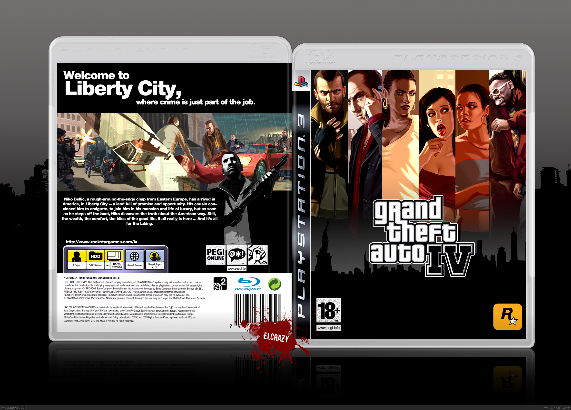
Reuploaded to change something.
This needs an explanation, definitely.
Firstly, as I crack my brain to think of an ultra-controversial box for the finals, I decided to do this.
No doubt that there would be many complaints about this box, especially about the back, but it'll be awesome if you manage to understand what I was going for the back.
For the back, I wanted a simple, yet stylish look, like the official cover and Vengeance's. I thought that the font gave that special touch.
Enjoy! (:
Cred to Sens for temp.
[ Reply ]
I really like the style. I'm glad you uploaded it again with my
suggestion.
[ Reply ]
Nice, 5/5. I dont really like Niko greyscaled at the back, but overall excellent! And #2 did you sort out the problem I PMed you about?
What font did you use for the back text?
Edited at 1 decade ago
[ Reply ]
#3, It's Arial Black but with minor adjustments. If you use Photoshop, you should be able to do it. -75 for the tracking of the characters, and a horizontal scale of 95%.
[ Reply ]
I don't really look at the back as sylish. It's good, but it's just too - dare I say - plain for my liking. The front is a cool concept, but the characters kinda clash with the grey background.
[ Reply ]
no wonder why you are rank 9
[ Reply ]
I really like the front of this box, very original :)
[ Reply ]
The front is really cool but I agree with TTT the colours do clash. The back is simple but good. +fav
[ Reply ]
Faved. My most favorite GTA IV box on the site fer sure.
Edited at 1 decade ago
[ Reply ]
Crazy.
[ Reply ]
That's a brilliant concept. Awesome job. 5/5 +Fav
[ Reply ]
very stylish and simple indeed. great job!
[ Reply ]
Sweet, but why are Mallorie and Lola on a different height level than the others?
[ Reply ]
#13, yeah I had noticed that as well. It looks odd.
[ Reply ]
oo i like te way you did the front :) stands out from the other styles, nice work
[ Reply ]
On the front, you should have put Niko in the middle. I think you could have centered the text on the back too. I think you could have done better.
[ Reply ]
HoF now
[ Reply ]
yay HoF!
thanks guys!
#16, yeah I was thinking of that, but I decided to go with this instead.
[ Reply ]
Woohoo!
[ Reply ]
Fabulous ! Favourite ! :)
[ Reply ]
Love it.
[ Reply ]
Amazing! Really cool! Love the style.
5/5 and fave.
[ Reply ]
Woah. I really like the style of the box - I think it works really well. One crit I would have is that the guy on the right of the front cover looks odd, and there is other artwork you could've used there.
[ Reply ]
This is pretty good +fav
[ Reply ]