I gotta say, I skipped this box looking at the thumbnail of the front on the index (look like every other MGS box out there) but I'm glad you linked me, the back is awesome. If I were to do anything, I'd maybe burn the edges of the note paper on the back and smudge up the text a little.
back is great but the pegis arent very good, look at a real game and compare, the 18, violence and bad language should all be the same size and the pegi.com should be in the middle of thr 3 logos, the front image is overused too, also move the konami logo on the front in a bit 3/5
#15, i mean, the 18 violence and language squares and the website should be placed under the middle pegi square, also, there were 2 boxes with that image, i made one but updated and i saw one but it was blue
#17, Well at least those boxes fronts are actually edited, this is just the cover from the Essential Collection. No editing at all. Back is pretty good though.
 Metal Gear Solid Box Cover Comments
i Wished this was Remade for the ps3....
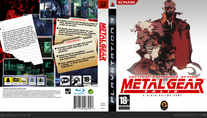
(credit to Sens for the temp)
[ Reply ]
Nice job vidboy. ;)
[ Reply ]
Cool :D
[ Reply ]
looks cool, especialy the back.
[ Reply ]
Ahh... classic metal gear ps1, remade for ps3. this box is great! lol i like ur "metal gear awesome" avatar XP
[ Reply ]
Thanks guys =D
[ Reply ]
I gotta say, I skipped this box looking at the thumbnail of the front on the index (look like every other MGS box out there) but I'm glad you linked me, the back is awesome. If I were to do anything, I'd maybe burn the edges of the note paper on the back and smudge up the text a little.
Edit: I'd also make the photos Polaroids.
Edited at 1 decade ago
[ Reply ]
Nice I think you can add some photo find in thee REVIVAL TRAILER of MGS4 where the action took place in Shadow Moses : link
You can also take some footage from MGS : The Twin Snakes
Good ! :)
[ Reply ]
Back looks great, just update the front to it has more effort. Its just a picture.
[ Reply ]
Thanks guys ^_^
[ Reply ]
Umm isn't that the official MGS1 PSX cover for the back? *checks*
Man, it isn't... I love this box, you've improved alot. Have a mah babies
[ Reply ]
#11, it ain't the offcial cover man =P
Oh yeah guys if you say the front is plain take a look at the offcial front
[ Reply ]
back is great but the pegis arent very good, look at a real game and compare, the 18, violence and bad language should all be the same size and the pegi.com should be in the middle of thr 3 logos, the front image is overused too, also move the konami logo on the front in a bit 3/5
#15, i mean, the 18 violence and language squares and the website should be placed under the middle pegi square, also, there were 2 boxes with that image, i made one but updated and i saw one but it was blue
Edited at 1 decade ago
[ Reply ]
Excellent work.
[ Reply ]
#13, Nah I havent seen anyone used those image's before and the pegi logo's are all the same size's to me but thanks =)
[ Reply ]
link
link
link
link
[ Reply ]
#16, so it has been overused pic... Oh well atleast my box looks nice
[ Reply ]
This needs more attention ^_^
[ Reply ]
i really, REALLY don't like the front.
The back is nice,though ^^:D
[ Reply ]
Nice. Fave'd
[ Reply ]
#17, Well at least those boxes fronts are actually edited, this is just the cover from the Essential Collection. No editing at all. Back is pretty good though.
[ Reply ]