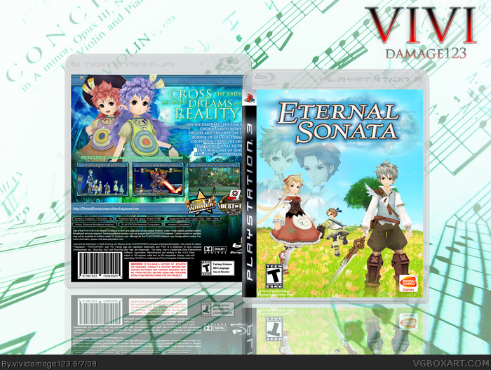
Here's an Eternal Sonata box I went for this boxes theme "Dream and Reality" very much like the game... The front represents reality while the back represents dreams, you can its more mystical while the front is more plain and "lifely" lol its a very serene view... Anyway ENJOY!
#7, I have nothing against low opacity renders, but I don't like where they're placed. And stop bashing people everytime they make a post that you disagree with.
#4- It wasn't so much harsh as it was unconstructive. "Nothing special" and "overused" don't tell Vivi how to improve.
It was merely a criticism instead of a critique.
As for the box, it's very nice. One thing I would change, however, is the blending of the renders on the front. Rather then soft brushing their feet, you should overlay some grass infront of them and adding some subtle shadows to make them look like they're actually standing there. ;)
#8, Bashing? How so? Anyways, I don't want to argue, there have been too many kiddies like you picking fight with me on this site. Just leave it, it's not worth it,
 Eternal Sonata Box Cover Comments
The front is really nothing special. The blended characters don't work there and the art is overused. The back is cool, though.
[ Reply ]
I love the back, but hate the front. And I can't figure out why...seems pretty bland to me.
[ Reply ]
#1, Well your harsh anyway
Here's an Eternal Sonata box I went for this boxes theme "Dream and Reality" very much like the game... The front represents reality while the back represents dreams, you can its more mystical while the front is more plain and "lifely" lol its a very serene view... Anyway ENJOY!
[ Reply ]
#3, how was that harsh?
[ Reply ]
Looks beautiful to me.
[ Reply ]
#5, I really appreciate that, and that you understand how the box was supposed to look
[ Reply ]
#1, I...I just wouldn't take about low-opacity renders on front covers if I were you...
link
link
link
link
link
link
....ridiculous. Anyways, this is awesomely done. The back is beautiful, but the renders on the front seem a little haphazardly placed.
[ Reply ]
#7, I have nothing against low opacity renders, but I don't like where they're placed. And stop bashing people everytime they make a post that you disagree with.
[ Reply ]
#4- It wasn't so much harsh as it was unconstructive. "Nothing special" and "overused" don't tell Vivi how to improve.
It was merely a criticism instead of a critique.
As for the box, it's very nice. One thing I would change, however, is the blending of the renders on the front. Rather then soft brushing their feet, you should overlay some grass infront of them and adding some subtle shadows to make them look like they're actually standing there. ;)
[ Reply ]
#9, I said it's nothing special then told why. And by telling him that it's overused I'm telling him to use different images.
[ Reply ]
pretty good
i really want this game.
[ Reply ]
#8, Bashing? How so? Anyways, I don't want to argue, there have been too many kiddies like you picking fight with me on this site. Just leave it, it's not worth it,
[ Reply ]
Holy crap! That's Concerto in A Minor in the background!
Lol.
[/music nerd]
[edit] I love how it says "VIOLIN is cock"
Edited at 1 decade ago
[ Reply ]
The front is nice, but its been seen before ya know, the back is where is at ;D
[ Reply ]
I think it looks good, and I agree with Shady.
[ Reply ]
Intresting all my boxes go in a pattern one box gets attention then the next gets none then the next gets some (hahah pretty sweet!)
Thanks I guess... I just wanted more of a beauitiful setting instead of the average crazy battle RPG fronts but thanks everyone!
[ Reply ]