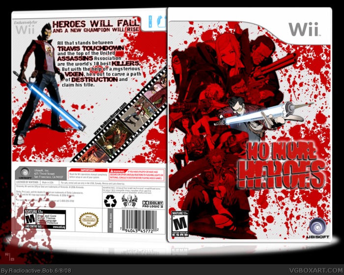
i personally LOVE the back, great job there mate.. allthough--the front is a bit vague,with the red characters. Perhaps try using their original colors, or tone the red a tad?
Nonetheless, an amazing box--well worth of my fav.
And Ayron, as for the characters on the front, i wanted Travis to stand out from them, so thats why i did that to their colors.
I might go back and tone down the contrast or something though. ;)
Oh, and about the outerglow on the logo;
It's extremely hard to see without it.
Sweet, as for the blood, it looks fine. After all the game itself has crazy amounts of blood i like (i too understand the problem with the outer glow, but if you lower the radius of the glow you will get a nice white outline.)
+fav
I agree with what other have said here, way too much blood splatter, to some degree it may have been a bit cool, but not now, the outer glow for the logo should probably be toned down a bit or just put a 1 or 2px white stroke on it. also the font choice for the back doesn't really fit. The box is still pretty appealing though, so nice job.
#10, thanks, i was debating between all the blood, but in the end i liked it more with it, since the game is one of the goriest out there. It looked to empty without it, as well. But opinions are opinions, lol.
Nice job, the character placement is stylish. I don't like the edited NMH logo because of the filters/layer effects on it. I preferred the original and plainer logo, I don't mind the outer glow though. A list of features on the back should be a neat addition.
and as well on your temp,
in the back were the warning is u might want
to read it next time before posting
it read as so
"WARNING:any unauthorized technical
midifications to your wii console may
render this game unplayable and
cause bladder disfunction"
bladder disfunction ?? really u might want to
remove that next time =]
 No More Heroes Box Cover Comments
Hope you like it. :)
[ Reply ]
nice, love the red
Edited at 1 decade ago
[ Reply ]
well...
- i dont really like the outer glow on the logo
-the back leaves me wanting for more
-and the blood splater was a little over used
3.5/5
but good job
Edited at 1 decade ago
[ Reply ]
thanks for the feedback and favs everyone.
[ Reply ]
not my faviroute from you? and the blood is a bit over used. tone down the outer glow on the logo! other than that nice job woohoo :)
[ Reply ]
i personally LOVE the back, great job there mate.. allthough--the front is a bit vague,with the red characters. Perhaps try using their original colors, or tone the red a tad?
Nonetheless, an amazing box--well worth of my fav.
[ Reply ]
Thanks for the comments. :)
And Ayron, as for the characters on the front, i wanted Travis to stand out from them, so thats why i did that to their colors.
I might go back and tone down the contrast or something though. ;)
Oh, and about the outerglow on the logo;
It's extremely hard to see without it.
Edited at 1 decade ago
[ Reply ]
Sweet, as for the blood, it looks fine. After all the game itself has crazy amounts of blood i like (i too understand the problem with the outer glow, but if you lower the radius of the glow you will get a nice white outline.)
+fav
[ Reply ]
Nice shit! really! I like it a lot!!!!
Edited at 1 decade ago
[ Reply ]
I agree with what other have said here, way too much blood splatter, to some degree it may have been a bit cool, but not now, the outer glow for the logo should probably be toned down a bit or just put a 1 or 2px white stroke on it. also the font choice for the back doesn't really fit. The box is still pretty appealing though, so nice job.
[ Reply ]
Hey, Michael, I want teh brushez! Nao.
[ Reply ]
#10, thanks, i was debating between all the blood, but in the end i liked it more with it, since the game is one of the goriest out there. It looked to empty without it, as well. But opinions are opinions, lol.
#11, i don't use brushes. xD
[ Reply ]
Nice job, the character placement is stylish. I don't like the edited NMH logo because of the filters/layer effects on it. I preferred the original and plainer logo, I don't mind the outer glow though. A list of features on the back should be a neat addition.
[ Reply ]
and as well on your temp,
in the back were the warning is u might want
to read it next time before posting
it read as so
"WARNING:any unauthorized technical
midifications to your wii console may
render this game unplayable and
cause bladder disfunction"
bladder disfunction ?? really u might want to
remove that next time =]
Edited at 1 decade ago
[ Reply ]
#13, thanks, i'm glad someone noted the character placement. :)
#14, Oh, i knew that was there....I'm the one that wrote it. xD
Edited at 1 decade ago
[ Reply ]
#15, oh lol had your own littile joke huh =P
funny
[ Reply ]
Bad-ass.
[ Reply ]
#16, yup, a little easter egg if you will. :P
#17, thanks dude. :D
and thanks for all the favs guys, i appreciate it.
[ Reply ]
great job
[ Reply ]