i mean, it's not awful, but it's way too similar to the official (like, the only difference is the cops in the bottom right corner, and Little Jacob in the left looks a bit off) but all the contrast and lighting looks weird. Lola has yellow skin, Niko's face is too bright on the one side, the motorbike seems to be normal but the helicopter and the guy on the phone are all in different art styles... it just looks messy.
All of a sudden lolipop girl looks unatractive... NO more looking at her, the color schemeing is alright but like #4 said its just similar and weird...
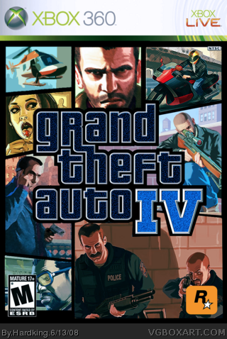
 Grand Theft Auto IV Box Cover Comments
lol what's up with the colours...
[ Reply ]
do you don't like it? i am not a superstar in colormanagement, and it's my first cover, so...
Edited at 1 decade ago
[ Reply ]
you have too see it from a high distance, then it looks good in my mind
[ Reply ]
i mean, it's not awful, but it's way too similar to the official (like, the only difference is the cops in the bottom right corner, and Little Jacob in the left looks a bit off) but all the contrast and lighting looks weird. Lola has yellow skin, Niko's face is too bright on the one side, the motorbike seems to be normal but the helicopter and the guy on the phone are all in different art styles... it just looks messy.
[ Reply ]
All of a sudden lolipop girl looks unatractive... NO more looking at her, the color schemeing is alright but like #4 said its just similar and weird...
Eh dont get bent outa shape its alright dood.
[ Reply ]