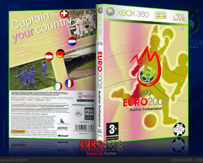
As i've been following the euro '08 tournament, i just HAD to do this box.
Printable is available, ofcourse.
Thanks to everyone in my WIP thread for feedback/encouragement/criticism ^^
Hope you all like it ^^
YAY! You followed my advice and put The Netherlands on the back ^_^
But to be honest, even if you didnt, I still would of faved because it looks great and Euro 2008 is brilliant this year =D
I doubt this game would be Xbox 360 Only but meh, just a minor flaw 4.5/5
I think it's bad. I don't like the color scheme, pink and yellow colors aren't really suitable. I suggest you do more to make the bright description text stand out on the bright background.
In full size, you can see that the Euro logo is quite choppy, the silhouettes look odd, for example the football on top of someone's hand. Instead of just the gradients, can you use something more interesting? I hope you don't take offense.
#5, i was going for a simple look, and i believe that the football on top of the front silhouette's hand doesn't look too odd, if at all, it gives depth.
I'm not taking this offense,though i do believe that some of the criticism is a bit far-fetched.
But, it might just be my own taste, but i personally like the background [pink/yellow]....
Thanks for the criticism though, i'll try not to be this radical with colors/gradients next time.
It looks like an Easter color scheme thingy. I agree with E_G and the back tagline is really boring. I do like what you were aiming for, but the execution isn't very good. :/
I agree with E_G, a little disappointing. :/
Minor suggestion - Also, the EA logo doesn't really look like a soccer ball. Make them black hexagons instead of spots.
 Euro 2008 Box Cover Comments
As i've been following the euro '08 tournament, i just HAD to do this box.
Printable is available, ofcourse.
Thanks to everyone in my WIP thread for feedback/encouragement/criticism ^^
Hope you all like it ^^
-Ayron
[ Reply ]
YAY! You followed my advice and put The Netherlands on the back ^_^
But to be honest, even if you didnt, I still would of faved because it looks great and Euro 2008 is brilliant this year =D
I doubt this game would be Xbox 360 Only but meh, just a minor flaw 4.5/5
Edited at 1 decade ago
[ Reply ]
omgomgomg best box ever! 5/5 fave!
should be in HoF
sincerely A_Masta
[ Reply ]
Very nice, Very nice indeed
[ Reply ]
I think it's bad. I don't like the color scheme, pink and yellow colors aren't really suitable. I suggest you do more to make the bright description text stand out on the bright background.
In full size, you can see that the Euro logo is quite choppy, the silhouettes look odd, for example the football on top of someone's hand. Instead of just the gradients, can you use something more interesting? I hope you don't take offense.
[ Reply ]
#5, i was going for a simple look, and i believe that the football on top of the front silhouette's hand doesn't look too odd, if at all, it gives depth.
I'm not taking this offense,though i do believe that some of the criticism is a bit far-fetched.
But, it might just be my own taste, but i personally like the background [pink/yellow]....
Thanks for the criticism though, i'll try not to be this radical with colors/gradients next time.
[ Reply ]
Honestly, I agree with E_G, although I really think you have a great sense of style.
[ Reply ]
I agree with E_G a little. I still think it looks great.
[ Reply ]
It looks like an Easter color scheme thingy. I agree with E_G and the back tagline is really boring. I do like what you were aiming for, but the execution isn't very good. :/
[ Reply ]
Brilliant.
I disagree with E_G about the colours; I think they look really cool and catch the eye
However the back kinda Looks plain and the font choice isn't so good.
Overall, it's good, but not your best.. 4/5
[ Reply ]
That's great. But not your best. But I love it! Good job putting the Swiss flag on the back, as well... ;)
[ Reply ]
It looks...weird. I have to agree with most of the people..
[ Reply ]
I agree with E_G, a little disappointing. :/
Minor suggestion - Also, the EA logo doesn't really look like a soccer ball. Make them black hexagons instead of spots.
[ Reply ]
The back seems really empty, although it flows quite nicley and is pretty great.
[ Reply ]
the ea logo looks bad
[ Reply ]
I think another player on the left for the front would complete it, that blank space seems a little odd.
[ Reply ]
huh! No Portugal Flag AhhGGGGhhh!!! (pulls hair) :D
The box is quite good. Not your best though. I think you should change the colour scheme and the back needs a little more work. Anyway..Ill fav :D
[ Reply ]
I agree with EG. Not your best. (sorry!)
[ Reply ]