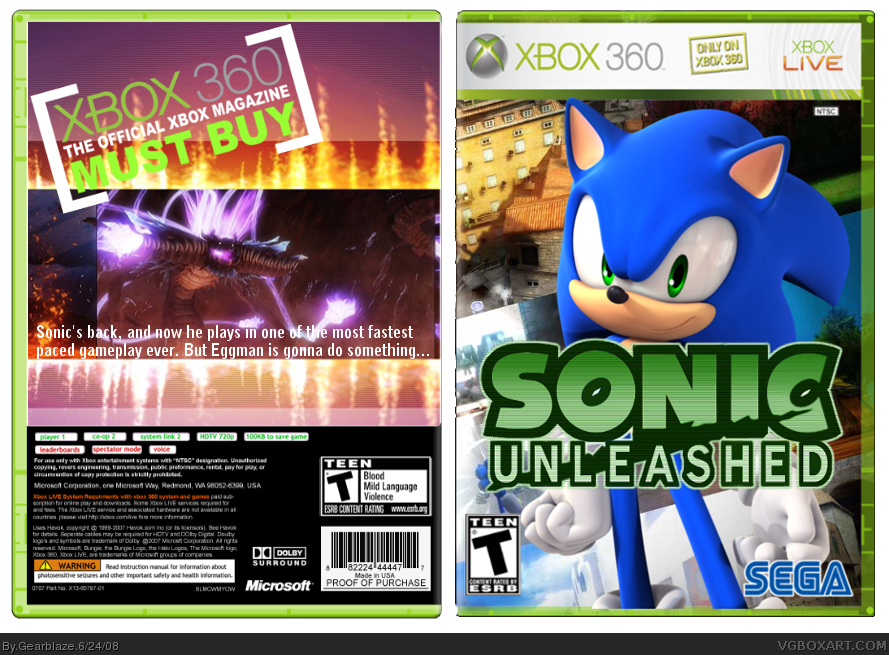
There are grammatical errors on the back, such as "most fasted paced".
Try and change that to "now he plays in an all new fast-paced style of gameplay". Otherwise it's quite nice. 4/5
Front pwns, except for the Sonic render that kills it. Back needs a lot of work. Get frames for the pics, more accurate realistic description, and it's way too bland. 3/5
I think I just threw up a little bit in my mouth. D:
I'm sorry, but this is just terrible. The whole thing looks like it was done in Paint. Just get rid of the back and change the logo's color back to it's original scheme.
The front is acceptable. It looks nice, nothing really wrong with it, maybe the game would be rated E or E+10 but thats not really a flaw. The back though, just totally kills it. The Xbox 360 Must Buy thing is HUGE and not needed. The description is badly placed and the grammar is terrible. I mean you wrote "Sonic's Back" which is assuming your talking about his actual back? Also the screenshot layout is madness.
Front: 3/5 Good effort
Back: 0/5 Nothing to like about it whatsoever

 Sonic Unleashed Box Cover Comments
New box :) Credit to Techne for the temp
First box with a back
[ Reply ]
There are grammatical errors on the back, such as "most fasted paced".
Try and change that to "now he plays in an all new fast-paced style of gameplay". Otherwise it's quite nice. 4/5
[ Reply ]
Front pwns, except for the Sonic render that kills it. Back needs a lot of work. Get frames for the pics, more accurate realistic description, and it's way too bland. 3/5
[ Reply ]
I think I just threw up a little bit in my mouth. D:
I'm sorry, but this is just terrible. The whole thing looks like it was done in Paint. Just get rid of the back and change the logo's color back to it's original scheme.
[ Reply ]
#4 C'mon, it isn't that bad...
[ Reply ]
#3, If the render wasn't there it'd be too plain, but I see what ya mean.
#4, God, get a grip. You didn't even point out what's wrong with it.
[ Reply ]
Hey, your Redhedd right?
[ Reply ]
The front is acceptable. It looks nice, nothing really wrong with it, maybe the game would be rated E or E+10 but thats not really a flaw. The back though, just totally kills it. The Xbox 360 Must Buy thing is HUGE and not needed. The description is badly placed and the grammar is terrible. I mean you wrote "Sonic's Back" which is assuming your talking about his actual back? Also the screenshot layout is madness.
Front: 3/5 Good effort
Back: 0/5 Nothing to like about it whatsoever
[ Reply ]
#7, Yeah.
#8, Should I delete the back?
Edited at 1 decade ago
[ Reply ]
i like it. 4/5
[ Reply ]
Updated!
[ Reply ]
Woah! Redhedd you have improved. +fav
[ Reply ]
i like, fav.
[ Reply ]
Looks very good. The background is the main part that grabs my attention. Very good.
[ Reply ]
This was just asking for an update.
Hope it looks better :)
[ Reply ]
All you did was change the background presentation..
[ Reply ]
#16, Well, I actually got rid of the "only for Xbox 360" tag and fixed the bleeding. But that too...
[ Reply ]