I agree with #1 completly.
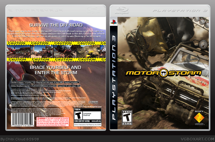
The front is nice, cant see anything wrong with it. The back just kills the box IMO. The background is boring, the text is boring, and those Caution Line things look really bad. 2.5/5
#1, damn you! Ha ha ha. You're quick! Thanks for the opinion, XCore! But bear in mind that this box was done in paint, again...! ;)
So yeah, my thirteenth box. Enjoy guys. Comments, criticisms, feedback, opinions, ratings and suggestions are always welcome. From now on, if someone gives me criticism, I'm going to accept it instead of fighting back (like I did in the past). Everyone is entitled to their own opinion. I can't change that. Looking back now, I can't believe how cocky and naive I was. If Naruto was here right now, he'd probably punch me in the face and yell out, "Believe it!" =D I'm sorry guys. Please forgive me. I've learned my lesson. You'll see a completely new difference in me. By the way, I know I said I would be leaving, but I changed my mind. This site is just too addicting! And TheSlyder, I'm glad you proved me wrong. I WAS looking for attention in my leaving thread. It's human nature, like you said. I can't just deny it.
Credit goes to WickedGamer1 for his awesome, kick-ass template. I can't stop using it! Whatever happened to that guy anyway? He's barely active.
#2, hm, that's weird. I thought people would've liked the yellow caution strip. I originally had planned in submitting the box without the back, but I thought it needed more. Should I just update this box with the front only?
 Motorstorm Box Cover Comments
Beat you to first!!
The front is superb, no flaws, but the back is very bland and a bit weird. 3/5
Edited at 1 decade ago
[ Reply ]
I agree with #1 completly.
The front is nice, cant see anything wrong with it. The back just kills the box IMO. The background is boring, the text is boring, and those Caution Line things look really bad. 2.5/5
[ Reply ]
#1, damn you! Ha ha ha. You're quick! Thanks for the opinion, XCore! But bear in mind that this box was done in paint, again...! ;)
So yeah, my thirteenth box. Enjoy guys. Comments, criticisms, feedback, opinions, ratings and suggestions are always welcome. From now on, if someone gives me criticism, I'm going to accept it instead of fighting back (like I did in the past). Everyone is entitled to their own opinion. I can't change that. Looking back now, I can't believe how cocky and naive I was. If Naruto was here right now, he'd probably punch me in the face and yell out, "Believe it!" =D I'm sorry guys. Please forgive me. I've learned my lesson. You'll see a completely new difference in me. By the way, I know I said I would be leaving, but I changed my mind. This site is just too addicting! And TheSlyder, I'm glad you proved me wrong. I WAS looking for attention in my leaving thread. It's human nature, like you said. I can't just deny it.
Credit goes to WickedGamer1 for his awesome, kick-ass template. I can't stop using it! Whatever happened to that guy anyway? He's barely active.
[ Reply ]
#2, hm, that's weird. I thought people would've liked the yellow caution strip. I originally had planned in submitting the box without the back, but I thought it needed more. Should I just update this box with the front only?
[ Reply ]
Personally I like it. fav
[ Reply ]
#2, Dang Cer, you're harsh!
This was done is paint?
[ Reply ]
#6, yeah. Even the logo was cut out in that program.
[ Reply ]
#7, Thought you had Photoshop now...?
[ Reply ]
#8, stupid trial ran out. :(
[ Reply ]
#9 WHy not get GIMP?
[ Reply ]
#10, I'm more used to photoshop than I am with GIMP. Oh well. Just forget about it now.
Edited at 1 decade ago
[ Reply ]
Get rid of the back sompletley. I would fav if front only.
[ Reply ]
#12, is it really that bad? :(
[ Reply ]
Honestly, i like the back :)
its one of your best boxes! +fav
Edited at 1 decade ago
[ Reply ]
You know what, if you guys don't like the back, then fine. The next time this happens, I won't be this opened minded about criticisms again.
Edited at 1 decade ago
[ Reply ]
#15, Do whatever you want. It's your box, but promise us one thing...THAT YOU'LL NEVER BUMP YOUR BOXES WITH SOMETHING AS POINTLESS AS THAT AGAIN.
[ Reply ]