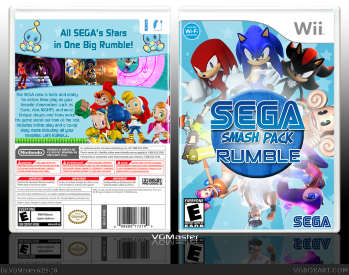
Eggboy made a thread wondering if a SEGA smash game could ever happen. Cerium said they didn't have enough popular characters. So I listed off 25. He said they wouldn't work and then I decided to make this box cuz I think it could work "if SEGA was lame enough to steal Nintendos idea" (Quote Buddyboy). I made this an unofficial box with a bit of humor in the idea and in the summary on the back.
About the logo: I see SEGA as the crazy, eye-popping, flashy kinds of producers. So I tried to make a logo based off that theory. Plus I didn't know what to do for the logo and tried something random and went with it. And 'Rumble' is not a subtitle. It's just part of the name (unlike Super Smash Bros BRAWL).
Credit to Koops for the RUMBLE logo and template and PlanetRenders for some of the renders and credit to Ninty for Billy's Gang/
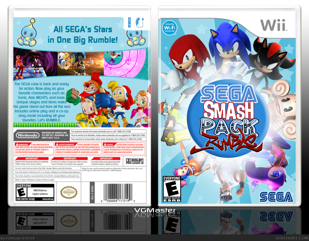
I thought the original logo had a more creative/messy feel to it but in a good way? The new logo is good too but it seems a bit boring in comparison. Maybe you could make the "Smash Pack" bit red?
this is tight, but isn't smash pack suppos to be full fo games not a brawl type game, o well this is still aswome mabey mario is in it like brawl,hmmmmm
 SEGA Smash Pack Rumble Box Cover Comments
Okay so here's what's up.
Eggboy made a thread wondering if a SEGA smash game could ever happen. Cerium said they didn't have enough popular characters. So I listed off 25. He said they wouldn't work and then I decided to make this box cuz I think it could work "if SEGA was lame enough to steal Nintendos idea" (Quote Buddyboy). I made this an unofficial box with a bit of humor in the idea and in the summary on the back.
About the logo: I see SEGA as the crazy, eye-popping, flashy kinds of producers. So I tried to make a logo based off that theory. Plus I didn't know what to do for the logo and tried something random and went with it. And 'Rumble' is not a subtitle. It's just part of the name (unlike Super Smash Bros BRAWL).
Credit to Koops for the RUMBLE logo and template and PlanetRenders for some of the renders and credit to Ninty for Billy's Gang/
C and C welcomed. Thanx.
Edited at 1 decade ago
[ Reply ]
as i said on im the only problem i have is with the logo but this is still worth a fav
[ Reply ]
I love it when somebody proves me wrong =D
Awesome box VGMaster!! 5/5 +fav
[ Reply ]
I don't like that outer glow on the circle, but other than that, it's not bad. Great work.
[ Reply ]
#2, Thanks
#3, I tried really hard.
#4, that originally wasn't there, but then I added it and when I looked at it without it, it looked weird.
Edited at 1 decade ago
[ Reply ]
Nice job, bro! But the "Pack" part of the title makes it seem like it's part of a bundle or something lol...
Still, fav.
[ Reply ]
OOOhhh was that Billy Hatcher Render from PR ?
it might be mine ;)
anyway i love this !
5/5 fav+
[ Reply ]
It's rubbish, no Shenmue. Seriously good job, suits Sega's style
[ Reply ]
#6, Pack is another word for group
#7, why yes it is! Thanks!
#8, thanks man.
Edited at 1 decade ago
[ Reply ]
where did that knuckles renders come frmom?
fav
[ Reply ]
not in love with the logo but other than that the is sweeet
[ Reply ]
Crap, I wanted to do this... ah well. Hate the logo, but the rest is cool.
[ Reply ]
the logo is ugly and the name sounds stupid, but this box looks pretty cool.
[ Reply ]
#10, Planet Renders
#11,12,13, I tried.
If someone wants to try making a new logo, feel free. Credit will be given.
[ Reply ]
can i try with the logo?
with or without the circle??
Edited at 1 decade ago
[ Reply ]
#15, go ahead. Please.
It'd be best if it's able to go over the circle. Thanks.
Edited at 1 decade ago
[ Reply ]
#16, Well, I kinda just made this one for fun and made it more the way I like it...http://img294.imageshack.us/img294/2974/srlogomv8.png
I know you probably can't use it because it doesn't say "Smash Pack" on it. >_>
[ Reply ]
link satisfied?? all you have to do is cut it.
Edited at 1 decade ago
[ Reply ]
#18, Very! I love it! Thanks so much!
[ Reply ]
awesome. Its kinda like my "crappy" SEGA box.
[ Reply ]
#18, Why didn't you give it a transparent background? Also, what font did you use for the "Rumble" part? :P
[ Reply ]
Updated with Hsoldier's fantastic logo!
#20, they look nothing alike...
#22, it's fine. Only problem was that I couldn't get the shadows outside of the circle.
Edited at 1 decade ago
[ Reply ]
#21, couldnt be arsed. :P the fonts called zeroes one for some stupid reason ? :S
[ Reply ]
Love it.
[ Reply ]
I thought the original logo had a more creative/messy feel to it but in a good way? The new logo is good too but it seems a bit boring in comparison. Maybe you could make the "Smash Pack" bit red?
[ Reply ]
I can't do anything to it. He's got the PSD or whatever.
[ Reply ]
Really sweet dude. Very creative. ;)
[ Reply ]
#27, Thanks LK!
and thanks E_G, Trev, Techne, and Sockey for the faves. I know it must be pretty good now!
[ Reply ]
#22, T_T. nvm. nice HOF.
[ Reply ]
Sweeeeeeet.
Thanks for the Hall guys! I feel back in the groove again!
[ Reply ]
Looks awesome VGmaster.
Congrats on the HoF
=D
[ Reply ]
Nice!!!
[ Reply ]
WOWOWOW!
This is awesome!
[ Reply ]
Very awesome.
[ Reply ]
I like it, it's just not amazingly exceptional
[ Reply ]
this is tight, but isn't smash pack suppos to be full fo games not a brawl type game, o well this is still aswome mabey mario is in it like brawl,hmmmmm
[ Reply ]
i would defently buy that, as long as it has enough charecters!!
[ Reply ]
this is worth a buy
[ Reply ]
Oh wow, I feel so special! :P
[ Reply ]