![]() »
»
[ Box updated on July 2nd, 2008 ] [ original ]
 Pirates of the Caribbean: At World's End Box Cover Comments
Comment on numerobetically's Pirates of the Caribbean: At World's End Box Art / Cover.
Very Very Nice.
[ Reply ]
*Sigh* And here it comes to an end.
I have recently come to the realization that there aren't enough hours in the day. So this may very well be my last box. At least for a while, unless my life stops going too fast.
Comments are, of course, welcomed, and so are critques, if you must =P.
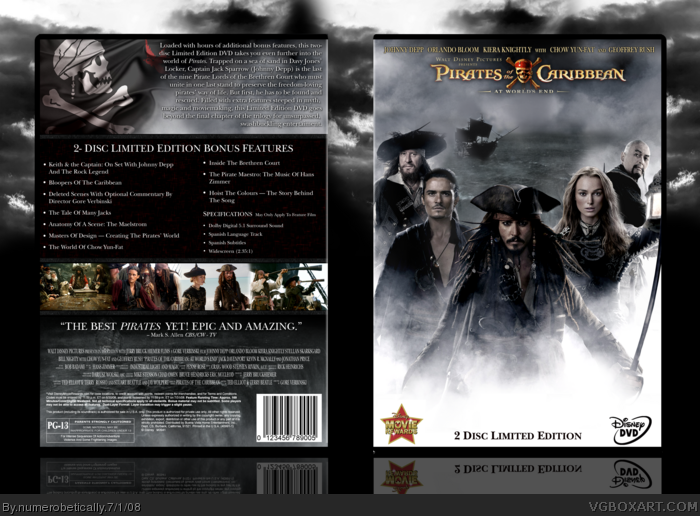
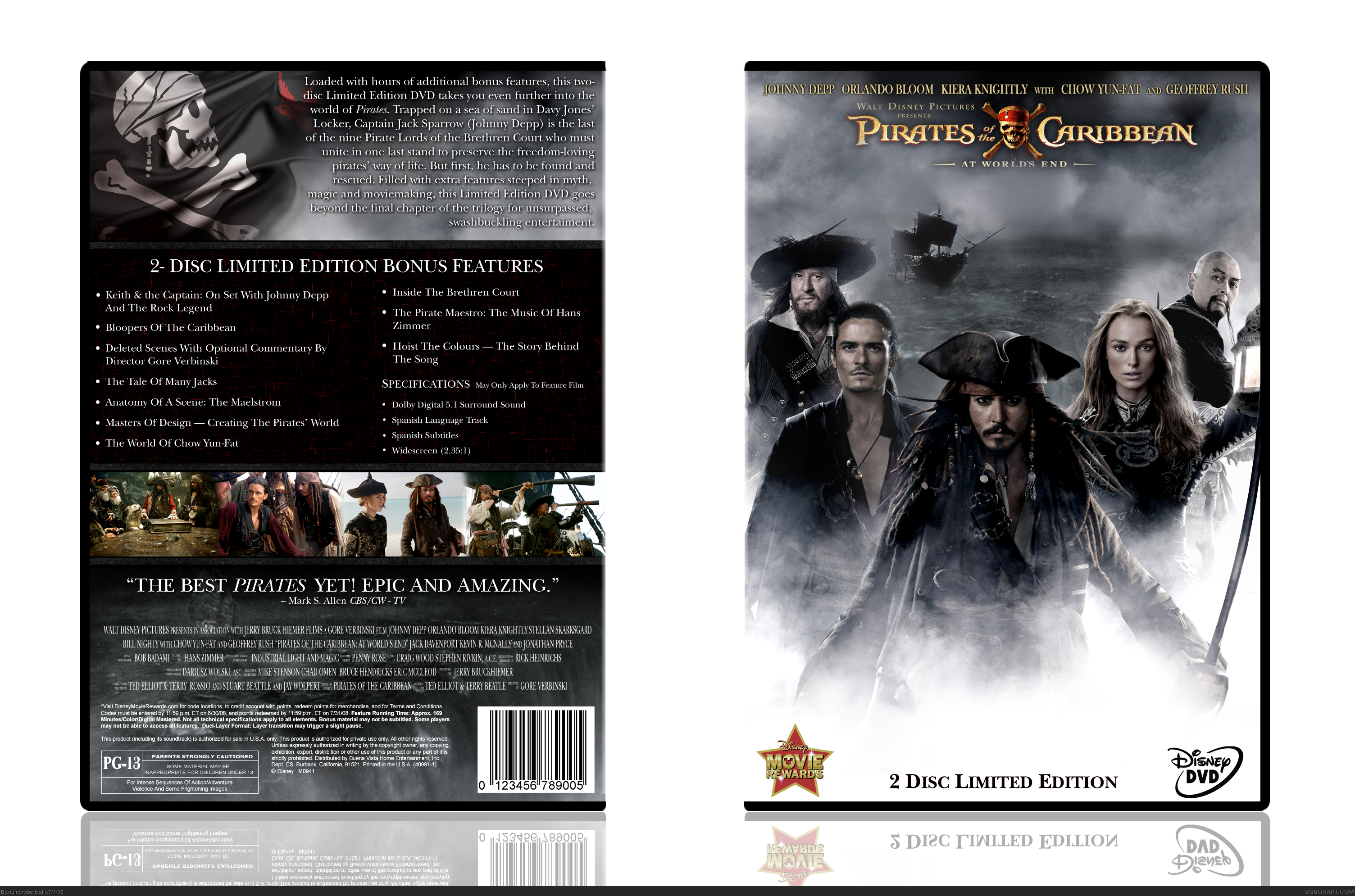
My temp, my effects, my textures, my screenboarders... everything except the actual characters/logos and the cool looking flag on the back is mine, and I actually typed out all the back information out myself.
Edited at 1 decade ago
[ Reply ]
Its nice, the back is very official looking.
Im just not feeling the front too much, not quite sure why, the logo could be bigger too.
Dont get me wrong, its a good box indeed, very well made but just not one of my favourites of yours 4/5
[ Reply ]
Logo on the front seems way too high up and small. The box isn't bad but it doesn't blow me away.
[ Reply ]
Umm....yes, I am having some problems. I don't know why I uploaded the box twice, and then deleted one, which I didn't mean to do, I meant to get rid of the other. Obviously I can't be trusted to do two things at once.. haha *embarassed*
Anyway, this is the version I want you to see.
[ Reply ]
#5 Sorry but whats the difference between version 1 and 2? >.>
I bet its really obvious and im just an idiot hahaha
I am really tired in my defence though =)
[ Reply ]
The background :) And there was a hideous white line at the top of the template. You can't see it in the full version but trust me it's there.
Edited at 1 decade ago
[ Reply ]
Im not a fan of the back too much but I love the overall design! The front amazing just like I said in the WIP enough said
[ Reply ]
I modeled the back after the official. Except I made it better haha.
[ Reply ]
Looks Pro!
[ Reply ]
It sucks. What a lame finish, Nikki.
wahahahaha! lol :]
[ Reply ]
i like it
[ Reply ]
#11 Omg lol. Coming from you, that means a lot =P
[ Reply ]
Looks great... especially all the info on the back. Still prefer a slight lowered title, and maybe a map or something behind the features list... but overall -- great job there, Nikki -- Top marks :)
[ Reply ]
Cya later mate.
[ Reply ]
#13, haha. But seriously, it looks amazing and very official. If I had the dvd, I'd print this out and use it. (If you add a printable version that is) :D
[ Reply ]
#16 I'm planning on it.
[ Reply ]
Okay I added the printable. Enjoy :)
[ Reply ]
thats pretty cool.. looks nice.. 5/5 +fav
[ Reply ]
i must say, that is astonashing!!!
+Fav.
[ Reply ]
Good job on the hall! And good job on the box. ;)
[ Reply ]