This is really good for a first box.
However the screenshots on the back could have a frame, (I know this isn't your fault) the company logo isn't good I wish they'd redesign it.
Again all that aside it is a really good box. Keep up the good work and I'm sure you can be a popular artist.
Its great dude, I'm really looking forward to this game, if this game doesnt flop it can set a new standard for Wii games. (and the online is going to own I mean headsets?! woo!)
I think you should add a little more blue and greenish tone and slightly increase the contrast. Then I think it deserves Hall of Fame. It's a great box.
 The Conduit Box Cover Comments
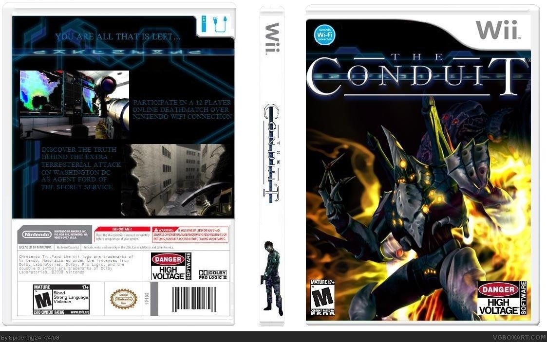
This is my first box, I hope you like it.
[ Reply ]
you did a good job.
[ Reply ]
This is really good for a first box.
However the screenshots on the back could have a frame, (I know this isn't your fault) the company logo isn't good I wish they'd redesign it.
Again all that aside it is a really good box. Keep up the good work and I'm sure you can be a popular artist.
[ Reply ]
#2, #3 thanks for the comments I will probably update it with frames around the screenshots.
[ Reply ]
Its great dude, I'm really looking forward to this game, if this game doesnt flop it can set a new standard for Wii games. (and the online is going to own I mean headsets?! woo!)
4/5
[ Reply ]
This game does look great. Kind of reminds of a Wii version of Halo. As for the box...well.....it's great too! 8/10, nicely done!
[ Reply ]
I updated the back.
[ Reply ]
still looks cool.
[ Reply ]
great dude! BTW sega has been confirmed as publisher+ wii speak at back 8/10 !!!
[ Reply ]
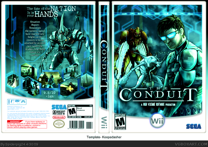
I wanted to update this old box of mine so here it is. Credit to KoopaDasher for the template. Let me know what you think of it.
[ Reply ]
Update, I added some screens and the "9.5/10" to it. I also fixed the rating on the back.
[ Reply ]
Wow! This is pretty awesome!! And it was your first? Great job! Personally I feel a slight bluish green tone would look great.
link
What do you think of something like that?
Edited at 1 decade ago
[ Reply ]
#12, Thanks, I think the bluish green tone makes it look really good.
[ Reply ]
Sorry for the double post, but I liked YoshiStars idea a lot so I decided to add a bluish green overlay to it.
[ Reply ]
I think you should use the official template, KD's template needs work in my opinion.
[ Reply ]
I think you should add a little more blue and greenish tone and slightly increase the contrast. Then I think it deserves Hall of Fame. It's a great box.
[ Reply ]
Thanks YoshiStar, I updated it with a higher contrast and I added another bluish green overlay.
@MF29, I would've switched Koopa's template with the official but I don't have the PDN file for this box anymore, so I couldn't really change it.
Edited at 1 decade ago
[ Reply ]
cool update...
[ Reply ]