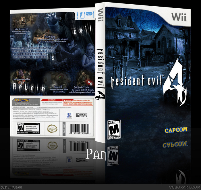
This was mostly experimental, I might make another RE4 box some other time. The front isn't the best quality because I did this at 300 DPI when I probably shouldn't have.
I used concept art and the official art to make the front. I also made the logo read "Resident Evil 4" instead of "4 Resident Evil.
I wanted the front to look simple, and the back to look complex, made it a bit chaotic though. Overall I think it came out pretty decent.
The 4 on the spine is cut. I think with official WII games the title is in basic font to prevent this. Idk. You should hang on to a box and check it for mistakes before posting. My templates have the ESRB on it all ready so that I don't worry about.
#15, You have to plug the GC controller in, and then unplug your nun-chuck or classic controller I believe. I'm not sure about the Pal version, but that's how you do it in the NTSC one.
#20, That this box was gonna be FREAKING AMAZING! Dude, it's awesome, I hate the fact that there are people with boxes in the Hall that are nowhere near as good as this.
Thanks people, feels nice to be above rank 5 :3. I just printed this out(not on gloss paper though) and it doesn't look too bad, hope it works this well on the right paper.
Sorry but I really don't like this. The blending on the back is horrendously bad and the whole thing is pixelated. The screen shots look terrible and the typography on the back is bad as well.
 Resident Evil 4: Wii Edition Box Cover Comments
Don't ignore me! ><
This was mostly experimental, I might make another RE4 box some other time. The front isn't the best quality because I did this at 300 DPI when I probably shouldn't have.
I used concept art and the official art to make the front. I also made the logo read "Resident Evil 4" instead of "4 Resident Evil.
I wanted the front to look simple, and the back to look complex, made it a bit chaotic though. Overall I think it came out pretty decent.
Edited at 1 decade ago
[ Reply ]
I really like it!
[ Reply ]
really good
[ Reply ]
Edited at 1 decade ago
[ Reply ]
ESRB and the Nintendo logo?
The 4 on the spine is cut. I think with official WII games the title is in basic font to prevent this. Idk. You should hang on to a box and check it for mistakes before posting. My templates have the ESRB on it all ready so that I don't worry about.
Edited at 1 decade ago
[ Reply ]
I don't like the description font, and the front is boring and blurry. Maybe add Leon? Back is awesome, still.
[ Reply ]
#5, Oh jesum christ! Thanks for telling me I forgot the ESRB, I seriously didn't notice. ><
Also, #6 I wanted the front to look empty, and I explained why it's blurry.
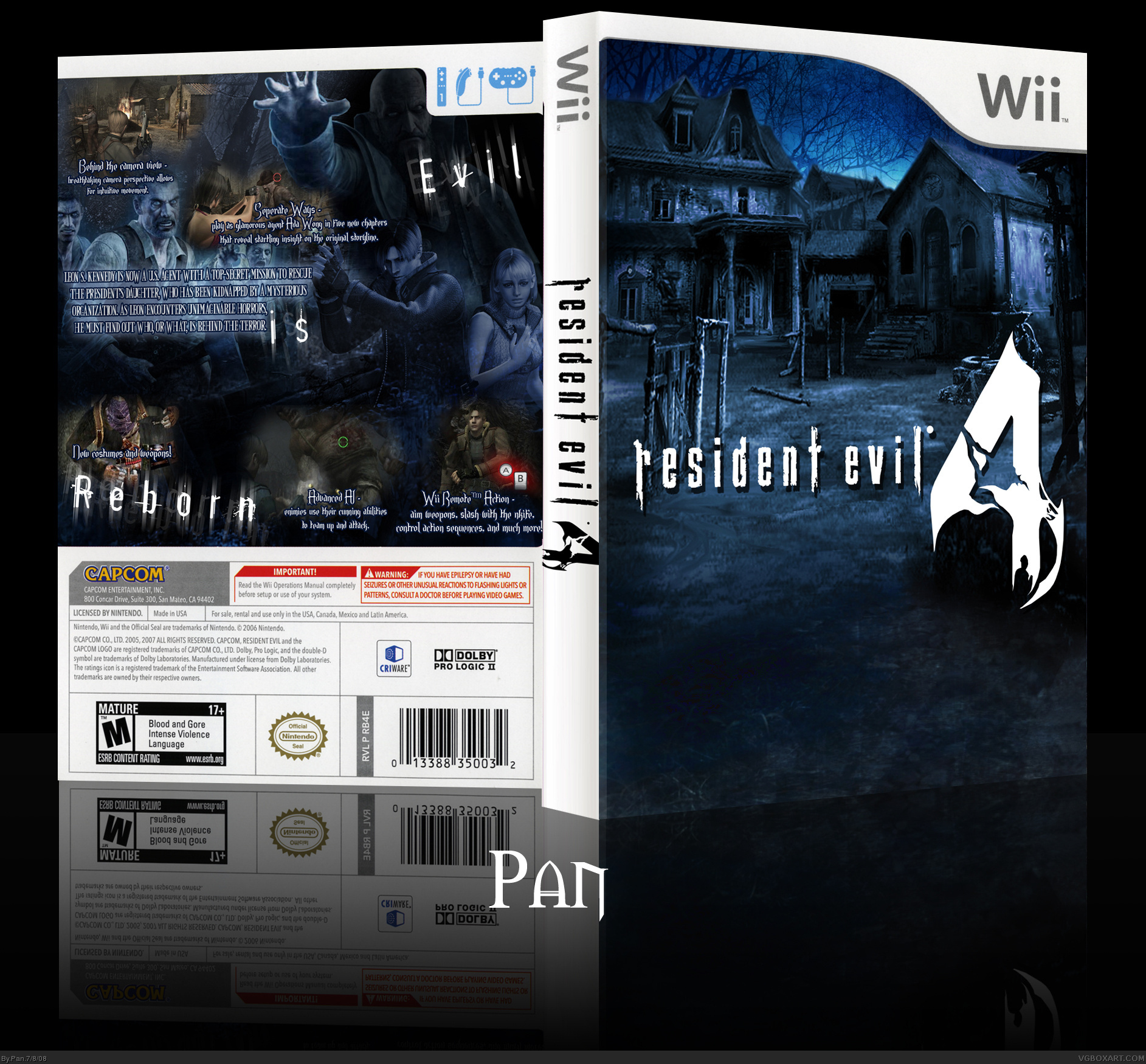
OK, ok, version 2. Dev logo and ESRB are there.
Edited at 1 decade ago
[ Reply ]
#7, Much better lol.
[ Reply ]
Looks Beaute.
[ Reply ]
That is awesome! +fav
[ Reply ]
Awsome Box! +fav!
And I've always had a question about the wii eddition of this game. Why the hell can't you use a G-cube controler? It was MADE for the G-cube. lol
[ Reply ]
Damn love it.
The front is great and the back oustanding.
Makes it look more like a classic resident evil game than it really is.
The 4 on the spine is still a little cut off.
Edited at 1 decade ago
[ Reply ]
Sweet, remind me of Silent Hill. Everything looks very smooth. 5/5 +fav
[ Reply ]
#11, You can use a gamecube controller on the Wii version.
I'm going to add the printable version now, not sure how this will actually look on paper but I might as well since I have it.
[ Reply ]
#14, really? you can't in the PAL version... stupid Capcom >_<
[ Reply ]
#15, You have to plug the GC controller in, and then unplug your nun-chuck or classic controller I believe. I'm not sure about the Pal version, but that's how you do it in the NTSC one.
[ Reply ]
I called it. I so called it. *points and laughs at you peons*
[ Reply ]
Amazing, very plain but it comes off very nicely
[ Reply ]
#14, I tried b4. Well the nunchuck was still plugged in. I'll try later.
[ Reply ]
#17, What did you call, exactly?
[ Reply ]
#20, That this box was gonna be FREAKING AMAZING! Dude, it's awesome, I hate the fact that there are people with boxes in the Hall that are nowhere near as good as this.
People, this needs attention!
[ Reply ]
*prints*
very Nice ;)
[ Reply ]
#22, Did you really? If so tell me how it looks, my printer has no ink.
[ Reply ]
Congratulations on rank 6.
[ Reply ]
#24, I hope it was my Author Fav that did it :)
[ Reply ]
Thanks people, feels nice to be above rank 5 :3. I just printed this out(not on gloss paper though) and it doesn't look too bad, hope it works this well on the right paper.
[ Reply ]
#26, now we just need this box to get Hall of Fame. :3
Edited at 1 decade ago
[ Reply ]
#26, I pronted on gloss paper and it looks awesome, i use it for the art now, i dont like the official one.
Thanks Pan
[ Reply ]
I as well printed a copy out, and it's looking verrrry nice!
[ Reply ]
I really like this. :]
[ Reply ]
Thanks everyone for commenting on this, and those who liked it enough to print. I have a printable Pal version too, if anyone wants that.
[ Reply ]
Looks very good. Choosing a pic of the desolate village as a front cover was a very interesting choice, and it worked really well.
Fav.
[ Reply ]
love the blue overtone.faved
[ Reply ]
Sorry but I really don't like this. The blending on the back is horrendously bad and the whole thing is pixelated. The screen shots look terrible and the typography on the back is bad as well.
[ Reply ]