It's...... alright , The logo is quite plain, and the ESRB is abit too far into the image, try moving it into the corner a bit more. also, it seems a bit cramped, apart from that, you did get some nice hi res images and the cutting out is good, so about a 3.75/5.
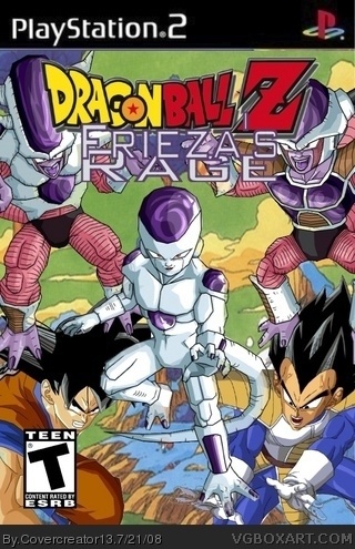
 Dragonball Z Frieza's Rage Box Cover Comments
good, this is one of your old boxes, so it dosen't have a developer logo
but i can see your using it now, and since you know now, i can definetely overlook it
great box!! really like the title!!
5/5 +fav
[ Reply ]
#1, I agree!
[ Reply ]
It's...... alright , The logo is quite plain, and the ESRB is abit too far into the image, try moving it into the corner a bit more. also, it seems a bit cramped, apart from that, you did get some nice hi res images and the cutting out is good, so about a 3.75/5.
A good effort
[ Reply ]