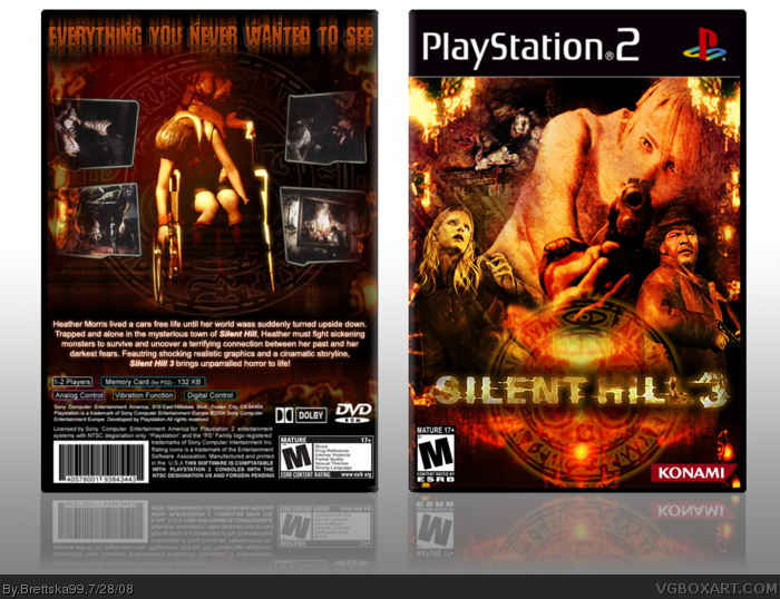
Im very displeased with the back but whatever. I'm back on track with my silent hill series, i'm half way there (i still have to do 4,homecoming, and origins) enjoy!
Nice... really like the front.. and I'll have to agree with above. I would have lose the circular symbol.. and the screenshots are weird - are they meant to be something, or just angled in a strange way?
The back information on this and your SH2 case is the same, and is wrong. I thought your SH2 one was pretty decent)other than movie Pyramid Head, BIG turn off), but I don't like this one too much.
 Silent Hill 3 Box Cover Comments
Very, Very Nice.
[ Reply ]
Im very displeased with the back but whatever. I'm back on track with my silent hill series, i'm half way there (i still have to do 4,homecoming, and origins) enjoy!
SH1: link
SH2: link
Edited at 1 decade ago
[ Reply ]
Move the screens up and add two more. And maybe you could have features in between all the screens?
Otherwise it's pretty nice.
[ Reply ]
Beautiful front. I think you're over using that symbol though.
[ Reply ]
#4, ya i am, but its not going to be on my next SH cover
[ Reply ]
Nice... really like the front.. and I'll have to agree with above. I would have lose the circular symbol.. and the screenshots are weird - are they meant to be something, or just angled in a strange way?
[ Reply ]
The back information on this and your SH2 case is the same, and is wrong. I thought your SH2 one was pretty decent)other than movie Pyramid Head, BIG turn off), but I don't like this one too much.
It's just not really Silent Hill-ish to me.
[ Reply ]
I think the back's really good too, great job overall.
[ Reply ]
catchy.. very nice work, good job. 5/5
[ Reply ]
I'm bumping, because this is the only box on the front page that isn't trash.
[ Reply ]
#10, Thats not cool lol Not all of the boxes are trash
[ Reply ]
Great Job. +fav
[ Reply ]
I love this. fave.
[ Reply ]