This is..great!, honestly.
i REALLY like the back.
The front not so much, but the box overall flows really well, and it really grabbed my attention.
+fav
Nice box... front is good - good colour scheme. The back is cool... although the layout of the text is a bit random IMO although text on the black strips are cool.
i'm sorry but I don't think this fits the style of the game, Hitman has always been very dark and intense, I don't think that your main color shouldn't be orange, it should be black and orange is the accent color, also I really don't like the picture placement on the back, sorry but 3/5.
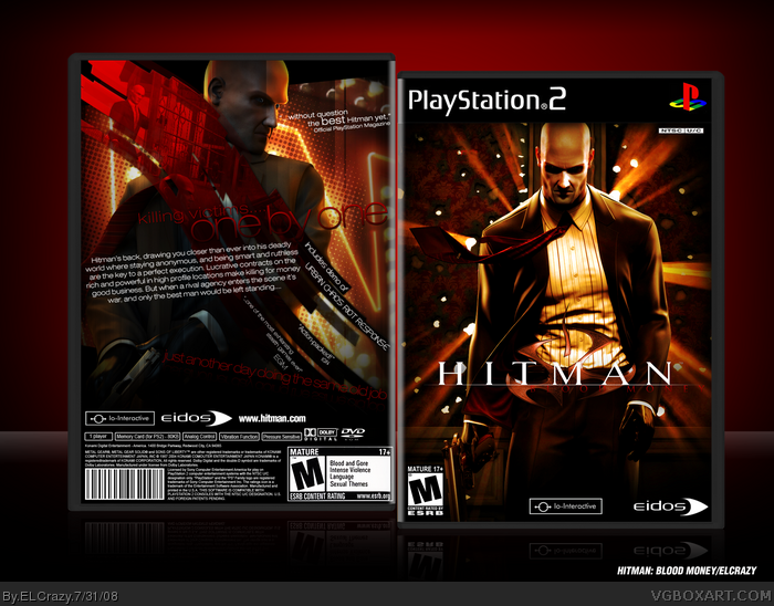
 Hitman: Blood Money Box Cover Comments
I experimented a million times, and this is the end result.
I'd be lying if I said that I'm happy with it, but hey, I wanna know your opinions =D
Cred to ADFD for back temp info.
Enjoy! (:
[ Reply ]
this is sehks =]
[ Reply ]
Well, I guess I won't be posting my Hitman box. :P
[ Reply ]
Ew
[ Reply ]
Looks very well designed but the blood money part of the logo doesn't standout much.
[ Reply ]
That taglin is tough to see. Id be cool white.
As a matter of fact, you should try making all red text to white, the reds tough to see.
Edited at 1 decade ago
[ Reply ]
agree with ninjamojo about the back tagline but other than that awsome!
[ Reply ]
ah front's okay
3/5
[ Reply ]
o.O
[ Reply ]
#8, lol @ you.
Awesome dude.
[ Reply ]
Genius much?
[ Reply ]
OMG!
7/5
[ Reply ]
#12, 7/5?
[ Reply ]
This is..great!, honestly.
i REALLY like the back.
The front not so much, but the box overall flows really well, and it really grabbed my attention.
+fav
[ Reply ]
You're not happy with it?
-_________________-
[ Reply ]
Very cool!
[ Reply ]
Nice box... front is good - good colour scheme. The back is cool... although the layout of the text is a bit random IMO although text on the black strips are cool.
[ Reply ]
#15, Yup, for some goddamn reason =P
I'm really glad you guys liked it. Thanks!
[ Reply ]
so very smexy
[ Reply ]
Added a printable!
[ Reply ]
Back looks awsome O.O Incredible O.O
+ FAV
+ FAV
[ Reply ]
Yatta its in the Hall
[ Reply ]
:O
I didn't expect it to be in the Hall. Thanks guys!!!
[ Reply ]
This box is amazing! I really really love it!
[ Reply ]
i'm sorry but I don't think this fits the style of the game, Hitman has always been very dark and intense, I don't think that your main color shouldn't be orange, it should be black and orange is the accent color, also I really don't like the picture placement on the back, sorry but 3/5.
[ Reply ]
Amazing Cover & Game +FAV
[ Reply ]
I love how it isn't white.
[ Reply ]
#25, the game is mostly set in Las Vegas >_>
orange is one of the primary colours in the game
[ Reply ]