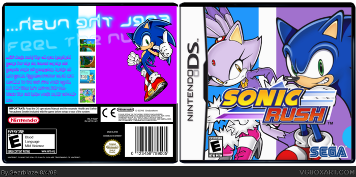
The cover doesn't seem to interesting, and that picture of Sonic really makes him look unflattering. He looks like he has a very big head and it clutters up the rest of the cover. The background isn't interesting at all, it's just a solid color; also I wouldn't pick that color because blaze seems to get lost in it.
As for the back, I don't like the tag line text, it's too girly. Also the color of the text is hard to read with the background.
Otherwise it's actually quite good, im surprised no one commented on it.
 Sonic Rush Box Cover Comments
No comments yet? Oh well, credit to numeroberiotcally (whatever it is)
for the temp, enjoy.
[ Reply ]
Comments?
[ Reply ]
The cover doesn't seem to interesting, and that picture of Sonic really makes him look unflattering. He looks like he has a very big head and it clutters up the rest of the cover. The background isn't interesting at all, it's just a solid color; also I wouldn't pick that color because blaze seems to get lost in it.
As for the back, I don't like the tag line text, it's too girly. Also the color of the text is hard to read with the background.
Otherwise it's actually quite good, im surprised no one commented on it.
[ Reply ]
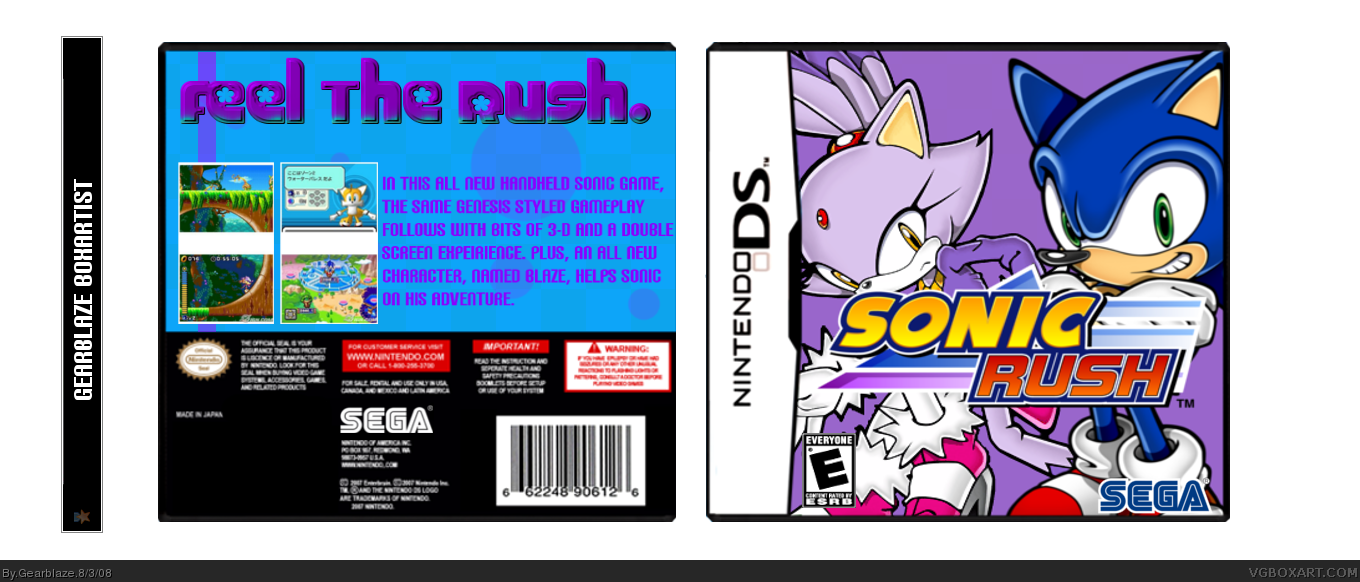
#3, Ok, I'm actually gonna redo the whole design, and the new one looks muck better so far so I think I'm gonna stick with it.
[ Reply ]
Hope it looks better now.
[ Reply ]