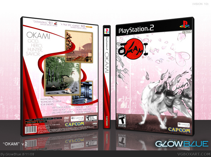
I see a dark shadow coming from the left side which would mean the light is on the right side but yet the back has a huge thick shadow down it. You lighting is off badly. The box is cool but its to dark and your shadows are in random places.
#12, Runawayred is actually right. There are two different light sources in this scene. A point light to the right of the camera is splashing the front of the box, while a spotlight to the left is shining on the spine. I guess I should clarify that I modeled this box in a 3D program, so every shadow you see is there because a light is creating it, not because I just decided to place them arbitrarily. Thanks for your comments all the same.
#16, If there was a light on the left side and right side wouldn't the light make it where the isn't a shadow on the back. Even if there is 2 lights I think the shadowing is off. I think you should stick with 1 light and keep the box from looking dark.
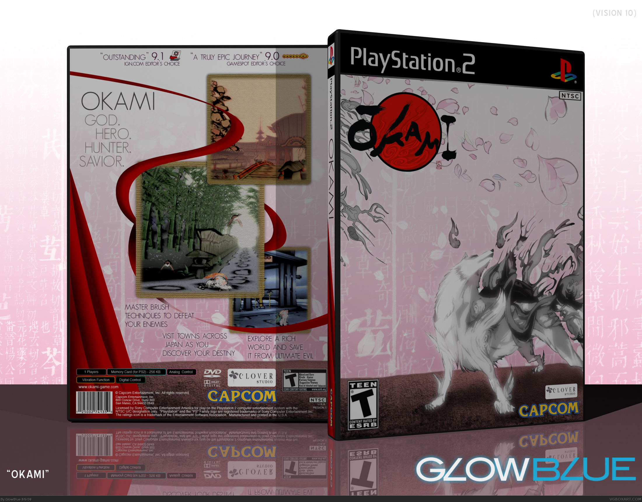
Updated! Removed the confusing shadows. Increased the light intensity to brighten the box. Changed the angles for the presentation to better show the spine, since many people commented that it looked too thin from the original angle.
 Okami Box Cover Comments
0___o +Fav
Edited at 1 decade ago
[ Reply ]
It looks too thin and I'm not sure about the shadow, but wow.
[ Reply ]
Something different from Okami. Looks good
[ Reply ]
The spine is really thin but i like the style you tried to adapt to this box :D other than that great!
[ Reply ]
Thanks for the favs guys!
Edited at 1 decade ago
[ Reply ]
the spine may be too thin but you really pulled off that style.
At first i didn't think that it was an Okami box. :p
[ Reply ]
i like it but the temp is a bit too thin
[ Reply ]
Love it! Great that there's something different for Okami. The spine looks too thin because you put it at a bad angle, but I don't really care, +Fav.
Oh and just to add in, I like how you put the shadow in there. I was going to say it was too big, but it looks just about right.
Edited at 1 decade ago
[ Reply ]
Finally, we have a different Okami box. unfortunately, it feels too empty and the spine is thin. just get rid of the shadow.
[ Reply ]
amazing.
[ Reply ]
Incredible.
[ Reply ]
I see a dark shadow coming from the left side which would mean the light is on the right side but yet the back has a huge thick shadow down it. You lighting is off badly. The box is cool but its to dark and your shadows are in random places.
[ Reply ]
#12 Actually it appears that there are two lights, one shining from the right and another from the left. I don't think that was a mistake.
Edited at 1 decade ago
[ Reply ]
I agree with what Hunter and Trev said. It's artistic and quite sleek.
[ Reply ]
Unique.
[ Reply ]
#12, Runawayred is actually right. There are two different light sources in this scene. A point light to the right of the camera is splashing the front of the box, while a spotlight to the left is shining on the spine. I guess I should clarify that I modeled this box in a 3D program, so every shadow you see is there because a light is creating it, not because I just decided to place them arbitrarily. Thanks for your comments all the same.
[ Reply ]
Wow.....the back is really nice.
[ Reply ]
#16, If there was a light on the left side and right side wouldn't the light make it where the isn't a shadow on the back. Even if there is 2 lights I think the shadowing is off. I think you should stick with 1 light and keep the box from looking dark.
[ Reply ]
diffrent but nice
[ Reply ]
nice, but could be brighter.
[ Reply ]
Updated! Removed the confusing shadows. Increased the light intensity to brighten the box. Changed the angles for the presentation to better show the spine, since many people commented that it looked too thin from the original angle.
[ Reply ]
'tis very nice!
[ Reply ]
This should be behind a glass case in an art museum.
[ Reply ]
very fashionable!
4.7/5 and faved!
[ Reply ]
WOW!! My favorite box art on the SITE!! Definitely!!
[ Reply ]