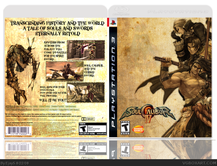
-bandai namco logo isn't supposed to be cut out. (i know wierd but that's how they roll)
-logo can be a little bit bigger and placed on top of box.
-And I dont like the text on the back. Change it with some other text and I'll fav. And try to fix up those other problems, too.
I actually really like the simplicity of the front, nicely done. But the back seems bland. You can get away with empty-ish fronts but not really with backs.
 Soul Calibur IV Box Cover Comments
My first non-sports cover thanks! Had fun doing this one.
[ Reply ]
i like it nice and basic love the textures ^_^
and i like the font
bleeding cowboys right? lol
[ Reply ]
I like the front but:
-bandai namco logo isn't supposed to be cut out. (i know wierd but that's how they roll)
-logo can be a little bit bigger and placed on top of box.
-And I dont like the text on the back. Change it with some other text and I'll fav. And try to fix up those other problems, too.
[ Reply ]
I actually really like the simplicity of the front, nicely done. But the back seems bland. You can get away with empty-ish fronts but not really with backs.
[ Reply ]
Why do I like this so much? Oh, right... cause it's GOOD! Very nice job. Love the look and the simplicity of the cover.
[ Reply ]
This is very sharp looking. I love the old scroll effect.
[ Reply ]
#6, Same here. I also agree with Apollo on the back - I don't think the tagline font is very fitting. Otherwise, great job!
[ Reply ]